-
AuthorPosts
-
February 5, 2018 at 9:49 pm #1090211
Hi,
I love the article view of Magz II, but the overall view of Focus. Is it posible to combine the two?
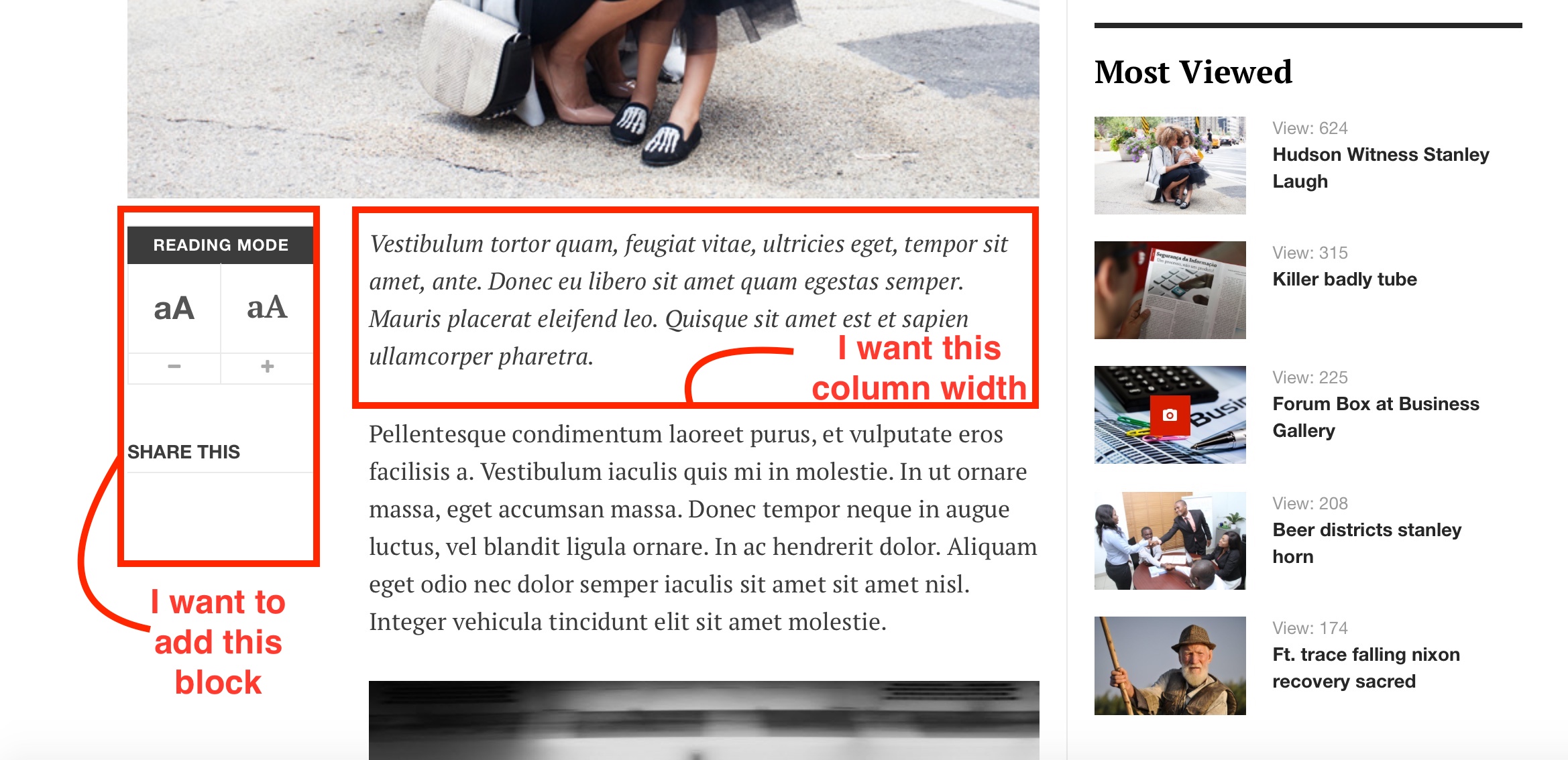
Please see the attached screenshot. My questions:
1) Can I add the ‘Reading mode’ buttons
2) I think the length of the content is to long. I want to have the same column-width in Focus as Magz II.I hope this is possible! 🙂
Thanks
 timtecsa
Friend
timtecsa
- Join date:
- October 2009
- Posts:
- 1382
- Downloads:
- 86
- Uploads:
- 327
- Thanks:
- 197
- Thanked:
- 132 times in 34 posts
February 5, 2018 at 11:10 pm #1090217Did you look at JA Teline V ? http://www.joomlart.com/demo/#ja_teline_v
Saguaros Moderator
Saguaros
- Join date:
- September 2014
- Posts:
- 31405
- Downloads:
- 237
- Uploads:
- 471
- Thanks:
- 845
- Thanked:
- 5346 times in 4964 posts
February 6, 2018 at 2:14 am #1090236Hi,
Do you mean the detailed view page or category page?
Could you attach screenshot again? as I don’t see it now.
February 6, 2018 at 9:21 am #1090295Yes! Thats exactly the article view I want to have on JA Focus! JA Teline V is nice, but I think JA Focus suits my website more (except of the article view).
February 6, 2018 at 9:28 am #1090297Saguaros Moderator
Saguaros
- Join date:
- September 2014
- Posts:
- 31405
- Downloads:
- 237
- Uploads:
- 471
- Thanks:
- 845
- Thanked:
- 5346 times in 4964 posts
February 6, 2018 at 10:00 am #1090305Hi,
These features are implemented in JA Magz II template specific, I’m afraid that it will require lots of customization to achieve that.
The associated file for article view layout is: /templates/ja_magz_ii/html/com_content/article/default.php You can see & update for same view in JA Focus. If you’re not familiar with code, I recommend you to hire a developer to get it done for you.
Regards
February 6, 2018 at 10:39 am #1090321These features are implemented in JA Magz II template specific, I’m afraid that it will require lots of customization to achieve that.
Hmm, that’s a pity! And what about point 2? I think the content column of JA Focus is to big. That doesn’t read easy for visitors because the sentences are to long. If only that feature can be implemented I’m OK with FA Focus.
Saguaros Moderator
Saguaros
- Join date:
- September 2014
- Posts:
- 31405
- Downloads:
- 237
- Uploads:
- 471
- Thanks:
- 845
- Thanked:
- 5346 times in 4964 posts
February 7, 2018 at 2:49 am #1090492Hi,
So, without the typo tool on left side (as in JA Magz II), you want to reduce the width of both Images & Content part or just content part only?
You can try with this CSS for content part only:
@media (min-width: 992px) {
.view-article .article-content {
    width: 80%;
    padding-left: 120px;
}
}
put into the CSS file: root/templates/ja_focus/css/custom.css (create this file if it doesn’t exist).
Regards
 timtecsa
Friend
timtecsa
- Join date:
- October 2009
- Posts:
- 1382
- Downloads:
- 86
- Uploads:
- 327
- Thanks:
- 197
- Thanked:
- 132 times in 34 posts
February 7, 2018 at 6:24 pm #1090622Did you consider putting a module into position sidebar-left on article pages ?
February 8, 2018 at 10:13 pm #1090913You can try with this CSS for content part only
This works! Thanks. The thing is that is also effects the MOST READ module. The item titles are now below the images.
Did you consider putting a module into position sidebar-left on article pages ?
I tried but the sidebar-left position seems not to exist. I can’t select it when creating a module.
Saguaros Moderator
Saguaros
- Join date:
- September 2014
- Posts:
- 31405
- Downloads:
- 237
- Uploads:
- 471
- Thanks:
- 845
- Thanked:
- 5346 times in 4964 posts
February 12, 2018 at 7:26 pm #1091588You can change a bit to
Great! It works like charm! 🙂
February 26, 2018 at 6:04 pm #1094017One last question: is it possible to exclude some static pages/ content to this lay-out? So, some pages should have the origial lay-out.
Thanks!
Saguaros Moderator
Saguaros
- Join date:
- September 2014
- Posts:
- 31405
- Downloads:
- 237
- Uploads:
- 471
- Thanks:
- 845
- Thanked:
- 5346 times in 4964 posts
February 27, 2018 at 2:58 am #1094081Hi,
I’m not entirely sure of how you want to achieve here, could you illustrate via screenshots?
AuthorPostsViewing 14 posts - 1 through 14 (of 14 total)This topic contains 13 replies, has 3 voices, and was last updated by
Saguaros 6 years, 10 months ago.
We moved to new unified forum. Please post all new support queries in our New Forum
Change article view
Viewing 14 posts - 1 through 14 (of 14 total)


