-
AuthorPosts
-
October 8, 2013 at 2:22 am #191214
Hello,
I apologize for the question but I’d rather ask than try to fix it on my own and mess something up with the templating of this lovely design.
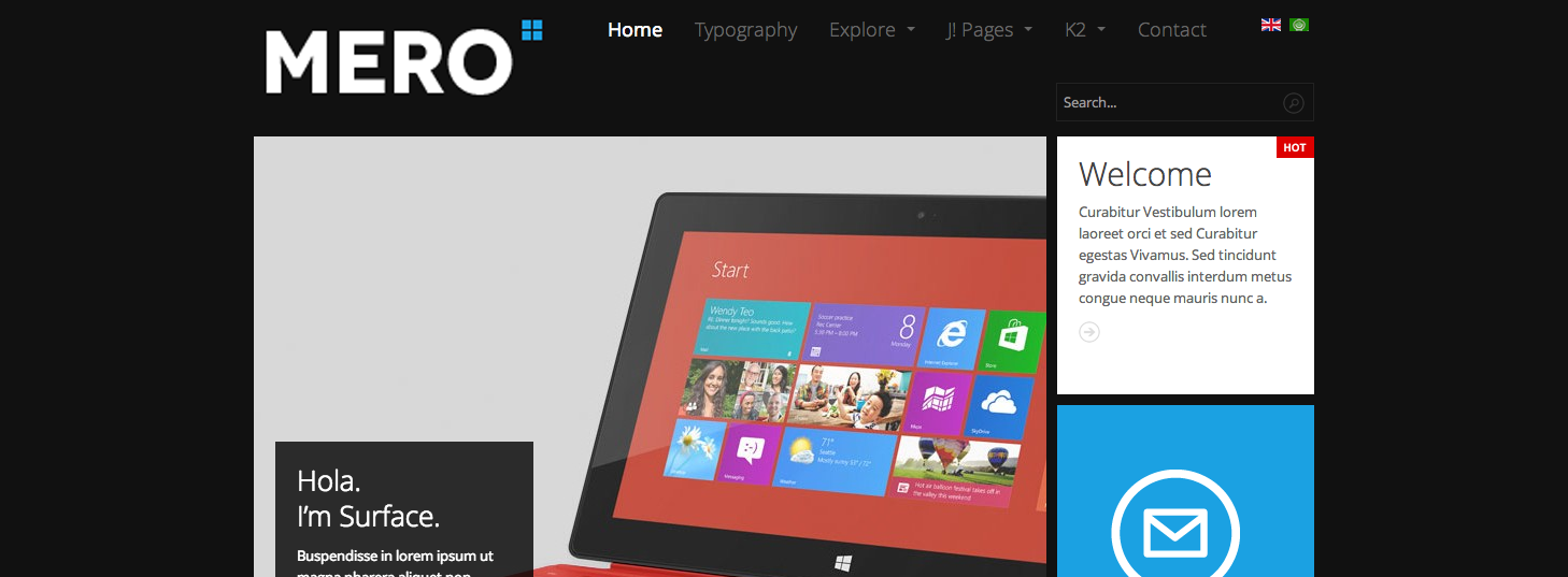
On the top, I would like to make the logo larger and move the navigation bar to the right of the logo. Is this possible?
Like this.
http://www.joomlart.com/forums/attachment.php?attachmentid=30550&stc=1&d=1381198833If this is not possible, or is rather complex, is it possible to just make the logo larger?
Thank you in advance for your help!!
Becky
 Ninja Lead
Moderator
Ninja Lead
- Join date:
- November 2014
- Posts:
- 16064
- Downloads:
- 310
- Uploads:
- 2864
- Thanks:
- 341
- Thanked:
- 3854 times in 3563 posts
October 9, 2013 at 8:24 am #508458Hi Becky,
You can try to do with my below solution
+ Download and extract my attachment file
+ Copy it into this templates/ja_mero/tpls/blocks folder
+ Backup header.php and mainnav.php file before doing
+ Change the big logo
Open templates/ja_mero/css/template.css file
.logo-image a {

  background-image: url("../images/logo.png");

  background-repeat: no-repeat;

  width: 151px;

  height: 41px;

}
Image path: templates/ja_mero/images/logo.png
Regards
October 10, 2013 at 11:39 pm #508664Thank you I will give this a shot!! =)
 Ninja Lead
Moderator
Ninja Lead
- Join date:
- November 2014
- Posts:
- 16064
- Downloads:
- 310
- Uploads:
- 2864
- Thanks:
- 341
- Thanked:
- 3854 times in 3563 posts
October 11, 2013 at 3:01 am #508673<em>@spattymac 393165 wrote:</em><blockquote>Thank you I will give this a shot!! =)</blockquote>
Let me know if you have any further issue in the future.
marinaw Friend
marinaw
- Join date:
- April 2007
- Posts:
- 20
- Downloads:
- 0
- Uploads:
- 1
- Thanks:
- 18
- Thanked:
- 1 times in 1 posts
February 25, 2014 at 7:14 pm #524346Hello,
What about having search aligned with logo/navigation/language switcher? It might seem like too much but it’s possible with fewer menu items and a smaller font size…
thanks in advance for any assistance you might provide,
marina
 TomC
Moderator
TomC
- Join date:
- October 2014
- Posts:
- 14077
- Downloads:
- 58
- Uploads:
- 137
- Thanks:
- 948
- Thanked:
- 3155 times in 2495 posts
February 25, 2014 at 7:32 pm #524349<em>@marinaw 413380 wrote:</em><blockquote>Hello,
What about having search aligned with logo/navigation/language switcher? It might seem like too much but it’s possible with fewer menu items and a smaller font size…
thanks in advance for any assistance you might provide,
marina</blockquote>
Can you provide the url of the site you’re working on?
Also, it would be helpful if you could temporarily set “Optimize CSS” to “Off” within your Template Manager–General settings
marinaw Friend
marinaw
- Join date:
- April 2007
- Posts:
- 20
- Downloads:
- 0
- Uploads:
- 1
- Thanks:
- 18
- Thanked:
- 1 times in 1 posts
February 27, 2014 at 2:26 pm #524627Hello Tom,
I sent you a pm with the info requested…
regards,marina
 TomC
Moderator
TomC
- Join date:
- October 2014
- Posts:
- 14077
- Downloads:
- 58
- Uploads:
- 137
- Thanks:
- 948
- Thanked:
- 3155 times in 2495 posts
February 28, 2014 at 11:26 pm #524815Okay, here’s a little hack that may work . . .
Within file path —> /ja_mero/css/themes/light/template.css
at line 2736, modify as follows:
.head-search {

    float: left;

    margin-top: -45px;

}
Is that along the lines of what you were thinking?
AuthorPostsViewing 8 posts - 1 through 8 (of 8 total)This topic contains 8 replies, has 4 voices, and was last updated by
 TomC 10 years, 10 months ago.
We moved to new unified forum. Please post all new support queries in our New Forum
Changing logo & Navigation
Viewing 8 posts - 1 through 8 (of 8 total)


