-
AuthorPosts
-
November 21, 2017 at 5:47 pm #1075705
Hi,
We just notice the color contrast in the JA slideshow item description box were too low according to the web accessibility guidelines.
Here is our page using the JA slideshow module with the description box:
http://district279.org/
(see screenshot "LowContrast1.jpg" with the warning message).I look through the documentation on JA slideshow but I’m not seeing where we can adjust the text, foreground and background color within the item description.
Can you please advise how we can adjust the colors for that and the "Last updated date" that shows in the News Module (see screenshot "LowContrast2.jpg").Thank you for your help!
Emily Pankaj Sharma
Moderator
Pankaj Sharma
- Join date:
- February 2015
- Posts:
- 24589
- Downloads:
- 144
- Uploads:
- 202
- Thanks:
- 127
- Thanked:
- 4196 times in 4019 posts
November 22, 2017 at 2:36 am #1075769Hi
To change the yellow BG image behind the description add this code in custom.css file and change the image with your image.ja-ss-desc { background-image: url(../../../images/themes/blue/sl-desc-bg.png) !important; }For the heading title use this code
.ja-ss-desc h3 {
    color: #ffffff;
    font-size: 30px;
    font-weight: normal;
    text-shadow: 1px 1px 0 rgba(0, 0, 0, 0.3);
}
And for description use this code
.ja-ss-desc {
    background: url(../../../images/trans-d40.png);
    color: #ffffff;
    left: 0;
    position: absolute;
    bottom: 90px;
    box-sizing: border-box;
    padding: 20px;
    width: 350px;
}
Change the style value as per needs.
Regards
1 user says Thank You to Pankaj Sharma for this useful post
November 30, 2017 at 10:16 pm #1078126Hi Pankaj Sharma,
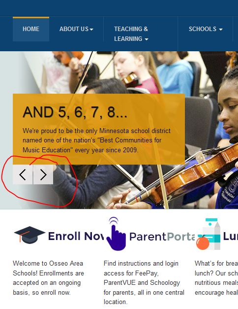
Everything worked except when I swap the arrow images and it still didn’t pass the accessibility scan for low contrast error.Here is the code I used in my custom.css
.ja-ss-btns span {
background-image: url("http://district279.org/templates/ja_university_t3/images/themes/blue/sl-btn-direction.png") !important;
}Can you please tell me if there is anything else I should try to change to bring up the contrast in these 2 arrows in the slideshow?
Thanks! Pankaj Sharma
Moderator
Pankaj Sharma
- Join date:
- February 2015
- Posts:
- 24589
- Downloads:
- 144
- Uploads:
- 202
- Thanks:
- 127
- Thanked:
- 4196 times in 4019 posts
December 1, 2017 at 1:56 am #1078162Hi
its the same image that is loading from custom.css file
Add this code in custom.css file to add a background to it.ja-ss-desc {background:#fff;}Hope it helps
Regards
December 1, 2017 at 4:59 pm #1078342Hi Pankaj,
Are you sure that’s the right code for the arrow buttons? Because I did what you suggest and it didn’t change anything. Please see my screenshot with the "arrow buttons" circled in red. Thanks!
 Pankaj Sharma
Moderator
Pankaj Sharma
- Join date:
- February 2015
- Posts:
- 24589
- Downloads:
- 144
- Uploads:
- 202
- Thanks:
- 127
- Thanked:
- 4196 times in 4019 posts
December 4, 2017 at 1:33 am #1078493Hi
have a look here:
templates/ja_university_t3/images/themes/blue/sl-btn-direction.png
This file is used as navigation on your site and same is loading: http://prntscr.com/hipo32Regards
December 4, 2017 at 3:35 pm #1078796Yes and that is what I did. I added this code to my custom.css file and changed the image.
.ja-ss-btns span {
background-image: url("http://district279.org/templates/ja_university_t3/images/themes/blue/sl-btn-direction.png") !important;
}However, the scanner is picking up some different color (not the gold and gray in your screenshot), that’s why I’m wondering if there is something more to it than just replacing the new image.
 Pankaj Sharma
Moderator
Pankaj Sharma
- Join date:
- February 2015
- Posts:
- 24589
- Downloads:
- 144
- Uploads:
- 202
- Thanks:
- 127
- Thanked:
- 4196 times in 4019 posts
December 5, 2017 at 1:43 am #1078987Hi
Kindly check again, its same image there is no other colour used over the image you added.
You can see it in the code as well.Regards
AuthorPostsViewing 8 posts - 1 through 8 (of 8 total)This topic contains 7 replies, has 2 voices, and was last updated by
 Pankaj Sharma 7 years ago.
We moved to new unified forum. Please post all new support queries in our New Forum
changing the colors within the JA Slideshow item description box
Viewing 8 posts - 1 through 8 (of 8 total)


