-
AuthorPosts
-
August 8, 2008 at 11:59 am #131968
Hi,
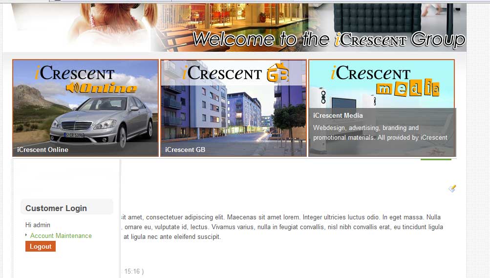
At present I wish to make the spotlight module take up 100% of the screen area (as it does when the the left column is collapsed).
When I activate the left the column, the spot light module shrinks to accommodate the left hand side. Instead I would like the left hand module to appear below the spotlight module. The reason for this is so I can add a login form on the left hand side, without the login module interfering with the spotlight.
Picture 1 shows what the site currently looks like, where as picture 2 shows what I want. If anyone can help I would be very grateful.
Regards
Craig-
 John Wesley Brett
Moderator
John Wesley Brett
- Join date:
- July 2013
- Posts:
- 2142
- Downloads:
- 17
- Uploads:
- 26
- Thanks:
- 175
- Thanked:
- 645 times in 426 posts
August 8, 2008 at 2:12 pm #264522Are you going to want to have the BODY area (as seen in the template in letter “E” remain as well…or is that something you don’t need.
John.
August 8, 2008 at 2:42 pm #264532Yeah, I want the body to still be intact.
 John Wesley Brett
Moderator
John Wesley Brett
- Join date:
- July 2013
- Posts:
- 2142
- Downloads:
- 17
- Uploads:
- 26
- Thanks:
- 175
- Thanked:
- 645 times in 426 posts
August 8, 2008 at 2:57 pm #264535This should do what you want.
Change template_css.css (line 1428) from this
.wide #ja-mainbody, .wide #ja-mainbody-fr {

width:730px;

}
To this:
.wide #ja-mainbody, .wide #ja-mainbody-fr {

width:100%

}
This may leave you with another issue and that is the background image for the left column…the vertical dropshadow line. But we really won’t be able to see if it’s a problem until you’ve done the above.
But if you do need to get rid of it…you’ll find the file referenced in two places. Just eliminate them.
template_css.css (line 1006)
.wide #ja-container, .wide #ja-container-fr {

background:transparent url(../images/container-bg.gif) repeat-y scroll 214px 0;

}
template_css.css (line 1002)
#ja-container, #ja-container-fr {

background:transparent url(../images/container-bg.gif) repeat-y scroll 170px 0;

}
Good luck!
Have fun!
John.1 user says Thank You to John Wesley Brett for this useful post
August 8, 2008 at 3:08 pm #264537Brilliant, that at least was a move in the right direction. However now the main article over writes everything on the left, so the left colums contents get pushed to the bottom. If you want a look check out http://www.icrescent.com
Thanks for your input BTW John Wesley Brett
Moderator
John Wesley Brett
- Join date:
- July 2013
- Posts:
- 2142
- Downloads:
- 17
- Uploads:
- 26
- Thanks:
- 175
- Thanked:
- 645 times in 426 posts
August 8, 2008 at 3:29 pm #264543I’m sorry…perhaps I wasn’t more clear in my original quesition as to whether you wanted the BODY to be included in that area as well.
Looking…
John.
 John Wesley Brett
Moderator
John Wesley Brett
- Join date:
- July 2013
- Posts:
- 2142
- Downloads:
- 17
- Uploads:
- 26
- Thanks:
- 175
- Thanked:
- 645 times in 426 posts
August 8, 2008 at 4:10 pm #264552You’re going to have to hack the index.php file to readjust the order of modules.
You need to remove all of the internal DIVS inside of the JA-CONTENT after the JA-TOPSLWRAP DIV…and create a new DIV to appear AFTER the JA-COL1WRAP DIV and make sure it FLOATS right.
That should do it.
John.August 8, 2008 at 5:47 pm #264568Wow…..I thought it may come to that. If I do that, would I not be just as well putting in a new div after JA-COL1WRAP DIV, giving it a new name and making it a module position?
lol, please don;t presume I know exactly how to do it, but if I am adding to the CSS then can I not select the new change as well?
Hope that makes sense.
Regards
Craig John Wesley Brett
Moderator
John Wesley Brett
- Join date:
- July 2013
- Posts:
- 2142
- Downloads:
- 17
- Uploads:
- 26
- Thanks:
- 175
- Thanked:
- 645 times in 426 posts
August 8, 2008 at 7:04 pm #264577Well…hacking the index.php file and hacking CSS are somewhat similar in many ways and quite different in others.
Shuffling the DIVs around is not really a big deal but you have to be very careful where you put the DIV because, as you may know, DIVs can be in DIVs can be in DIVs…and you have to get the hierarchy exactly right or you’ve got big trouble.
Adding to that fact is that you are also doing this while working around PHP scripting which can be quite tricky.
But let’s assume you do create the new DIV in the right place…I wouldn’t change the name of it primarily because it is the main body section of code you are moving. The Body section is NOT a module nor inside a module. It’s its own unique thing…a table actually. It would be nice if it were a module, cause then we could throw it around all over the place. About the only easy things you can do with the BODY area once set in a template is keep it…or delete it. Other than that you’ve got some work to do.
Now am I making any sense? 🙂
John.1 user says Thank You to John Wesley Brett for this useful post
August 9, 2008 at 5:55 pm #264728You’ve convinced me that the logical solution is to use the top panel extension from Yoo……It’ll allow me to integrate the virtue mart login into the top of the screen and save me having to start hacking away at the code! Thank you for your input though, very helpful! 😉 😀
-
AuthorPosts
Viewing 12 posts - 1 through 12 (of 12 total)This topic contains 12 replies, has 3 voices, and was last updated by
craigieb 16 years, 4 months ago.
We moved to new unified forum. Please post all new support queries in our New Forum
Jump to forum
-


