-
AuthorPosts
-
crossix Friend
crossix
- Join date:
- June 2015
- Posts:
- 57
- Downloads:
- 9
- Uploads:
- 12
- Thanked:
- 1 times in 1 posts
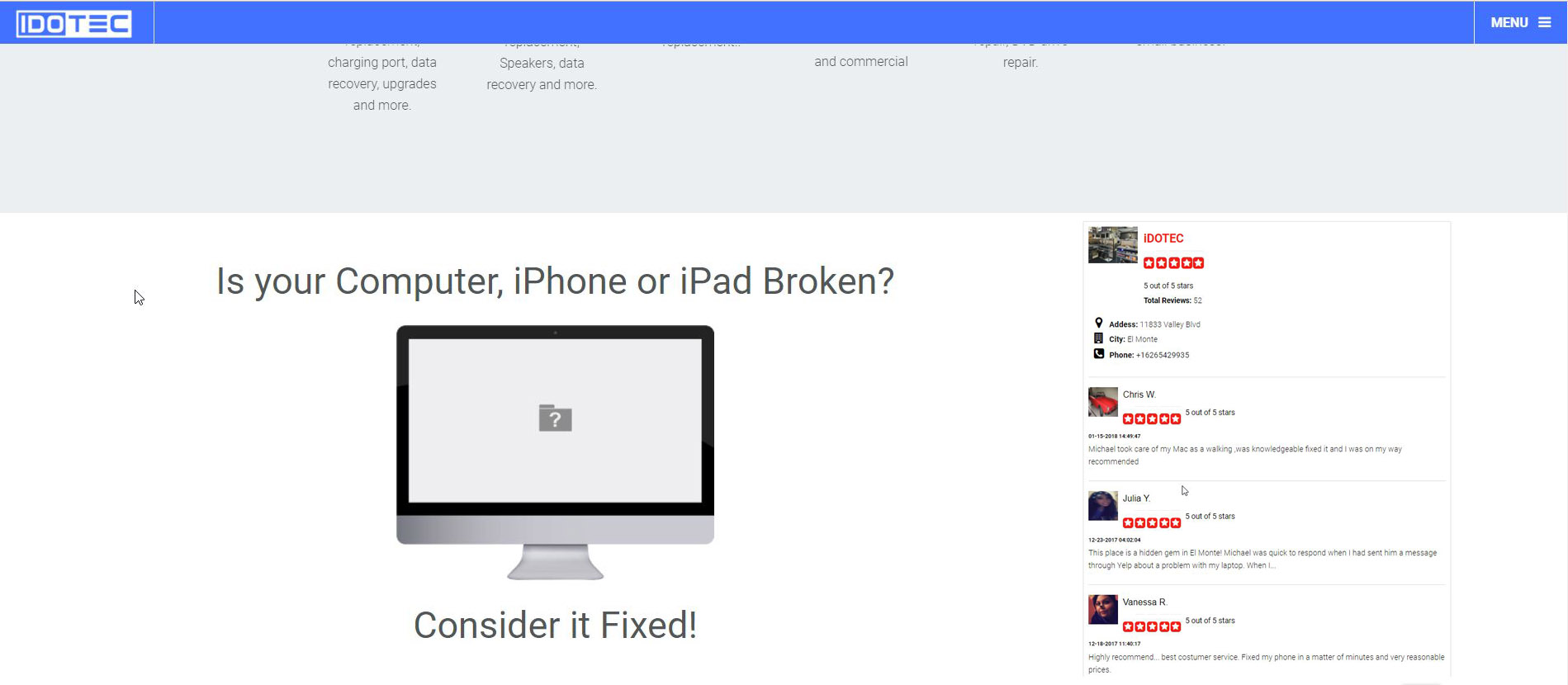
January 27, 2018 at 1:54 am #1088680Hi, i want to edit the layout of my website, i want to have the component and sidebar position to be full width, how to accomplish that… see screenshot, im using default layout.
Saguaros Moderator
Saguaros
- Join date:
- September 2014
- Posts:
- 31405
- Downloads:
- 237
- Uploads:
- 471
- Thanks:
- 845
- Thanked:
- 5346 times in 4964 posts
January 29, 2018 at 4:07 am #1088855Hi,
Kindly share the credentials of your site so I can have a closer look and check for you.
Regards
crossix Friend
crossix
- Join date:
- June 2015
- Posts:
- 57
- Downloads:
- 9
- Uploads:
- 12
- Thanked:
- 1 times in 1 posts
January 29, 2018 at 6:20 am #1088874This reply has been marked as private.Saguaros Moderator
Saguaros
- Join date:
- September 2014
- Posts:
- 31405
- Downloads:
- 237
- Uploads:
- 471
- Thanks:
- 845
- Thanked:
- 5346 times in 4964 posts
January 29, 2018 at 8:06 am #1088894You can try opening this file: root/templates/uber/tpls/blocks/mainbody/one-sidebar-right.php
Remove the container class in this line of code:
<div id="t3-mainbody" class="container t3-mainbody">crossix Friend
crossix
- Join date:
- June 2015
- Posts:
- 57
- Downloads:
- 9
- Uploads:
- 12
- Thanked:
- 1 times in 1 posts
January 29, 2018 at 5:30 pm #1088996that will make the sidebars and mainbody full width?
Saguaros Moderator
Saguaros
- Join date:
- September 2014
- Posts:
- 31405
- Downloads:
- 237
- Uploads:
- 471
- Thanks:
- 845
- Thanked:
- 5346 times in 4964 posts
January 30, 2018 at 1:38 am #1089036Hi,
Yes, because at this moment, the main content + sidebar are inside a div with ‘container’ class which is defined with specific width associated with screen size.
Backup your old file first before changing.
Regards
crossix Friend
crossix
- Join date:
- June 2015
- Posts:
- 57
- Downloads:
- 9
- Uploads:
- 12
- Thanked:
- 1 times in 1 posts
January 30, 2018 at 3:36 am #1089070would you please check why the sidebars are shown in 2 column on mobile view? and how to get the side bars with no backgrounds and no padding? look at yelpreviews module it looks weird. thanks for the help
Saguaros Moderator
Saguaros
- Join date:
- September 2014
- Posts:
- 31405
- Downloads:
- 237
- Uploads:
- 471
- Thanks:
- 845
- Thanked:
- 5346 times in 4964 posts
January 30, 2018 at 6:44 am #1089083When you use 2 sidebars, it will use this layout file: root/templates/uber/tpls/blocks/mainbody/two-sidebar.php
You can open this file and look for the class: col-xs-6, then change it to: col-xs-12: http://prntscr.com/i7ic5q
For the module in sidebar, you can try with this custom CSS:
.t3-sidebar .t3-module { padding: 0; background: none; }AuthorPostsViewing 8 posts - 1 through 8 (of 8 total)This topic contains 7 replies, has 2 voices, and was last updated by
Saguaros 6 years, 9 months ago.
We moved to new unified forum. Please post all new support queries in our New Forum
component and sidebar width
Viewing 8 posts - 1 through 8 (of 8 total)


