-
AuthorPosts
-
 Scott Lavelle
Friend
Scott Lavelle
- Join date:
- November 2010
- Posts:
- 266
- Downloads:
- 16
- Uploads:
- 5
- Thanks:
- 6
- Thanked:
- 64 times in 27 posts
June 29, 2016 at 11:10 pm #945571Using the current version of ja_simpli
Using Joomla 3.5.1
Select the Simpli Default, Green, Blue, etc style
Go to Layout Configuration
Go to Main Content
Select Main Content = Content Position = Right
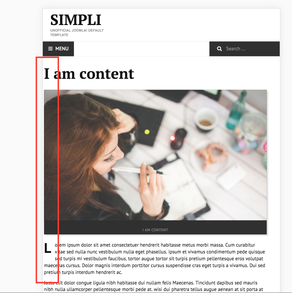
Look at site on mobile device or in responsive mode in FirebugThe left column is not flowing properly. For instance, if you set a background color on that sidebar, it will be showing behind the main content area. Even in just the unmodified background, the "highlight module" that is in position-7 has a border around it that lays on top of the main content area. This only happens when below 768px.
I have added this to a custom.css file to eliminate the issue:
@media (max-width: 768px) {
[class="span"], .uneditable-input[class="span"], .row-fluid [class*="span"] {
float: left;
}
}Can someone please verify that this is a problem and correct it?
Scott Lavelle - Technical Resource Solutions, LLC
Certified Joomla Administrator Scott Lavelle
Friend
Scott Lavelle
- Join date:
- November 2010
- Posts:
- 266
- Downloads:
- 16
- Uploads:
- 5
- Thanks:
- 6
- Thanked:
- 64 times in 27 posts
June 30, 2016 at 12:36 pm #945791I’ve determined it’s not just me or my install or something I’ve done wrong. The problem exists on the demo page here:
http://ja-simpli.demo.joomlart.com/index.php/2016-04-29-08-58-29/template-layouts/content-two-cols-2Just squeeze your browser down to <768px or open it on mobile and you’ll see what I’m talking about.
Scott Lavelle - Technical Resource Solutions, LLC
Certified Joomla Administrator Ninja Lead
Moderator
Ninja Lead
- Join date:
- November 2014
- Posts:
- 16064
- Downloads:
- 310
- Uploads:
- 2864
- Thanks:
- 341
- Thanked:
- 3854 times in 3563 posts
July 4, 2016 at 4:38 am #946481Hi,
I guess you are mentioning about it does not show the left space on the link above. You can use this way to fix this bug
Open templates/ja_simpli/css/template.css file
find and change
@media (max-width: 979px) and (min-width: 768px) {
    .row {
        margin-left: -20px;
    }
}
to
@media (max-width: 979px) and (min-width: 768px) {
    .row {
        margin-left: 20px;
    }
}
Regards
 Scott Lavelle
Friend
Scott Lavelle
- Join date:
- November 2010
- Posts:
- 266
- Downloads:
- 16
- Uploads:
- 5
- Thanks:
- 6
- Thanked:
- 64 times in 27 posts
August 17, 2016 at 9:42 am #960765No, this is not the issue.
Just open that link and make the page smaller than 768px and you will see the orange border of the highlight module overlap with the content area. It’s easiest to see that, but it’s actually a whole sidebar problem. Imagine you had a background color on the sidebar of Black, for example. When in mobile mode, the whole content area would have black laying behind it instead of just the sidebar parts.
This only happens when you have the content to the right and sidebar to the left. It works correctly when you have the sidebar on the right (the default layout for this template).
Scott Lavelle - Technical Resource Solutions, LLC
Certified Joomla Administrator Ninja Lead
Moderator
Ninja Lead
- Join date:
- November 2014
- Posts:
- 16064
- Downloads:
- 310
- Uploads:
- 2864
- Thanks:
- 341
- Thanked:
- 3854 times in 3563 posts
August 18, 2016 at 3:54 am #960977Try to use this way to fix that problem
Open templates/ja_simpli/css/template.css file and add new rule
@media (max-width: 767px) {
    [class*="span"].pull-right {
        float: none !important;
    }
}
Scott Lavelle
Friend
Scott Lavelle
- Join date:
- November 2010
- Posts:
- 266
- Downloads:
- 16
- Uploads:
- 5
- Thanks:
- 6
- Thanked:
- 64 times in 27 posts
August 21, 2016 at 3:59 am #961669Without actually trying this fix, note that I already found a similar thing to resolve this. My point in reporting it (which you have confirmed with your workaround) is that it is a problem in the template. This should be fixed since I can’t think of a reason that you would want it to behave the way that it does.
Scott Lavelle - Technical Resource Solutions, LLC
Certified Joomla Administrator Ninja Lead
Moderator
Ninja Lead
- Join date:
- November 2014
- Posts:
- 16064
- Downloads:
- 310
- Uploads:
- 2864
- Thanks:
- 341
- Thanked:
- 3854 times in 3563 posts
AuthorPostsViewing 7 posts - 1 through 7 (of 7 total)This topic contains 6 replies, has 2 voices, and was last updated by
 Ninja Lead 8 years, 4 months ago.
We moved to new unified forum. Please post all new support queries in our New Forum
Content to the right in default template style breaks float in mobile
Viewing 7 posts - 1 through 7 (of 7 total)


