-
AuthorPosts
-
Saguaros Moderator
Saguaros
- Join date:
- September 2014
- Posts:
- 31405
- Downloads:
- 237
- Uploads:
- 471
- Thanks:
- 845
- Thanked:
- 5346 times in 4964 posts
September 23, 2016 at 4:10 am #970391Hi
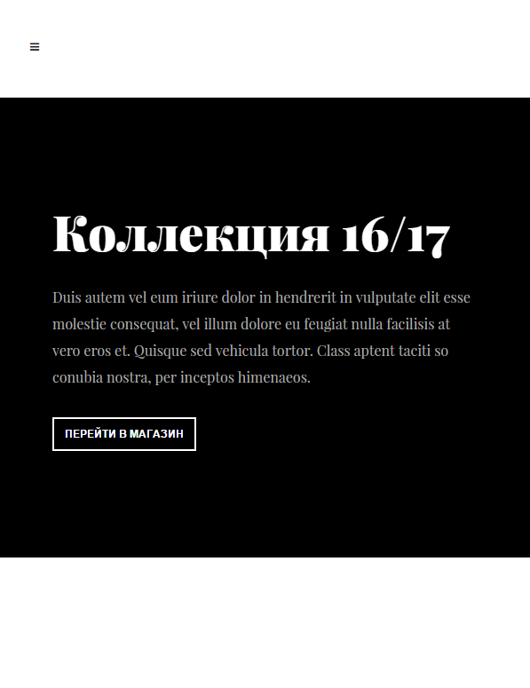
In small view port, the width is not enough to display them all, if you want to show image, try with this tweak:
- Go to file: ROOT/templates/ja_cagox/css/custom.css (create this file it doesn’t exist)
- Add this css rule:
@media (max-width: 480px) {
.block-slideshow.style-2 .slick-slider {
display: block !important;
}
}
 natali.klochan
Friend
natali.klochan
- Join date:
- August 2016
- Posts:
- 107
- Downloads:
- 677
- Uploads:
- 59
- Thanks:
- 3
- Thanked:
- 3 times in 2 posts
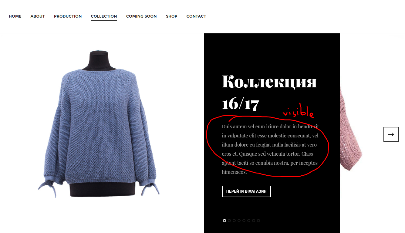
September 23, 2016 at 9:05 am #970469I understand. Really image is displaying on the full size photo. But can I make visible this photo is smaller – for the small display?
Can you tell me – where or which files and rules I can make changing for 4-th types width (for 4-th types display). Because I need 2-nd text in small display will be visible.
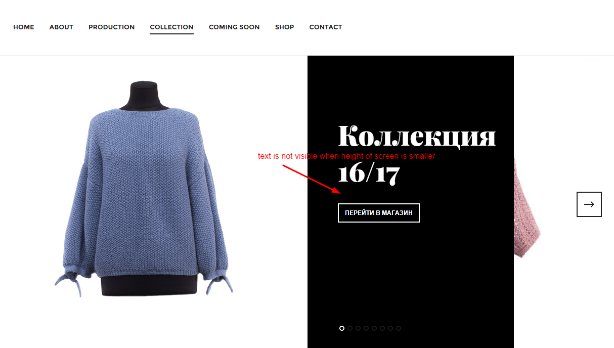
My height is not enough for displaying second text after title in this module (photo).

 natali.klochan
Friend
natali.klochan
- Join date:
- August 2016
- Posts:
- 107
- Downloads:
- 677
- Uploads:
- 59
- Thanks:
- 3
- Thanked:
- 3 times in 2 posts
September 23, 2016 at 9:13 am #970474This moment very important for my work.
Because my future buyers often is watching my site on the phone and I need that collection and coming soon pages is visible on the smartphone is good (with foto).
This module very like to me and I want that it working in all device is good.
Thanks for understanding.Saguaros Moderator
Saguaros
- Join date:
- September 2014
- Posts:
- 31405
- Downloads:
- 237
- Uploads:
- 471
- Thanks:
- 845
- Thanked:
- 5346 times in 4964 posts
September 26, 2016 at 4:53 am #970889You can use this css rule:
@media (max-height: 768px) {
 .style-2.block-slideshow .slideshow-content .block-intro {
    display: block !important;
 }
}
natali.klochan
Friend
natali.klochan
- Join date:
- August 2016
- Posts:
- 107
- Downloads:
- 677
- Uploads:
- 59
- Thanks:
- 3
- Thanked:
- 3 times in 2 posts
September 26, 2016 at 2:15 pm #971089Great thanks.
It works..AuthorPostsViewing 6 posts - 1 through 6 (of 6 total)This topic contains 6 replies, has 2 voices, and was last updated by
Saguaros 8 years, 3 months ago.
The topic ‘Displaying horizontal page style on the phone’ is closed to new replies.
Jump to forum


