-
AuthorPosts
-
Benjamin Falcon Friend
Benjamin Falcon
- Join date:
- September 2014
- Posts:
- 74
- Downloads:
- 0
- Uploads:
- 20
- Thanks:
- 20
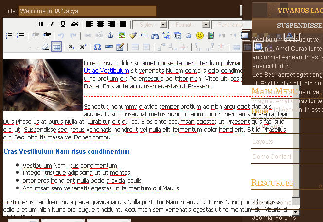
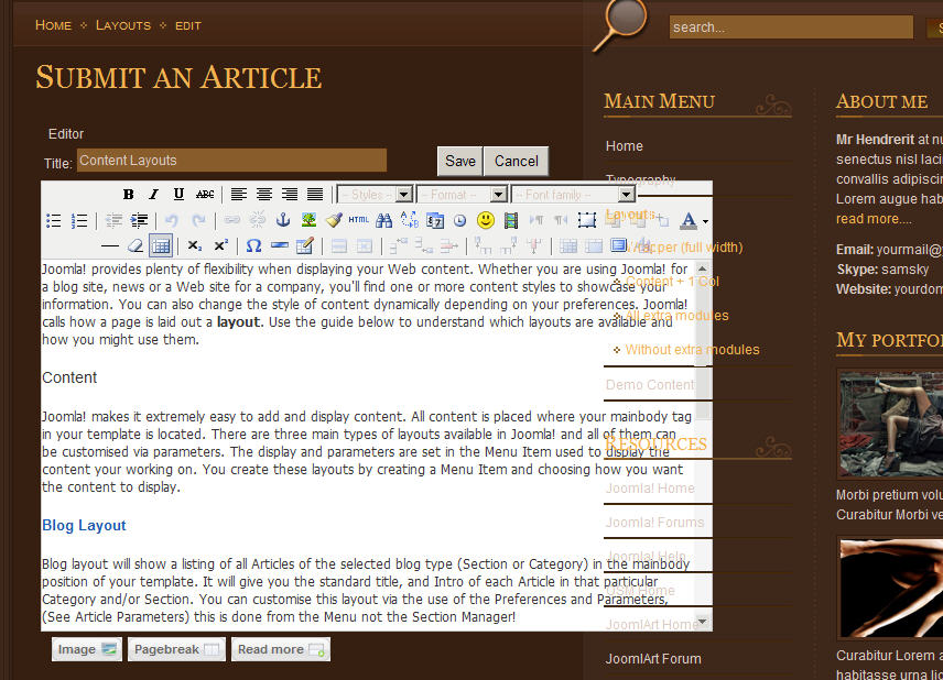
September 7, 2008 at 4:17 am #133056When you go into an article to edit it, the menu overlaps into the editor.
Please go into an article (edit mode) and see what I mean. The problem will appear when the Left and Right module areas are used.
Thank you
2792
Here is another screen shot:
2750
-
Benjamin Falcon Friend
Benjamin Falcon
- Join date:
- September 2014
- Posts:
- 74
- Downloads:
- 0
- Uploads:
- 20
- Thanks:
- 20
September 11, 2008 at 3:11 pm #270101Is this problem happening to anyone else? Please note that the problem happens in both IE and Firefox.
cybatek Friend
cybatek
- Join date:
- August 2007
- Posts:
- 38
- Downloads:
- 0
- Uploads:
- 4
- Thanked:
- 1 times in 1 posts
September 12, 2008 at 1:13 am #270147I’d imagine the solution might involve manipulating the Z-index of the editing window to a lower value than the z-index used in the col1 col2 elements.
I haven’t had a chance to play around with this template yet – so that’s just a guess. 😉
Benjamin Falcon Friend
Benjamin Falcon
- Join date:
- September 2014
- Posts:
- 74
- Downloads:
- 0
- Uploads:
- 20
- Thanks:
- 20
September 12, 2008 at 1:21 am #270148Thanks for responding, other templates automatically shift the modules further to the right when editing or adding an article.
Hopefully this problem will be addressed.
instantinlaw Friend
instantinlaw
- Join date:
- February 2007
- Posts:
- 1646
- Downloads:
- 6
- Uploads:
- 28
- Thanks:
- 68
- Thanked:
- 210 times in 62 posts
September 12, 2008 at 1:53 am #270154Try editing in the admin, or installing another editor, or use Firefox. If it is indeed a z-index problem you will never get it to work in IE. Sorry didn’t see that it also hapens in FF. Try the other suggestions.
1 user says Thank You to instantinlaw for this useful post
Benjamin Falcon Friend
Benjamin Falcon
- Join date:
- September 2014
- Posts:
- 74
- Downloads:
- 0
- Uploads:
- 20
- Thanks:
- 20
September 12, 2008 at 3:01 am #270159I sort of wish it worked right out of the box like other template do. But I do appreciate your suggestions though.
Best Regards,
Jeff
instantinlaw Friend
instantinlaw
- Join date:
- February 2007
- Posts:
- 1646
- Downloads:
- 6
- Uploads:
- 28
- Thanks:
- 68
- Thanked:
- 210 times in 62 posts
September 12, 2008 at 3:22 am #270162Hi,
You could try editing the z-index in the css for the editor to 999 or 1000. But if the containing css (the container that holds the content) is positioned relativley it will not work (in IE anyway). It will probably work on FF though if you do that. I have struggled with this template for a couple of weeks and I am not a noob. I had problems with the z-index myself. It’s not really JAs fault though. It’s Micro$oft’s fault.
If you visit my site (the photoshop one) in IE you will see that I had to shrink the logo to fit in the header, but if you visit my site in FF you will see the correct way it should display with the camera over the slideshow. But beyond that, there are issues with sef urls, and the list goes on and on. If I was you, I would just move on to one of the other templates that are not so difficult to modify.
Whatever you choose to do, good luck.missyw Friend
missyw
- Join date:
- May 2008
- Posts:
- 171
- Downloads:
- 0
- Uploads:
- 19
- Thanks:
- 98
- Thanked:
- 2 times in 1 posts
September 24, 2008 at 9:26 pm #272143<em>@directcorrespondentlender 79327 wrote:</em><blockquote>Is this problem happening to anyone else? Please note that the problem happens in both IE and Firefox.</blockquote>
Hi. Yes, I’ve had exactly the same problem when using the default editor TinyMCE 2.0. I did not want to change editors (with all the downloading and testing that is involved). By trial and error I found this rather quirky work-around:
1. It would help to reduce the width of the front-end editor window, however TinyMCE ignores your parameter setting to change the width of the display
2. You can get TinyMCE to obey your width settings IF you move the toolbar display to the bottom of the text area. A bit annoying but it works.:
– go to the plugin manager and edit the TinyMCE editor settings. Click on Advanced Parameters and change Toolbar to “Bottom” and change HTML width to 450.Hope this gets you out of trouble!
-
AuthorPosts
Viewing 9 posts - 1 through 9 (of 9 total)This topic contains 9 replies, has 5 voices, and was last updated by
mattym 16 years ago.
We moved to new unified forum. Please post all new support queries in our New Forum
Jump to forum


