-
AuthorPosts
-
January 26, 2013 at 5:03 pm #184396
Hi,
One of the things we all must like about the Mero template is the look of the “tiles” and similar theme. I have found a problem though with keeping this look consistent when dealing with page views for K2 Categories and Joomla Categories.
It appears the correct formatting was included for only category and sub category view. I’d like to figure out how to edit the K2 css to display the same way for main category listing with item view. I tried to figure this out but the K2 CSS set is extensive and I can’t figure out what code needs to be included to add this padding or margins as needed. I am positive it’s possible because Joomlart already programmed this exact style to the blocks when viewing category w/sub category block view.
I’ve attached some screen shots to demonstrate what I am talking about.
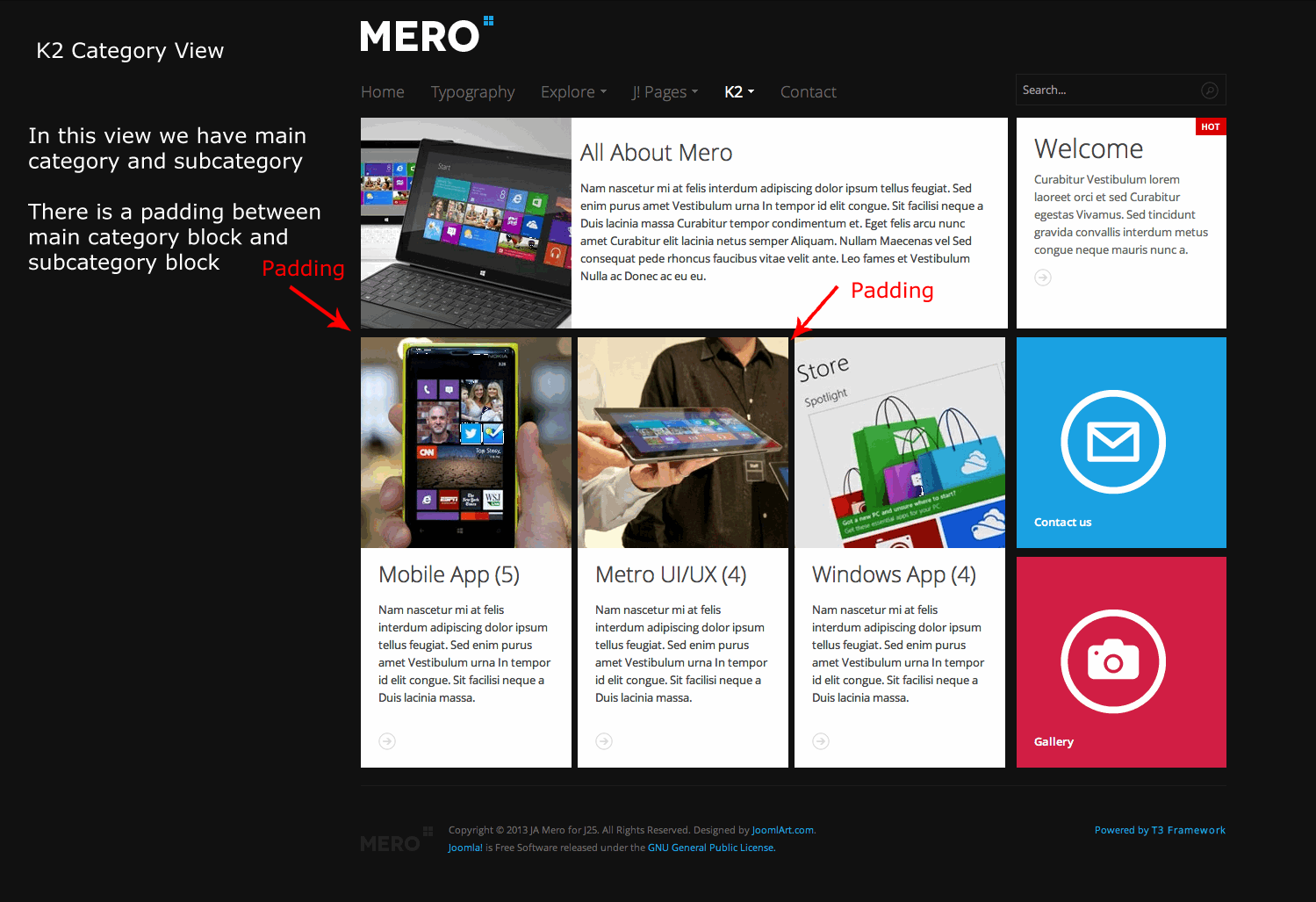
The first is how it looks in the demo, when you choose “All Categories”. This page shows main category image/text with sub category blocks below. You will note the padding between these blocks looks correct and is consistent with the design of the rest of the site. The background can be seen between blocks.
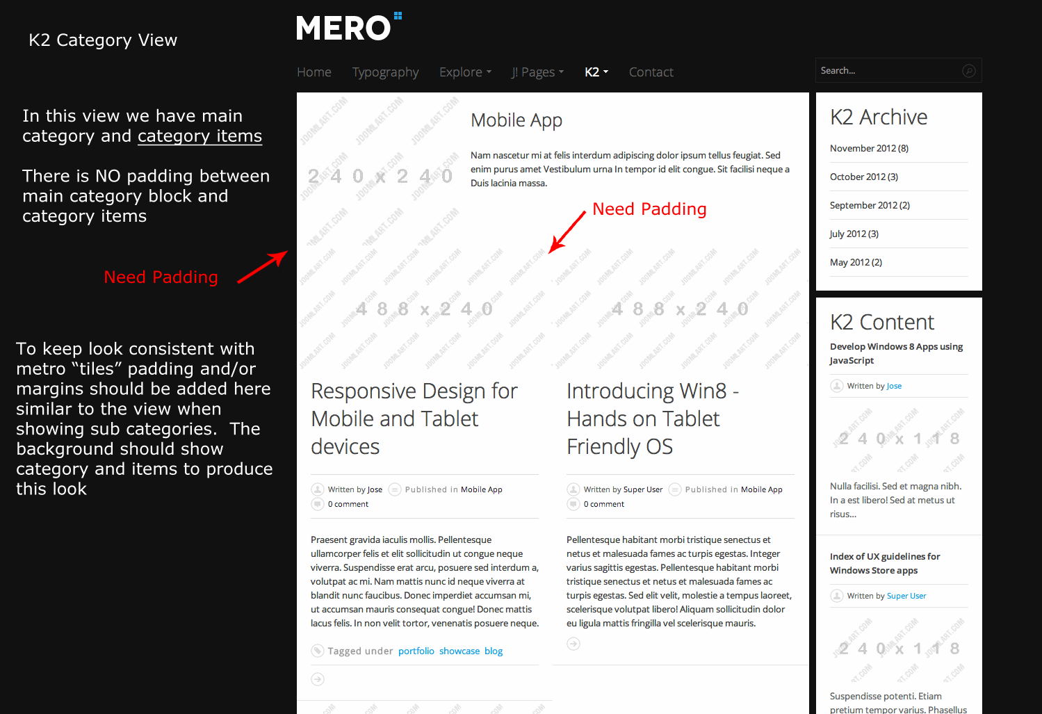
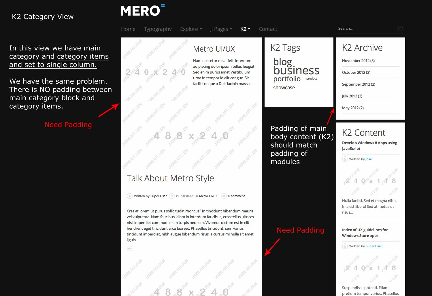
The other attachments show how the demo looks when looking at category view with all items in that category shown. You will see that the padding is missing here. You cannot see the background, all the blocks just press together. This is what I’d like help fixing.
So, the question is: What needs to be added/changed in k2.css to create this padding between blocks in category all item view?
I have also noticed this same thing happens in default Joomla category blog view, but we can deal with that in another post.
Looking for some help here and my guess is I’m not alone in noticing this!
Thank you! 🙂

Luna Garden Moderator
Luna Garden
- Join date:
- July 2011
- Posts:
- 2617
- Downloads:
- 80
- Uploads:
- 96
- Thanks:
- 78
- Thanked:
- 453 times in 425 posts
January 28, 2013 at 10:01 am #481334Hello,
The page you saw with the padding is Category List: http://joomla25-templates.joomlart.com/ja_mero/k2/all-categories.html that include the padding for each Category
And the page you set for All category is All category item, it the same with Item category blog: http://joomla25-templates.joomlart.com/ja_mero/k2/all-categories/mobile-app.html
The padding of each page is different that how we define the style for it.
I did try to add the padding for each blog, but it will take a lot of time. So I think you may need a developer to help you apply the style for All category with all item view.
January 28, 2013 at 11:42 pm #481424Really? Nobody else has noticed this? Joomlart, I’d like to have a mod review and respond soon. I feel a little bit like the demo misled us on this point in the way the items display (as subcategories) but not the same way in regular item view….please help.
Luna Garden Moderator
Luna Garden
- Join date:
- July 2011
- Posts:
- 2617
- Downloads:
- 80
- Uploads:
- 96
- Thanks:
- 78
- Thanked:
- 453 times in 425 posts
January 29, 2013 at 3:06 am #481438Hello,
In K2 page, the space between blocks only available for List Category, like this link: http://joomla25-templates.joomlart.com/ja_mero/k2/all-categories.html There are 4 categories is shown: All About Mero, Mobile App, Metro UI/UX, and Window App.
And for K2 item page, subcategory view, there will be no space between block, like this link: http://joomla25-templates.joomlart.com/ja_mero/k2/all-categories/mobile-app.html (List item of Mobile App Category)
The page category all item view as you said is a list of K2 item, therefor no space between block. All the style is shown clearly on the demo, you can check it.
Hope now everything is clear for you.
January 29, 2013 at 4:53 am #481462Hello,
Thank you for the response. I understand completely what is going on. I also understand it takes time to code this CSS but basically what we have then is an unfinished template. As you can see in my screenshots, the layout of multi-column K2 item view doesn’t fit with the layout of the rest of the site. Why even start on a K2 theme if it is not going to be correct and fully usable?
You say above that this is clearly displayed in the demo but that is in fact not the case. The demo does not include a multi column K2 item view. Instead, it displays multi column K2 category view which looks correct. When viewing the demo it is fair to assume that a standard K2 multi item view would look the same way as category view. There is no reason to think anything otherwise. I am not positive for the logic of your choice to add this to category view only. To fully use K2 its important to use both category and item view and to have the layouts match. I’d suggest you add this multi-column K2 category view to the demo so people can see what it actually will look like prior to jumping in. My guess is that you will not because you agree it looks terrible and doesn’t match the theme.
Moving on, I guess I will pay a developer to finish this K2 css properly. I will post the correct code here when it is complete. This really is too bad because this is not how things used to be with Joomlart…you now release an unfinished product then tell paying members to hire a developer to finish it…. :((
Otherwise, this template is fantastic, some of your best work yet. Cheers to that.
Luna Garden Moderator
Luna Garden
- Join date:
- July 2011
- Posts:
- 2617
- Downloads:
- 80
- Uploads:
- 96
- Thanks:
- 78
- Thanked:
- 453 times in 425 posts
January 29, 2013 at 10:12 am #481505Hello,
Thanks for your words about bout JA Mero.
And yes, in K2 item list, JA Mero provide the style for one column like default settings, but for other number column, it still look nice. i have tried on the demo with 2 columns, you can check my capture here: http://easycaptures.com/fs/uploaded/529/4735607655.jpg
with the backend setting in Menu item: http://easycaptures.com/fs/uploaded/529/4534992657.pngIt only doesn’t show the space between blocks as you expected.
<blockquote> To fully use K2 its important to use both category and item view and to have the layouts match. I’d suggest you add this multi-column K2 category view to the demo so people can see what it actually will look like prior to jumping in. </blockquote>
We provide demo builder tool that give you chance to explore our products ( you can see it in demo page http://www.joomlart.com/demo/ ) from front-end to back-end.
January 29, 2013 at 3:08 pm #481540Hello,
Thanks for your continued reply and also for the screen shots. I guess my main point here is this; the beauty of this template (imho) is the live tile look that is present in almost all aspects of this site, from home page config to modules. I had hoped that this style would be consistent in all elements of the design the same way it is this style in K2 category view. I do admit, I could have used the demo builder to test first but think I have just grown accustomed to only the highest quality templates from JA and didn’t expect this style, which is again the entire basis for the template, to have been left out. That is my fault, I should not assume and should always test first.
I will have a developer help me accomplish what I want with this code. Thanks.
Luna Garden Moderator
Luna Garden
- Join date:
- July 2011
- Posts:
- 2617
- Downloads:
- 80
- Uploads:
- 96
- Thanks:
- 78
- Thanked:
- 453 times in 425 posts
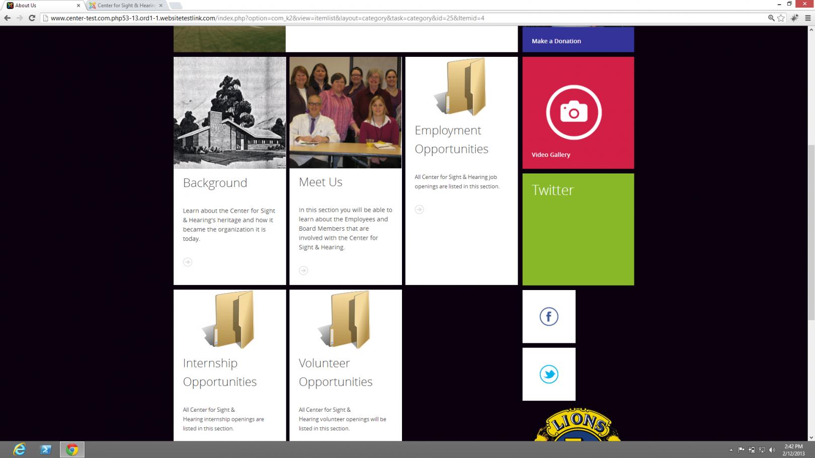
January 31, 2013 at 6:39 am #481790February 12, 2013 at 9:46 pm #483245Hi, I need help to figure out what is going on on my test site. I am using Joomla 2.5 and K2. I have a Category with Sub category. When I use the bak end to configure the category view and sub category view for the parent category I get the results shown on this image.
Now About Us is the parent category and the rest are Sub Categories of About Us I have disabled the viewing of items in this view. Notice the images next to Background and Meet Us. Notice the white line to the right of the image? How do I fix it? My images are 240 x 240 just like on the sample site. Please help me figure this out.
Thank you
Luna Garden Moderator
Luna Garden
- Join date:
- July 2011
- Posts:
- 2617
- Downloads:
- 80
- Uploads:
- 96
- Thanks:
- 78
- Thanked:
- 453 times in 425 posts
February 17, 2013 at 11:06 am #483693chomzz0s Friend
chomzz0s
- Join date:
- December 2012
- Posts:
- 8
- Downloads:
- 0
- Uploads:
- 6
- Thanks:
- 3
- Thanked:
- 1 times in 1 posts
February 21, 2013 at 7:15 am #484123hmmm i changed the pic to be 241×240 and it was fixed… i dont know whether our problems are the same 😀
February 21, 2013 at 3:15 pm #484169Thanks for your reply but changing the images to 241×240 did not have any effect I can see. Check out the image below there’s still a white line on the right side of the sub-categories. I wish this template would get some much needed attention from JoomlArt I love it but it has way too many problems it feels like it was rushed to get something out there. Come on guys fix the bugs and release an upgrade. Ok rant over 🙂 hope someone can help me figure this out. And thank you ahead of time.
I am trying to upload a new picture but it will not work I don’t know if it’s a browser issue or a forum issue. Refer to previous post to see the images the problem is the same even after changing the picture size to 241×240.
Saguaros Moderator
Saguaros
- Join date:
- September 2014
- Posts:
- 31405
- Downloads:
- 237
- Uploads:
- 471
- Thanks:
- 845
- Thanked:
- 5346 times in 4964 posts
February 22, 2013 at 10:30 am #484251Hi tonymira70,
Could you post link of page which has that issue here? Uploading image works normally, there seems to be problem with browser. Another way is that you can upload your image to imgur.com or http://easycaptures.com/ and post link of image here.
Regards
1 user says Thank You to Saguaros for this useful post
AuthorPostsViewing 13 posts - 1 through 13 (of 13 total)This topic contains 13 replies, has 5 voices, and was last updated by
Saguaros 11 years, 10 months ago.
We moved to new unified forum. Please post all new support queries in our New Forum
Jump to forum


