-
AuthorPosts
-
darengr Friend
darengr
- Join date:
- January 2012
- Posts:
- 108
- Downloads:
- 112
- Uploads:
- 30
- Thanks:
- 4
- Thanked:
- 1 times in 1 posts
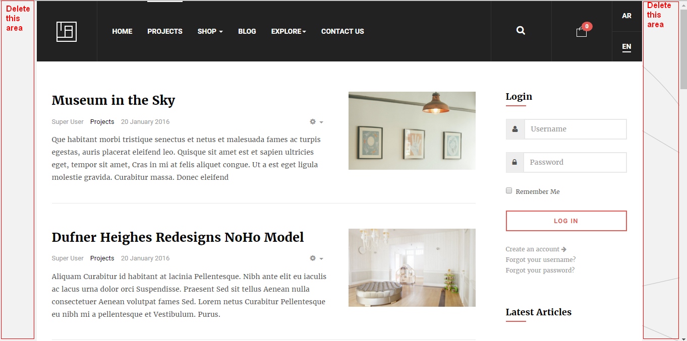
April 1, 2016 at 10:40 am #907980Hi, how easy is to get 100% width on the large resolutions (tablet, desktop), I mean to NOT have the left and right grey areas? So the site covers all the screen. thanks . darenGr
 Pankaj Sharma
Moderator
Pankaj Sharma
- Join date:
- February 2015
- Posts:
- 24589
- Downloads:
- 144
- Uploads:
- 202
- Thanks:
- 127
- Thanked:
- 4196 times in 4019 posts
April 4, 2016 at 1:10 am #908693Hi @darengr
IN bootstrap3 (T3) the width is defined in the px . you can define the specific width for different screen sizes .
Here is documentation that help u to change the template width .
Compile Less to Css after change the width .Do not forget to take full backup of site before applying the above changes .
darengr Friend
darengr
- Join date:
- January 2012
- Posts:
- 108
- Downloads:
- 112
- Uploads:
- 30
- Thanks:
- 4
- Thanked:
- 1 times in 1 posts
April 4, 2016 at 9:47 am #908907thanks,
the link you supplied says >2: For templates developed with T3 Framework version 2.x+ and integrated Bootstrap 3
Here is the list of templates developed with T3 Framework version 1.4.x- and integrated Bootstrap 2.
JA Sugite
JA Decor
JA Biz
Purity III
JA Bookshop
JA Appolio
JA Obelisk
JA University (T3 version)>so I cannot understand it. It also does not mention Elicyon.
Anyway, what I mean is automatically find the display resolution and expand to the maximum, without scrol bars. How can I achieve this?
 Pankaj Sharma
Moderator
Pankaj Sharma
- Join date:
- February 2015
- Posts:
- 24589
- Downloads:
- 144
- Uploads:
- 202
- Thanks:
- 127
- Thanked:
- 4196 times in 4019 posts
April 4, 2016 at 11:05 am #908933Hi
You need to go to same path in this template .
Path : /templates/ja_elicyon/less/variable.less Here you can see the code : http://prntscr.com/anybwm
I am afraid in bootstrap3 it does not auto width . You need set the width as given in variable.less file
Compile Less to css after changes .Do not forget to take full backup of site before applying chnages .
darengr Friend
darengr
- Join date:
- January 2012
- Posts:
- 108
- Downloads:
- 112
- Uploads:
- 30
- Thanks:
- 4
- Thanked:
- 1 times in 1 posts
April 6, 2016 at 7:56 am #909988thanks for your help, but I do not understand why the layout can not be like for example JA healthcare, so responsive full auto width. Isn’t this also with bootstrap3?
All I need is a large layout without empty columns (areas) on the sides, like in the first page of JA healthcare demo. So any image covers the whole page, from left to right, without emtpy areas. Pankaj Sharma
Moderator
Pankaj Sharma
- Join date:
- February 2015
- Posts:
- 24589
- Downloads:
- 144
- Uploads:
- 202
- Thanks:
- 127
- Thanked:
- 4196 times in 4019 posts
April 6, 2016 at 8:03 am #909994Hi
In this case you need to increase the width of the container , so it can fill more space . Use my suggestion given Here JA Healthcare also based on the BS3 . All template use different container width but not 100% . If you will check the template they are also using fixed width according to screen sizes .darengr Friend
darengr
- Join date:
- January 2012
- Posts:
- 108
- Downloads:
- 112
- Uploads:
- 30
- Thanks:
- 4
- Thanked:
- 1 times in 1 posts
April 6, 2016 at 8:54 am #910027by container, you mean the number ie
@screen-hd: 1680px
and similar, within variables.less?
And if someone has a display with 2000px resolution they will see empty columns at the 2 sides? Pankaj Sharma
Moderator
Pankaj Sharma
- Join date:
- February 2015
- Posts:
- 24589
- Downloads:
- 144
- Uploads:
- 202
- Thanks:
- 127
- Thanked:
- 4196 times in 4019 posts
April 6, 2016 at 10:34 am #910081Hi This is the maximum width for more HD display (big devices ) . This feature is added in new templates .
You use tweak in custom.css file to apply 100%width for container
/css/custom.css file (create new if it does not exist) and add new rule@media (min-width: 1600px) { .container-hd { width: 100%; } }You can see the Bootstrap 3 grid options Here
AuthorPostsViewing 8 posts - 1 through 8 (of 8 total)This topic contains 7 replies, has 2 voices, and was last updated by
 Pankaj Sharma 8 years, 7 months ago.
We moved to new unified forum. Please post all new support queries in our New Forum
Full width coverage on large display resolutions
Viewing 8 posts - 1 through 8 (of 8 total)


