-
AuthorPosts
-
romolo Friend
romolo
- Join date:
- August 2012
- Posts:
- 585
- Downloads:
- 97
- Uploads:
- 37
- Thanks:
- 79
- Thanked:
- 23 times in 11 posts
January 10, 2017 at 1:18 pm #1001281Hi,
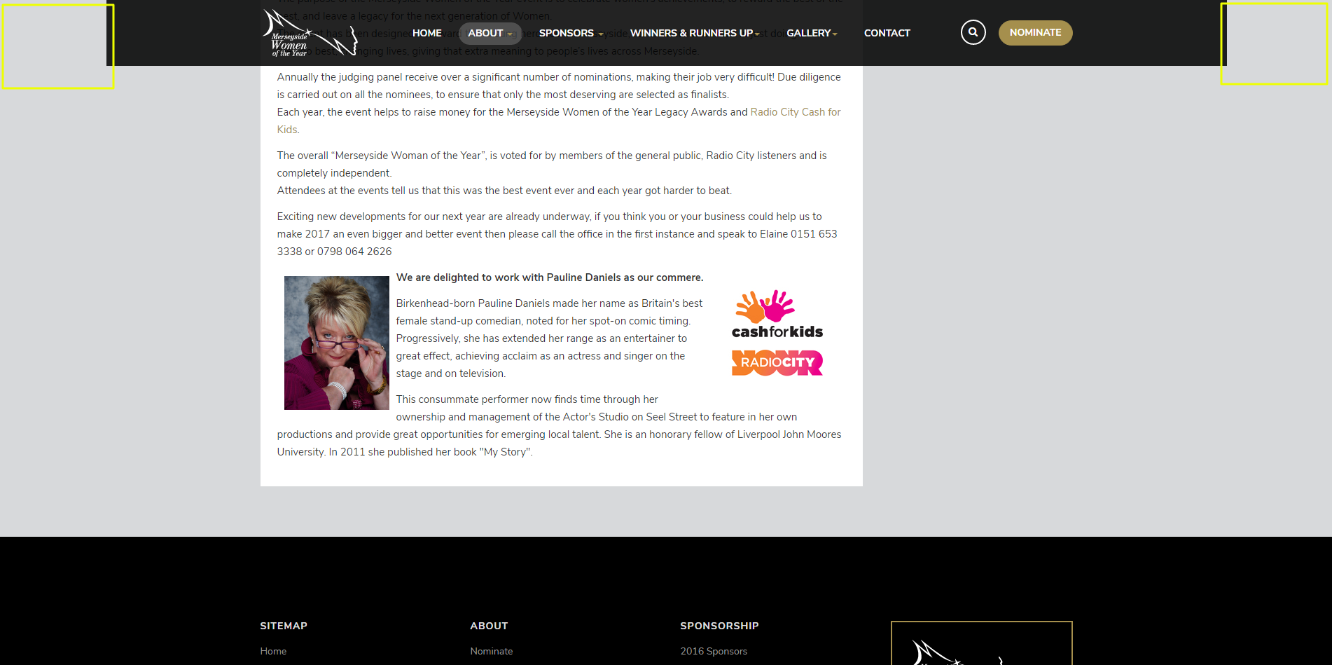
Is it possible to have the menu/navbar full width?
Please see attached screenshot – We want the menu to cover the areas highlighted in yellow.Please advise.
Thank you
 Pankaj Sharma
Moderator
Pankaj Sharma
- Join date:
- February 2015
- Posts:
- 24589
- Downloads:
- 144
- Uploads:
- 202
- Thanks:
- 127
- Thanked:
- 4196 times in 4019 posts
January 10, 2017 at 1:38 pm #1001286Hi Add below code in custom.css
.t3-header . container {width:100%}And open /tpls/feaure-intro.php and remove the main-container class.
Hope it helpsromolo Friend
romolo
- Join date:
- August 2012
- Posts:
- 585
- Downloads:
- 97
- Uploads:
- 37
- Thanks:
- 79
- Thanked:
- 23 times in 11 posts
January 10, 2017 at 2:59 pm #1001313Hi,
I’ve added the code provided into custom.css which has widened the navbar, but it hasn’t made it full width right across.
If I remove the "main-container" class from feature-intro.php it doesn’t display anything on the homepage, so I’ve put the "main-container" class back for now.
To clarify, we just want the translucent background to continue into the yellow areas highlighted in the previous screenshot.
Please advise.
Many thanks
 Pankaj Sharma
Moderator
Pankaj Sharma
- Join date:
- February 2015
- Posts:
- 24589
- Downloads:
- 144
- Uploads:
- 202
- Thanks:
- 127
- Thanked:
- 4196 times in 4019 posts
January 11, 2017 at 12:45 am #1001426Hi Becuase the main container width is defined the header does not 100% width. Try this open /tpls/features-intro.php file Find
<?php $this->loadBlock('header') ?>And paste it above the main container http://prntscr.com/du29of
Add below code in custom.css#t3-header { width: 100%; }Hope it helps.
romolo Friend
romolo
- Join date:
- August 2012
- Posts:
- 585
- Downloads:
- 97
- Uploads:
- 37
- Thanks:
- 79
- Thanked:
- 23 times in 11 posts
January 11, 2017 at 11:16 am #1001583This reply has been marked as private. Pankaj Sharma
Moderator
Pankaj Sharma
- Join date:
- February 2015
- Posts:
- 24589
- Downloads:
- 144
- Uploads:
- 202
- Thanks:
- 127
- Thanked:
- 4196 times in 4019 posts
January 12, 2017 at 2:11 am #1001711Hi
if you want to apply the same for default layout, You have to apply the same changes in the tpls/default.php
Cut the header code and paste it above main container.
Here :http://prntscr.com/duiztz
Hope it helps.romolo Friend
romolo
- Join date:
- August 2012
- Posts:
- 585
- Downloads:
- 97
- Uploads:
- 37
- Thanks:
- 79
- Thanked:
- 23 times in 11 posts
January 12, 2017 at 9:22 am #1001782Thanks @pankaj,
This has made the navbar full width on the other pages.
I’ve added the following code to custom.css
#t3-header {
    padding-left: 110px;
    padding-right: 110px;
}
Which makes the header display well when viewing on a full size desktop monitor, but not so well when it’s resized down to tablet or mobile view.
Is it possible to add some a line for "@media max-width:" ?
Thanks
 Pankaj Sharma
Moderator
Pankaj Sharma
- Join date:
- February 2015
- Posts:
- 24589
- Downloads:
- 144
- Uploads:
- 202
- Thanks:
- 127
- Thanked:
- 4196 times in 4019 posts
January 12, 2017 at 9:26 am #1001784Hi
Use below code to add media query@media (min-width:992px){ #t3-header { padding-left: 110px; padding-right: 110px; }}This work till screen size is 992px.
Regardsromolo Friend
romolo
- Join date:
- August 2012
- Posts:
- 585
- Downloads:
- 97
- Uploads:
- 37
- Thanks:
- 79
- Thanked:
- 23 times in 11 posts
January 13, 2017 at 11:43 am #1002092This reply has been marked as private. Pankaj Sharma
Moderator
Pankaj Sharma
- Join date:
- February 2015
- Posts:
- 24589
- Downloads:
- 144
- Uploads:
- 202
- Thanks:
- 127
- Thanked:
- 4196 times in 4019 posts
January 13, 2017 at 3:36 pm #1002124Hi
Its becuaase of this code in custom.css file#t3-header { width: 100%; padding-left: 160px; padding-right: 160px; }You have to apply same code on this.
@media(min-width:992px){ #t3-header { width: 100%; padding-left: 160px; padding-right: 160px; }}AuthorPostsViewing 10 posts - 1 through 10 (of 10 total)This topic contains 9 replies, has 2 voices, and was last updated by
 Pankaj Sharma 7 years, 11 months ago.
We moved to new unified forum. Please post all new support queries in our New Forum
Full width menu/navbar?
Viewing 10 posts - 1 through 10 (of 10 total)


