-
AuthorPosts
-
 woluweb
Friend
woluweb
- Join date:
- October 2012
- Posts:
- 196
- Downloads:
- 18
- Uploads:
- 69
- Thanks:
- 68
- Thanked:
- 31 times in 3 posts
June 19, 2014 at 10:53 am #198980Hi,
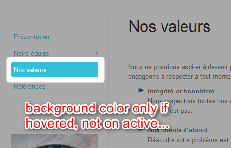
I was trying to highlight the active menu item in Menu Module (well, the side Menu Module in fact, not the main MegaMenu).
I had spotted these lines, and indeed if I change the background color, it works if I *hover* a menu item.
I tried to add
.nav .open > a:active,
to have the same background on the active menu item, but it doesn’t work.What have I missed ?
TxsMarc
.nav .open > a,

.nav .open > a:hover,

.nav .open > a:focus {

  color: #ffffff

  background: #33bed9

}
 Pankaj Sharma
Moderator
Pankaj Sharma
- Join date:
- February 2015
- Posts:
- 24589
- Downloads:
- 144
- Uploads:
- 202
- Thanks:
- 127
- Thanked:
- 4196 times in 4019 posts
June 19, 2014 at 2:16 pm #539513Can you share your working site url , so that we can assist you in a better way:cool:
 woluweb
Friend
woluweb
- Join date:
- October 2012
- Posts:
- 196
- Downloads:
- 18
- Uploads:
- 69
- Thanks:
- 68
- Thanked:
- 31 times in 3 posts
June 19, 2014 at 2:26 pm #539517Sure !
Sorry I didn’t think of it when I posted my msg 🙂Here it is :
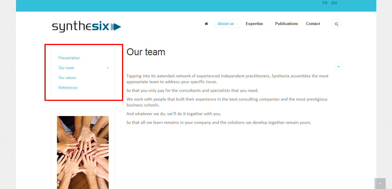
http://synthesix.com/en/about-us/team
I speak of lateral-left-menu. On the page I am linking to “Our Team” should have some coloured background to show that it is the one being active.
Yours,
Marc
 Pankaj Sharma
Moderator
Pankaj Sharma
- Join date:
- February 2015
- Posts:
- 24589
- Downloads:
- 144
- Uploads:
- 202
- Thanks:
- 127
- Thanked:
- 4196 times in 4019 posts
June 19, 2014 at 2:34 pm #539518HI
as per the screenshot you added in your first postThere is already white color .
>>
is it solved by you?
 woluweb
Friend
woluweb
- Join date:
- October 2012
- Posts:
- 196
- Downloads:
- 18
- Uploads:
- 69
- Thanks:
- 68
- Thanked:
- 31 times in 3 posts
June 19, 2014 at 3:11 pm #539534Hi,
No, it is not solved :
– when inactive, they have white background : OK
– when hovered, they get blue background : OK
– but wat I would like to have is that the *active* menu has also coloured background, and not the white background…Txs for your help already 🙂
Marc
 Pankaj Sharma
Moderator
Pankaj Sharma
- Join date:
- February 2015
- Posts:
- 24589
- Downloads:
- 144
- Uploads:
- 202
- Thanks:
- 127
- Thanked:
- 4196 times in 4019 posts
 woluweb
Friend
woluweb
- Join date:
- October 2012
- Posts:
- 196
- Downloads:
- 18
- Uploads:
- 69
- Thanks:
- 68
- Thanked:
- 31 times in 3 posts
June 20, 2014 at 2:39 pm #539664Txs again for trying 🙂
I was full o fhope, but unluckily, it does not work
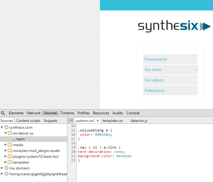
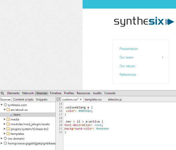
Or more precisely, it would work for a:link for example
.nav > li > a:link {
text-decoration: none;
background-color: #eeeeee
}but not for a:active
.nav > li > a:active {

text-decoration: none;

background-color: #eeeeee

}See for yourself in the Console of your browser, you can directly play in the custom.css file for example.
-
 Pankaj Sharma
Moderator
Pankaj Sharma
- Join date:
- February 2015
- Posts:
- 24589
- Downloads:
- 144
- Uploads:
- 202
- Thanks:
- 127
- Thanked:
- 4196 times in 4019 posts
 woluweb
Friend
woluweb
- Join date:
- October 2012
- Posts:
- 196
- Downloads:
- 18
- Uploads:
- 69
- Thanks:
- 68
- Thanked:
- 31 times in 3 posts
June 20, 2014 at 9:30 pm #539698Hi !
We’re almost there 🙂
The background color of active menu is indeed changed with
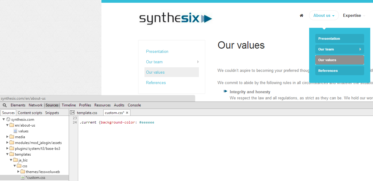
.current {background-color: #eeeeee}But still there is two side effects :
1. the main menu also takes that background menu
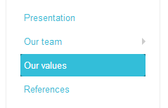
2. but also, there is a little problem of overlapping background colours because of the round corner (see screenshot). And that is not neatDo you see how to make it apply for example only on the side menu with our custom.css file ?
txs
 Pankaj Sharma
Moderator
Pankaj Sharma
- Join date:
- February 2015
- Posts:
- 24589
- Downloads:
- 144
- Uploads:
- 202
- Thanks:
- 127
- Thanked:
- 4196 times in 4019 posts
 woluweb
Friend
woluweb
- Join date:
- October 2012
- Posts:
- 196
- Downloads:
- 18
- Uploads:
- 69
- Thanks:
- 68
- Thanked:
- 31 times in 3 posts
June 21, 2014 at 6:35 am #539716Hi,
Very good trick to change the color, picking the one for the main menu 🙂
Visually, it solves the problem for the main menu.But for the lateral menu, you now see in the round-corners the overlap of background colors.
I can live with that, but isn’t there a cleaner way to give our background color to the active menu item without messing up with the original color of the template ?
txs,
M
 woluweb
Friend
woluweb
- Join date:
- October 2012
- Posts:
- 196
- Downloads:
- 18
- Uploads:
- 69
- Thanks:
- 68
- Thanked:
- 31 times in 3 posts
June 21, 2014 at 7:18 am #539717Hi again,
Here is the solution I found based on a mix of all your post 🙂
Doing this, the change only applies to lateral menu. And if I keep a colour which is very light, then the “round corner” overlap is less visible and can be ignored…/* change background color of selected menu item in lateral menu */
.nav > li.current {
background-color: #eee
}
/* next line would work but also apply on main menu
.current {background-color: #1F7282} */Txs again for all your feedback !
Marc
 Pankaj Sharma
Moderator
Pankaj Sharma
- Join date:
- February 2015
- Posts:
- 24589
- Downloads:
- 144
- Uploads:
- 202
- Thanks:
- 127
- Thanked:
- 4196 times in 4019 posts
AuthorPostsViewing 13 posts - 1 through 13 (of 13 total)This topic contains 13 replies, has 2 voices, and was last updated by
 Pankaj Sharma 10 years, 6 months ago.
We moved to new unified forum. Please post all new support queries in our New Forum
Jump to forum
give different layout to active link in side menu (by default, only hovered link)
Viewing 13 posts - 1 through 13 (of 13 total)


