-
AuthorPosts
-
smitheringale Friend
smitheringale
- Join date:
- December 2009
- Posts:
- 236
- Downloads:
- 0
- Uploads:
- 0
- Thanks:
- 63
- Thanked:
- 44 times in 18 posts
April 29, 2010 at 12:57 pm #150737Hello 🙂
I am trying to achieve the following with the ja lime template: –
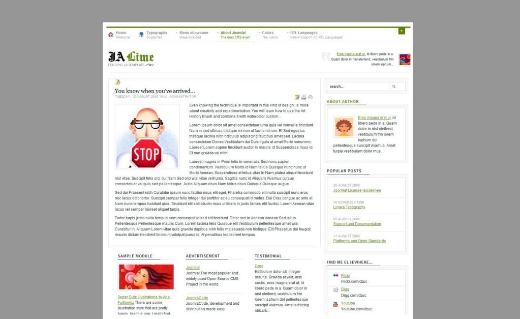
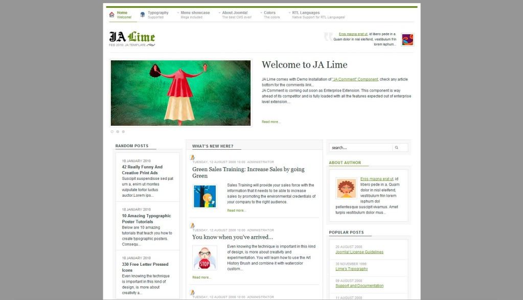
- grey background
- white border, margin or padding around site
I’ve attached a picture to help you understand how I would like this to look.
Please can you help me with this.
FYI: I have already centred the site using the suggestion of tihnc in another thread.

smitheringale Friend
smitheringale
- Join date:
- December 2009
- Posts:
- 236
- Downloads:
- 0
- Uploads:
- 0
- Thanks:
- 63
- Thanked:
- 44 times in 18 posts
April 29, 2010 at 1:30 pm #342069I have achieved a lot of what I would like to achieve by making some small changes to the css
In layout.css, I have put the following (my changes or additions are shown in bold: –
.main {

width: 980px;

max-width: 1200px;

margin: 0 auto;

position: relative;

}
In template.css, I have put
#ja-wrapper {

overflow: hidden;

width:1000px;

margin-right:auto;

margin-left:auto;

margin-top:10px;

margin-bottom:10px;

background-color:#ffffff;

padding:10px;

}
Then in template.css I have done this: –
body#bd

{

background: #949494;

color: #333;

}
Now, two questions.
Firstly, what does this bit of css do – (right at the top of the template.css file). Changing it does not seem to make a lot of difference either way
body {

background: #fff;

}
Finally – how do I make the cpanel opening button come into view now that the site is not spread across the whole screen? I couldn’t see how to do this from a brief look at the css.
One more point – joomlart templates are produced by experienced professionals and as such can be somewhat complicated.
I’m referring to browser hacks and php code which might need to be changed as well to make this look work in most browsers and for most people. Is there anything else that I need to do?
And this is what my changes have achieved thus far…

smitheringale Friend
smitheringale
- Join date:
- December 2009
- Posts:
- 236
- Downloads:
- 0
- Uploads:
- 0
- Thanks:
- 63
- Thanked:
- 44 times in 18 posts
April 29, 2010 at 1:54 pm #342073Finally,
It was so simple to move the cpanel switcher into view by changing some more css in the template.css file.
Changing the position from the right to 15px has moved the switcher 15px from the right of my new web layout.
The only reason I am going to the trouble of putting this information here is so that it might help someone now or in the future. I hope it helps someone. 🙂
.ja-cpanel-switcher {

	position: absolute;

	right: 15px;

	bottom: -10px;

	color: #858585;

	width: 22px;

	height: 22px;

	text-decoration: none;

	font-size: 95%;

	font-weight: bold;

text-indent: -5000px; -
AuthorPosts
This topic contains 3 replies, has 1 voice, and was last updated by smitheringale 14 years, 8 months ago.
We moved to new unified forum. Please post all new support queries in our New Forum

