-
AuthorPosts
-
clrmedia Friend
clrmedia
- Join date:
- October 2007
- Posts:
- 102
- Downloads:
- 18
- Uploads:
- 8
- Thanks:
- 17
- Thanked:
- 11 times in 1 posts
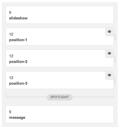
January 12, 2013 at 5:39 pm #183903How can I hide the slideshow for the Mobile view? I want to retain the slideshow in the other views.
It would be great if Joomlart were to provide a toggle in the layout panel for the slideshow as was done for Positions 1, 2 and 3, as shown below.
clrmedia Friend
clrmedia
- Join date:
- October 2007
- Posts:
- 102
- Downloads:
- 18
- Uploads:
- 8
- Thanks:
- 17
- Thanked:
- 11 times in 1 posts
January 12, 2013 at 6:52 pm #479499The site is http://tinyurl.com/bs5ogkb. As you shrink the width, the slideshow remains visible at all times.
Even removing the gap between the slideshow and “Book Your Tee Time” would help, although the slideshow is bandwidth heavy and not really relevant to mobile device users.
Saguaros Moderator
Saguaros
- Join date:
- September 2014
- Posts:
- 31405
- Downloads:
- 237
- Uploads:
- 471
- Thanks:
- 845
- Thanked:
- 5346 times in 4964 posts
January 15, 2013 at 10:08 am #479824Hi,
You can use media jquery to apply css rule to specific screen resolution of different devices.
Open file: templatesja_merocsscustom.css and add this css code:
 @media (max-width: 767px) {

	.ja-slideshow {

		display: none;

	}

}
you can change max-width to your appropriate screen resolution.
Hope this helps.
2 users say Thank You to Saguaros for this useful post
clrmedia Friend
clrmedia
- Join date:
- October 2007
- Posts:
- 102
- Downloads:
- 18
- Uploads:
- 8
- Thanks:
- 17
- Thanked:
- 11 times in 1 posts
January 17, 2013 at 6:27 pm #480220Excellent idea. I cannot get the following code to work in custom.css unless I remove the @media component. Any idea as to what I am doing wrong?
  @media (max-width: 480px){

	.ja-ss-items,

	.ja-ss-item .animate .curr .active {

    	display: none;

	}

	.ja-slideshow {

		display: none;

	}

}
clrmedia Friend
clrmedia
- Join date:
- October 2007
- Posts:
- 102
- Downloads:
- 18
- Uploads:
- 8
- Thanks:
- 17
- Thanked:
- 11 times in 1 posts
January 17, 2013 at 8:33 pm #480234The following works! Thank you Sagusros for pointing me in the right direction.
@media (min-width: 480px) {

	.ja-ss-items,

	.ja-ss-item .animate .curr .active {

    	display: none !important;

	}

	.ja-slideshow {

		display: none !important;

	}

}
clrmedia Friend
clrmedia
- Join date:
- October 2007
- Posts:
- 102
- Downloads:
- 18
- Uploads:
- 8
- Thanks:
- 17
- Thanked:
- 11 times in 1 posts
February 16, 2013 at 3:05 pm #483654Sorry. Just looked at my code above, which should use max-width as Saguaros stated above.
  @media (max-width: 490px) {

	.ja-ss-items,

	.ja-ss-item .animate .curr .active {

    	display: none !important;

	}

	.ja-slideshow {

		display: none !important;

	}

}
1 user says Thank You to clrmedia for this useful post
vicentebelmonte Friend
vicentebelmonte
- Join date:
- November 2007
- Posts:
- 24
- Downloads:
- 0
- Uploads:
- 8
- Thanks:
- 12
- Thanked:
- 2 times in 1 posts
April 3, 2013 at 7:38 am #488679It works, Thanks a lot!!!
AuthorPostsViewing 7 posts - 1 through 7 (of 7 total)This topic contains 7 replies, has 3 voices, and was last updated by
vicentebelmonte 11 years, 8 months ago.
We moved to new unified forum. Please post all new support queries in our New Forum
Hide Slideshow for iPhone
Viewing 7 posts - 1 through 7 (of 7 total)


