Tagged: home slideshow countdown
-
AuthorPosts
-
February 23, 2016 at 3:03 am #888873
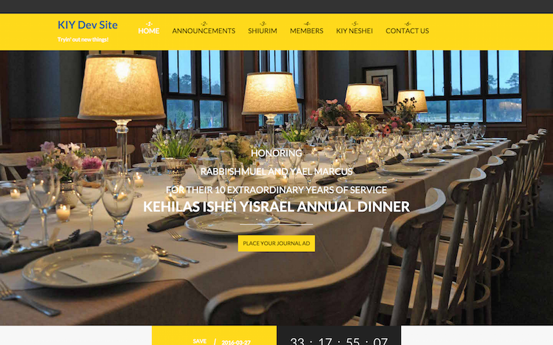
I’m trying to configure the home page in my Joomla instance to sort of look like the demo site. I need the slideshow, countdown clock, features intro, and equivalent of the "Our Specialty" section (but not the store, events, and stories just yet).
To start, I made a clone of the production Joomla instance into a subdirectory and cloned the MySQL tables with a different prefix, installed the JA Charity template, ACM module and other supporting modules specified by the documentation.
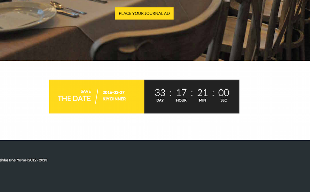
So far, I have created a template style based on the "default" layout. I was able to configure the slideshow and countdown. The slideshow looks fine; however, the countdown appears below the slideshow, not inside and flush with the bottom edge. When doing this with a template style based on "home-1", like the sample home page tutorial uses, there are huge gaps between each of these two modules. I was also not able to figure out how to get the features intro and Our Specialty to look right. Can you please log in to my Joomla instance and configure the home page to the above requirements?
Thanks,
Michael

 Ninja Lead
Moderator
Ninja Lead
- Join date:
- November 2014
- Posts:
- 16064
- Downloads:
- 310
- Uploads:
- 2864
- Thanks:
- 341
- Thanked:
- 3854 times in 3563 posts
February 24, 2016 at 3:34 am #889507Hi,
You can find my answer to the problem on your site
- The logo of your site is very big and the header top menu is not good, you can change the dimension of your logo is small as the top header or you can use this way to fix the top header is align center of the menu
Create templates/ja_charity/css/custom.css file and add new rule
.navbar-default { margin-top: 55px !important; }- Another problem with countdown module, you can add the CSS style below into custom.css file to fix this problem
@media screen and (min-width: 992px) {
    .home .section-inner .acm-countdown {
        position: absolute !important;
        right: 0px !important;
        left: 0px !important;
        bottom: 0px !important;
    }
}
Hope it helps
Regards
March 2, 2016 at 1:05 am #893189Both of these tweaks worked for the desktop view; thanks for your help with that. On mobile, the countdown clock now covers the link in the slideshow, but I suspect we won’t be getting as much mobile traffic, so it can be left as-is.
 Ninja Lead
Moderator
Ninja Lead
- Join date:
- November 2014
- Posts:
- 16064
- Downloads:
- 310
- Uploads:
- 2864
- Thanks:
- 341
- Thanked:
- 3854 times in 3563 posts
March 2, 2016 at 7:16 am #893301Try to use my solution below to run on mobile layout.
- Open templates/ja_charity/css/custom.css file
- Add this css rule:
@media (max-width: 767px) { .owl-carousel .item .slider-content { padding: 0px !important; } .owl-carousel .item .slider-content .item-title { padding-bottom: 10px !important; margin-bottom: 10px !important; } }AuthorPostsViewing 4 posts - 1 through 4 (of 4 total)This topic contains 3 replies, has 2 voices, and was last updated by
 Ninja Lead 8 years, 8 months ago.
We moved to new unified forum. Please post all new support queries in our New Forum
Jump to forum


