-
AuthorPosts
-
July 21, 2016 at 7:32 pm #952123
I’m hoping you can help with a little css help. I would like banners in the content-mast-bottom position to be displayed horizontally vs vertically.
I have a series of 5 small square banners that I would like to display side by side, horizontally instead of vertically.
I changed:
.t3-content-mast-bottom .banneritem {
padding: 40px;
}To:
.t3-content-mast-bottom .banneritem {
float: left; padding: 40px;
}That lined up the banners horizontally, but it also pushed them down into the footer area.
pavit Moderator
pavit
- Join date:
- September 2007
- Posts:
- 15749
- Downloads:
- 199
- Uploads:
- 2274
- Thanks:
- 417
- Thanked:
- 4028 times in 3778 posts
July 21, 2016 at 9:10 pm #952142Hi
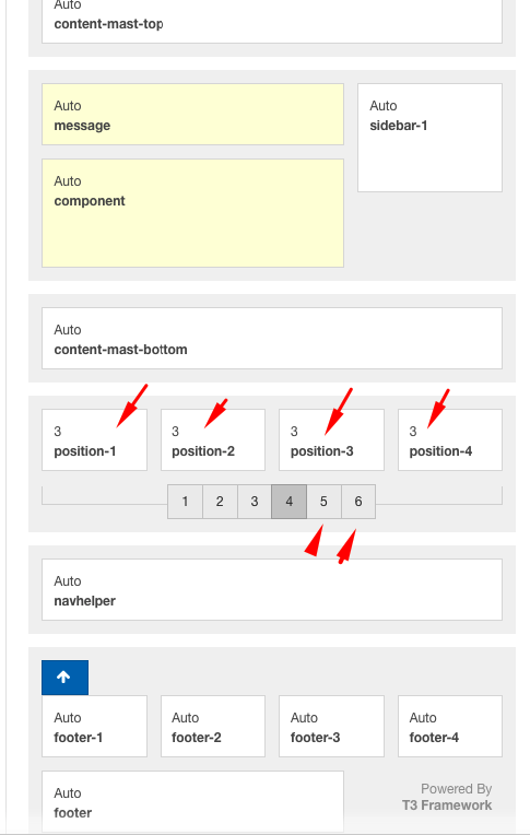
My suggestion is to add a spotlight block just below the content-mast-bottom , so you can easily manage your banners instead to add a css override that may cause problems on mobile layouts
To add a new spotlight block to your default layout edit this file/templates/ja_moviemax/tpls/default-php and add the spotlight-1 block as showed below
      <?php $this->loadBlock('header') ?>
      <?php $this->loadBlock('slideshow') ?>
      <?php $this->loadBlock('content-mast-top') ?>
      <?php $this->loadBlock('mainbody') ?>
      <?php $this->loadBlock('content-mast-bottom') ?>
      <?php $this->loadBlock('spotlight-1') ?>
      <?php $this->loadBlock('navhelper') ?>
      <?php $this->loadBlock('footer') ?>
See resulted layout below
AuthorPostsViewing 2 posts - 1 through 2 (of 2 total)This topic contains 1 reply, has 2 voices, and was last updated by
pavit 8 years, 4 months ago.
We moved to new unified forum. Please post all new support queries in our New Forum
Horizontal banner layout.
Viewing 2 posts - 1 through 2 (of 2 total)


