-
AuthorPosts
-
sobe Friend
sobe
- Join date:
- June 2010
- Posts:
- 249
- Downloads:
- 13
- Uploads:
- 20
- Thanks:
- 32
- Thanked:
- 4 times in 1 posts
July 5, 2016 at 1:04 am #946778Specifically, how does one add the music-block "Listings/Latest News/Artist" to the spa-homepage?
It seems the module location for the block ("music-sl-1") does not automatically function in the spa-site.
 Pankaj Sharma
Moderator
Pankaj Sharma
- Join date:
- February 2015
- Posts:
- 24589
- Downloads:
- 144
- Uploads:
- 202
- Thanks:
- 127
- Thanked:
- 4196 times in 4019 posts
July 5, 2016 at 1:34 am #946795Hi
All template style have different positions .
You can try to use the same position that are present in the spa . For example : span-home
This will give the same view . Also check the "music-sl-1 position is custom position that is loaded by the acm module .sobe Friend
sobe
- Join date:
- June 2010
- Posts:
- 249
- Downloads:
- 13
- Uploads:
- 20
- Thanks:
- 32
- Thanked:
- 4 times in 1 posts
July 5, 2016 at 2:25 am #946814Hi Pankaj,
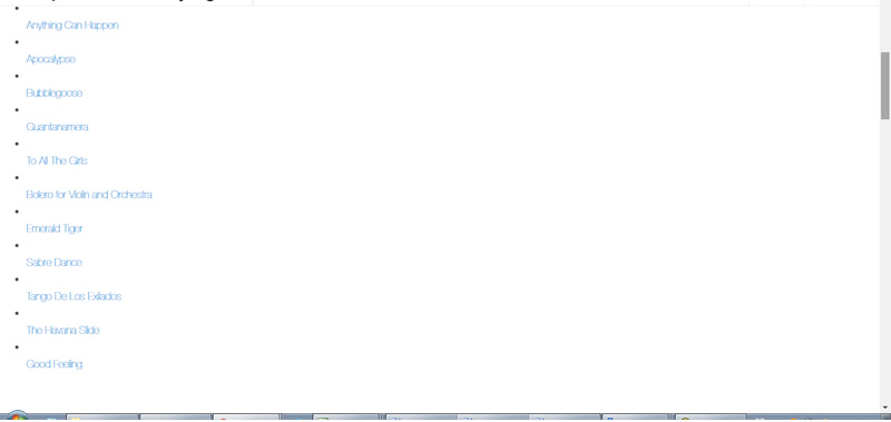
Thanks for your suggestion, but are you sure that’s the right solution?I used "spa-home" as a position for the Listings-module, but it resulted in an unrecognizable bullet-point list (see attached image).
Plus, I don’t understand your last sentence:
Also check the "music-sl-1 position is custom position that is loaded by the acm module .
This module isn’t ACM, it’s Custom.
 Pankaj Sharma
Moderator
Pankaj Sharma
- Join date:
- February 2015
- Posts:
- 24589
- Downloads:
- 144
- Uploads:
- 202
- Thanks:
- 127
- Thanked:
- 4196 times in 4019 posts
July 5, 2016 at 2:58 am #946827Hi
These 3 modules in the Uber music site loads under the acm blocks .- Create a module ACM type : spotlight
- Add your 3 custom module position name in it .
- Then publish 3 module on these 3 custom positions .
- Then Publish the spotlight module on spa-home .
sobe Friend
sobe
- Join date:
- June 2010
- Posts:
- 249
- Downloads:
- 13
- Uploads:
- 20
- Thanks:
- 32
- Thanked:
- 4 times in 1 posts
July 13, 2016 at 9:37 am #949579Thank you Pankaj, that’s very helpful instructions.
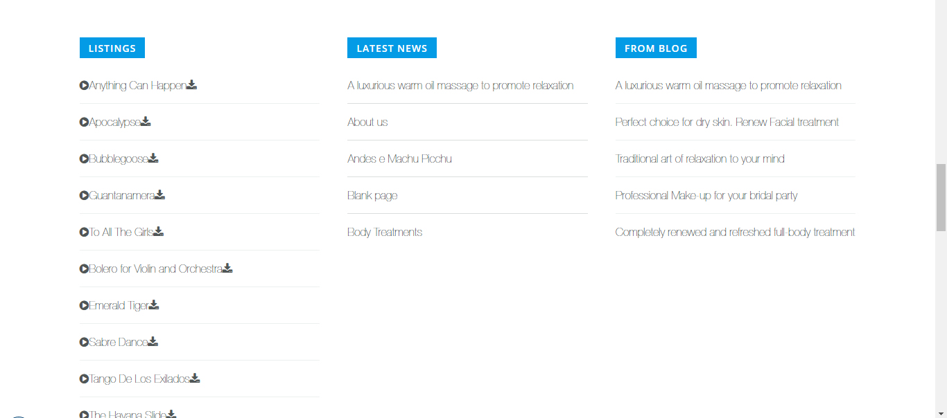
Unfortunately, there’s two issues that comes up: (*see attached image)
1) The "Listings" content is improperly spaced, with everything crammed together to the left
2) There’s no small images showing next to the titles of "Latest News" and "From Blog"
 Pankaj Sharma
Moderator
Pankaj Sharma
- Join date:
- February 2015
- Posts:
- 24589
- Downloads:
- 144
- Uploads:
- 202
- Thanks:
- 127
- Thanked:
- 4196 times in 4019 posts
July 13, 2016 at 10:14 am #949619Hi
You can give me you can give me site super user details via Private reply . I will check it .sobe Friend
sobe
- Join date:
- June 2010
- Posts:
- 249
- Downloads:
- 13
- Uploads:
- 20
- Thanks:
- 32
- Thanked:
- 4 times in 1 posts
July 14, 2016 at 11:11 am #950136This reply has been marked as private. Pankaj Sharma
Moderator
Pankaj Sharma
- Join date:
- February 2015
- Posts:
- 24589
- Downloads:
- 144
- Uploads:
- 202
- Thanks:
- 127
- Thanked:
- 4196 times in 4019 posts
July 15, 2016 at 4:29 am #950309Hi
I added the code below used for Listing module in demo<ul class="list-music"> <li class="clearfix"><a href="#"><i class="fa fa-play-circle"></i>Anything Can Happen</a><a href="#" class="download"><i class="fa fa-download"></i></a></li> <li class="clearfix"><a href="#"><i class="fa fa-play-circle"></i>Apocalypse</a><a href="#" class="download"><i class="fa fa-download"></i></a></li> <li class="clearfix"><a href="#"><i class="fa fa-play-circle"></i>Bubblegoose</a><a href="#" class="download"><i class="fa fa-download"></i></a></li> <li class="clearfix"><a href="#"><i class="fa fa-play-circle"></i>Guantanamera</a><a href="#" class="download"><i class="fa fa-download"></i></a></li> <li class="clearfix"><a href="#"><i class="fa fa-play-circle"></i>To All The Girls</a><a href="#" class="download"><i class="fa fa-download"></i></a></li> <li class="clearfix"><a href="#"><i class="fa fa-play-circle"></i>Bolero for Violin and Orchestra</a><a href="#" class="download"><i class="fa fa-download"></i></a></li> <li class="clearfix"><a href="#"><i class="fa fa-play-circle"></i>Emerald Tiger</a><a href="#" class="download"><i class="fa fa-download"></i></a></li> <li class="clearfix"><a href="#"><i class="fa fa-play-circle"></i>Sabre Dance</a><a href="#" class="download"><i class="fa fa-download"></i></a></li> <li class="clearfix"><a href="#"><i class="fa fa-play-circle"></i>Tango De Los Exilados</a><a href="#" class="download"><i class="fa fa-download"></i></a></li> <li class="clearfix"><a href="#"><i class="fa fa-play-circle"></i>The Havana Slide</a><a href="#" class="download"><i class="fa fa-download"></i></a></li> <li class="clearfix"><a href="#"><i class="fa fa-play-circle"></i>Good Feeling</a><a href="#" class="download"><i class="fa fa-download"></i></a></li> </ul>For featured module , its using the News as alternative layout > http://prntscr.com/bt3s0a
then add below code in custom.css file to give it same style#Mod569 .item-list-view li .item-image { border-radius: 2px; display: block; float: left; margin: 0 13px 0 0; width: 60px; }The latest module on your site Article latest type module , that has the default Joomla view .
There is no override style for this type .sobe Friend
sobe
- Join date:
- June 2010
- Posts:
- 249
- Downloads:
- 13
- Uploads:
- 20
- Thanks:
- 32
- Thanked:
- 4 times in 1 posts
July 15, 2016 at 5:57 pm #950531Thank you Pankaj.
The Featured module has been fixed, but I’m afraid your code for the Listing module did not resolve the issue. If you take a look at my site, everything is still clustered together to the left side.
Any thoughts?
 Pankaj Sharma
Moderator
Pankaj Sharma
- Join date:
- February 2015
- Posts:
- 24589
- Downloads:
- 144
- Uploads:
- 202
- Thanks:
- 127
- Thanked:
- 4196 times in 4019 posts
July 16, 2016 at 4:14 am #950601Hi
Kindly set the default editor to NONE from global config. and then add the code in custom HTML module .Click save .
Add below code in custom.css file#Mod566 .list-music li .download { float: right; } #Mod566 .list-music li > a > i { margin-right: 10px; color: #96a1a3; }Your issue will be solved .
sobe Friend
sobe
- Join date:
- June 2010
- Posts:
- 249
- Downloads:
- 13
- Uploads:
- 20
- Thanks:
- 32
- Thanked:
- 4 times in 1 posts
July 17, 2016 at 5:53 pm #950816Thanks Pankaj, that worked! Almost…
Though the icons are no longer cluttered to the left, the list and buttons look slightly different then the Music demo site. How do I get it to look exactly the same as the demo?
Including:
1) font thickness
2) play button hovers blue (not working)
3) download button transparency & hovers blue
4) spacing between list items is wider than demo Pankaj Sharma
Moderator
Pankaj Sharma
- Join date:
- February 2015
- Posts:
- 24589
- Downloads:
- 144
- Uploads:
- 202
- Thanks:
- 127
- Thanked:
- 4196 times in 4019 posts
July 18, 2016 at 2:56 am #950925Hi
Add below code in custom.css file.home-music .list-music li .download > i { margin-right: 0; color: #ecf0f1; } #Mod566 .list-music li > a:hover > i { color: #039be5; }spacing looks fine , you can give me screenshot for both version if there is any issue .
AuthorPostsViewing 12 posts - 1 through 12 (of 12 total)This topic contains 11 replies, has 2 voices, and was last updated by
 Pankaj Sharma 8 years, 5 months ago.
We moved to new unified forum. Please post all new support queries in our New Forum
Jump to forum


