-
AuthorPosts
-
infocubic Friend
infocubic
- Join date:
- September 2011
- Posts:
- 105
- Downloads:
- 71
- Uploads:
- 66
- Thanks:
- 8
- Thanked:
- 1 times in 1 posts
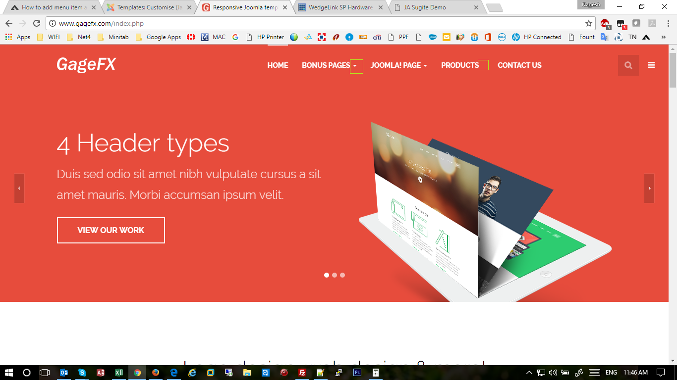
August 7, 2017 at 5:23 am #1054116Hi I have added menu item as text separator and now the style changed. Please help to fix this issue. URL:gagefx.com
 Pankaj Sharma
Moderator
Pankaj Sharma
- Join date:
- February 2015
- Posts:
- 24589
- Downloads:
- 144
- Uploads:
- 202
- Thanks:
- 127
- Thanked:
- 4196 times in 4019 posts
August 7, 2017 at 6:06 am #1054119Hi
Add this code in custom.css file to add the same style.navbar-default .navbar-nav > li > .separator:hover:before, .navbar-default .navbar-nav > li > .separator:focus:before { border-top: 2px solid #ffffff; content: ""; position: absolute; left: 0; top: -7px; width: 100%; } .nav > li > .separator {border-radius: 0; color: #ffffff; font-size: 14px; font-weight: 700; padding: 21px 0; outline: none; text-transform: uppercase;}Regards
infocubic Friend
infocubic
- Join date:
- September 2011
- Posts:
- 105
- Downloads:
- 71
- Uploads:
- 66
- Thanks:
- 8
- Thanked:
- 1 times in 1 posts
August 7, 2017 at 6:18 am #1054120 Pankaj Sharma
Moderator
Pankaj Sharma
- Join date:
- February 2015
- Posts:
- 24589
- Downloads:
- 144
- Uploads:
- 202
- Thanks:
- 127
- Thanked:
- 4196 times in 4019 posts
August 7, 2017 at 6:37 am #1054125Hi
Use this code.navbar-default .navbar-nav > .open > .separator .caret, .navbar-default .navbar-nav > .open > .separator:hover .caret, .navbar-default .navbar-nav > .open > .separator:focus .caret { border-top-color: #ffffff; border-bottom-color: #ffffff; } .navbar-default .navbar-nav .separator .caret { border-top-color: #ffffff; border-bottom-color: #ffffff; }Regards
infocubic Friend
infocubic
- Join date:
- September 2011
- Posts:
- 105
- Downloads:
- 71
- Uploads:
- 66
- Thanks:
- 8
- Thanked:
- 1 times in 1 posts
August 7, 2017 at 6:45 am #1054131Hi Pankaj,
I have added this code, still some issue is there. It is not looking as same like bonus pages menu item.
There is a space between end of the text and dropdown icon. Could you pls help me?
 Pankaj Sharma
Moderator
Pankaj Sharma
- Join date:
- February 2015
- Posts:
- 24589
- Downloads:
- 144
- Uploads:
- 202
- Thanks:
- 127
- Thanked:
- 4196 times in 4019 posts
August 8, 2017 at 1:24 am #1054324Hi
Use this code.navbar-default .navbar-nav .separator .caret { margin-left: 5px; }save and check, it would be same now.
Regards
infocubic Friend
infocubic
- Join date:
- September 2011
- Posts:
- 105
- Downloads:
- 71
- Uploads:
- 66
- Thanks:
- 8
- Thanked:
- 1 times in 1 posts
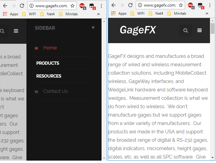
August 8, 2017 at 12:41 pm #1054488Now it is looking fine, but when I open in mobile device, I am unable browse any of the sub menu items.
Pls suggest how to fix this? Please see the screenshot for your reference.
And also the text in the mobile site left side is not looking good as no padding…
 Pankaj Sharma
Moderator
Pankaj Sharma
- Join date:
- February 2015
- Posts:
- 24589
- Downloads:
- 144
- Uploads:
- 202
- Thanks:
- 127
- Thanked:
- 4196 times in 4019 posts
August 8, 2017 at 1:26 pm #1054496Hi
Can you open a new thread for this topic. As the question is not related to topic subject.
It also helps out community.Regards
AuthorPostsViewing 8 posts - 1 through 8 (of 8 total)This topic contains 7 replies, has 2 voices, and was last updated by
 Pankaj Sharma 7 years, 5 months ago.
We moved to new unified forum. Please post all new support queries in our New Forum
Jump to forum


