-
AuthorPosts
-
December 3, 2008 at 1:03 pm #135902
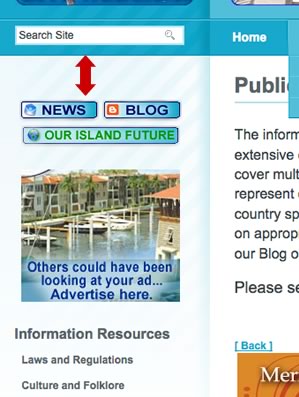
I would like to have less empty space between the spotlight area and first left menu item, in my case it is buttons.
In attached image this space is indicated with red arrow.
I tried to edit several tags in template_css.css but none of the edits gave me the result I am looking for. Please help.
Thank you in advance.
scotty Friend
scotty
- Join date:
- March 2008
- Posts:
- 2339
- Downloads:
- 0
- Uploads:
- 13
- Thanks:
- 76
- Thanked:
- 827 times in 595 posts
December 3, 2008 at 1:25 pm #281141Open template_css.css (line 1188) and find…
#ja-leftcol {

float:left;

padding-top:20px;

width:25%;

}
adjust padding-top to whatever you want.
December 4, 2008 at 12:33 am #281200I had changed this to 5px, and the original pictures shows setting at 5pix
There is no change on the fron.
Now I changed it to 0px. still no change.Any other ideas?
scotty Friend
scotty
- Join date:
- March 2008
- Posts:
- 2339
- Downloads:
- 0
- Uploads:
- 13
- Thanks:
- 76
- Thanked:
- 827 times in 595 posts
December 4, 2008 at 12:38 am #281201This isn’t an ‘idea’! This IS where the styling is controlled for that padding.
Did you clear your browser cache before checking the new settings? Go to your homepage and hold SHIFT and click Refresh.
AuthorPostsViewing 4 posts - 1 through 4 (of 4 total)This topic contains 4 replies, has 2 voices, and was last updated by
scotty 16 years ago.
We moved to new unified forum. Please post all new support queries in our New Forum
How to edit empty space/padding size in left menu?
Viewing 4 posts - 1 through 4 (of 4 total)


