-
AuthorPosts
-
September 29, 2016 at 10:30 am #972129
Hi, I have some problems with the department module, the photo and the box doesn’t look quite perfect as in the template. can you suggest the solution? it doesn’t align very well.
LM SKINCENTRE
 Ninja Lead
Moderator
Ninja Lead
- Join date:
- November 2014
- Posts:
- 16064
- Downloads:
- 310
- Uploads:
- 2864
- Thanks:
- 341
- Thanked:
- 3854 times in 3563 posts
September 30, 2016 at 8:46 am #972454Hi,
Your site requires the username/password login. You could give me that info via private reply. I will check the problem on your site
Regards
December 3, 2016 at 7:06 am #991920This reply has been marked as private.LM SKINCENTRE
 Ninja Lead
Moderator
Ninja Lead
- Join date:
- November 2014
- Posts:
- 16064
- Downloads:
- 310
- Uploads:
- 2864
- Thanks:
- 341
- Thanked:
- 3854 times in 3563 posts
December 5, 2016 at 2:00 am #992103Hi,
I fixed the both problems on your site and you can see the solution from templates/ja_medicare/css/custom.css file with the CSS style
@media  (max-width: 767px) {
    .category-module.five-columns .category-module-item {
        min-height: 270px !important;
    }
    .t3-sl-1 .t3-module {
        min-height: 430px;
    }
}
About the image under Slideshow module, you can change this image: images/joomlart/slideshow/cosmetic-treatments-guernsey21.jpg file with the dimension (width and height) is larger. Now, I see it (940px and 400px)
Regards
December 5, 2016 at 7:26 am #992168Thank you very much for your help. It looks much better now. For the make-an-appointment module, it is still overlapping with logo. How can I fix that?
And for the department module, the traditional chinese version is fixed but I can see the english and simplified chinese. do i need to do anything to fix that?
You mean I should change the slideshow module image to one that is larger than 940 x 400, right?LM SKINCENTRE
 Ninja Lead
Moderator
Ninja Lead
- Join date:
- November 2014
- Posts:
- 16064
- Downloads:
- 310
- Uploads:
- 2864
- Thanks:
- 341
- Thanked:
- 3854 times in 3563 posts
December 6, 2016 at 1:07 am #992410Hi,
make-an-appointment module and logo on mobile device are overlaps because the width on mobile device is very small. I added the CSS style below to templates/ja_medicare/css/custom.css file and you can see make-an-appointment module is disabled
.appointment-content {
    display: none;
}
About the image under Slideshow module, you need to change it to large image.
Regards
December 6, 2016 at 5:42 am #992486Thanks a lot. The modifications work well. it’s much better now.
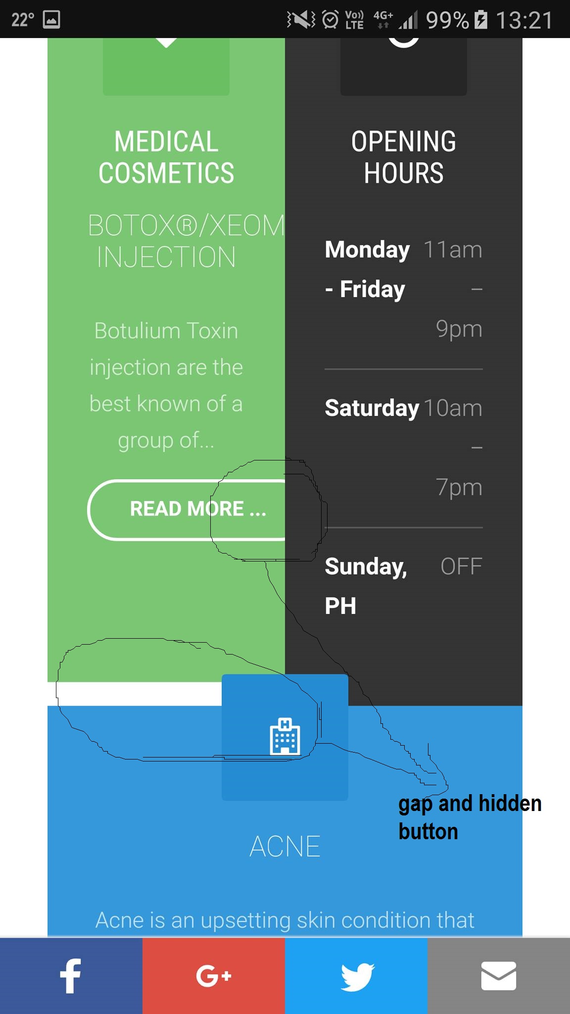
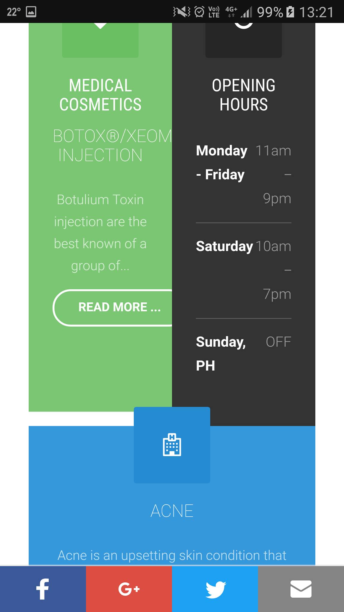
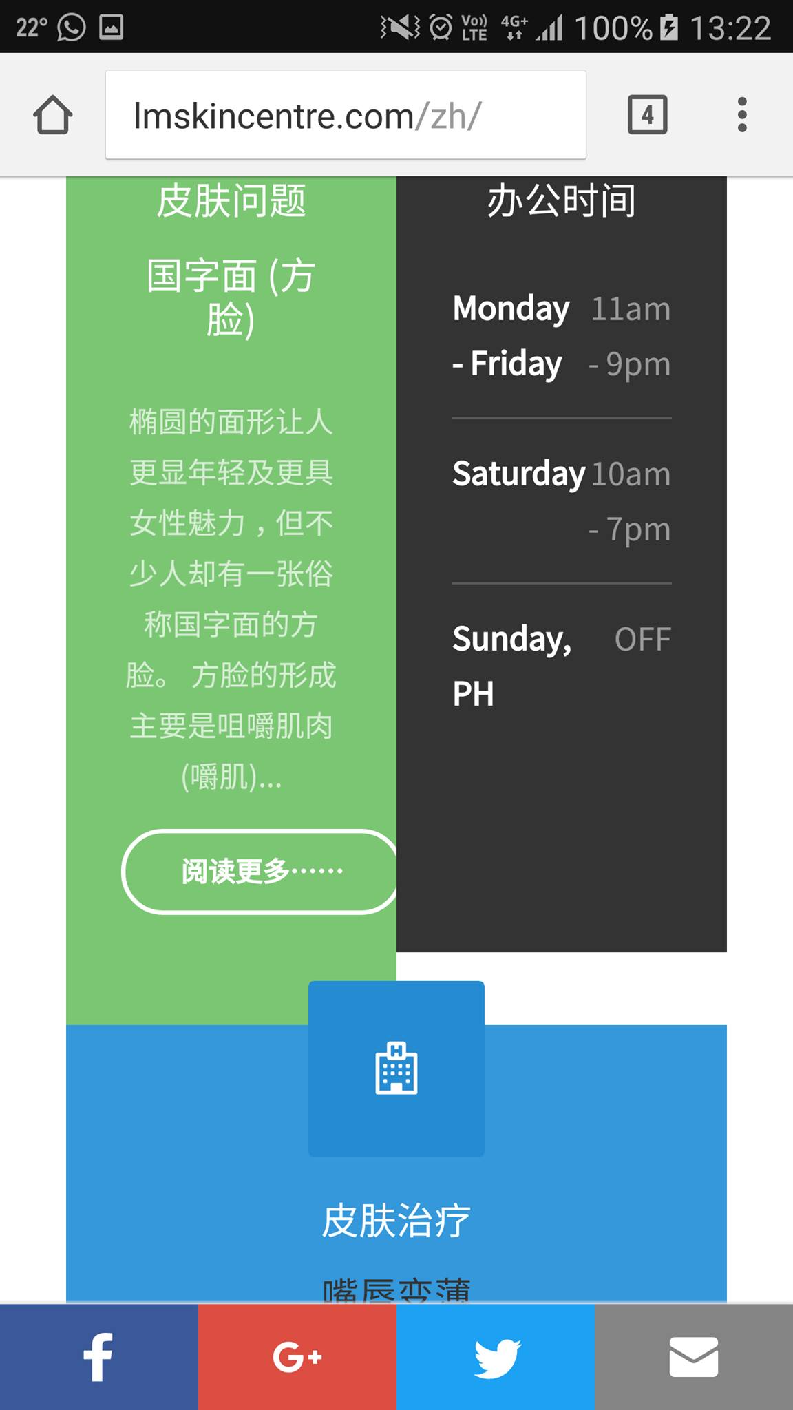
For position 1-3 modules, although the traditional chinese version looks well, the simplified chinese and english version still have a small gap between the modules (see attachments). Can you please help?
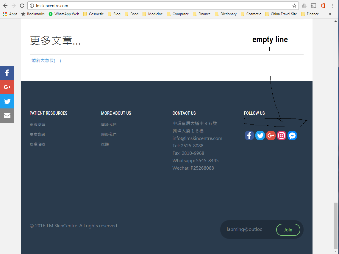
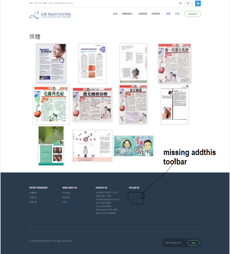
For footer 4, there is a small gap between the header and the links. I inserted the addthis extension into that position and emptied the title in addthis. Is there any method to eliminate that empty line? And also for position 4, the links disappeared in the page media (same in all languages). What is the reason for that?
 Ninja Lead
Moderator
Ninja Lead
- Join date:
- November 2014
- Posts:
- 16064
- Downloads:
- 310
- Uploads:
- 2864
- Thanks:
- 341
- Thanked:
- 3854 times in 3563 posts
December 7, 2016 at 1:07 am #992722Hi,
I fixed the problem directly on your site with the CSS style below
.ja-ss-item img {
    height: 100%;
}
and changed the configuration of Follow Us module on your site. Now you can see it’s working as well
Regards
December 7, 2016 at 9:32 am #992871Excellent! The site is nearly perfect. I mentioned about the gap between modules in position 1-3, is that fixable?
Also, the addthis toolbar is missing in media page (English, Trad Chinese and Simplified Chinese). It is the only page that it is missing. Do you know why?Appreciate a lot for your help!
-
 Ninja Lead
Moderator
Ninja Lead
- Join date:
- November 2014
- Posts:
- 16064
- Downloads:
- 310
- Uploads:
- 2864
- Thanks:
- 341
- Thanked:
- 3854 times in 3563 posts
December 8, 2016 at 2:10 am #993055Hi,
I fixed the problem https://www.joomlart.com/content/uploads/sites/4/2016/12/15387388_10154693973820135_1700164243_o-1.jpg directly on your site with the solution below
.t3-sl-1 .category-module .mod-articles-category-readmore .mod-articles-category-title {
    text-transform: capitalize;
    padding-left: 15px;
    padding-right: 15px;
}
.t3-sl-1 .t3-module {
    min-height: 455px;
}
and you can see the solution from custom.css file
About the social icon, I see it’s working fine on your site
Regards
-
AuthorPosts
Viewing 10 posts - 1 through 10 (of 10 total)This topic contains 9 replies, has 2 voices, and was last updated by
 Ninja Lead 8 years ago.
We moved to new unified forum. Please post all new support queries in our New Forum
Jump to forum
how to fix the department module
Viewing 10 posts - 1 through 10 (of 10 total)


