-
AuthorPosts
-
mediamuis Friend
mediamuis
- Join date:
- December 2006
- Posts:
- 23
- Downloads:
- 32
- Uploads:
- 5
- Thanks:
- 5
- Thanked:
- 2 times in 2 posts
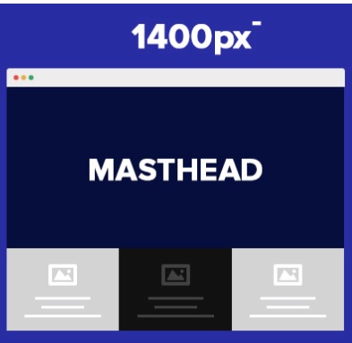
April 12, 2016 at 7:43 pm #917233Hi I’d like to force the usage of one lay-out (see attached file). The lay-out <1400px.
How can I force this.
Thanks in advance.
Mark
 Ninja Lead
Moderator
Ninja Lead
- Join date:
- November 2014
- Posts:
- 16064
- Downloads:
- 310
- Uploads:
- 2864
- Thanks:
- 341
- Thanked:
- 3854 times in 3563 posts
April 13, 2016 at 8:16 am #917406Hi,
You can force it as my tweak below
Create templates/ja_mono/css/custom.css file and add new CSS style
@media (min-width: 1399px) {
    .block-right, .block-left, .block-footer {
        width: 100% !important;
        margin-left: 0% !important;
        position: inherit !important;
    }
}
Hope it helps
Regards
rabarrig Friend
rabarrig
- Join date:
- March 2015
- Posts:
- 87
- Downloads:
- 12
- Uploads:
- 10
- Thanks:
- 16
- Thanked:
- 5 times in 2 posts
June 9, 2016 at 12:55 am #938963Hello guys,
My need is exactly the opposite: is there a way to force the big layout (1400p+) as the default one for notebook-size screens?
Thanks!!
 Ninja Lead
Moderator
Ninja Lead
- Join date:
- November 2014
- Posts:
- 16064
- Downloads:
- 310
- Uploads:
- 2864
- Thanks:
- 341
- Thanked:
- 3854 times in 3563 posts
June 9, 2016 at 3:36 am #938995@rabarrig: If you want to force the big layout to one for notebook-size screens, you can use this way
Open templates/ja_mono/css/custom.css file(create new if it does not exist) and add new CSS style
@media (min-width: 1399px) {
    .block-right, .block-left, .block-footer {
        width: 100% !important;
        margin-left: 0% !important;
        position: inherit !important;
    }
    .container {
        width: 100% !important;
    }
}
Hope it helps
rabarrig Friend
rabarrig
- Join date:
- March 2015
- Posts:
- 87
- Downloads:
- 12
- Uploads:
- 10
- Thanks:
- 16
- Thanked:
- 5 times in 2 posts
June 14, 2016 at 6:16 am #940335Thanks a lot, Ninja!
rabarrig Friend
rabarrig
- Join date:
- March 2015
- Posts:
- 87
- Downloads:
- 12
- Uploads:
- 10
- Thanks:
- 16
- Thanked:
- 5 times in 2 posts
July 2, 2016 at 12:25 am #946191Hi again, Ninja Lead,
sorry to reopen this… I thought this was working properly, but it’s not. I was confused.
Let me explain.
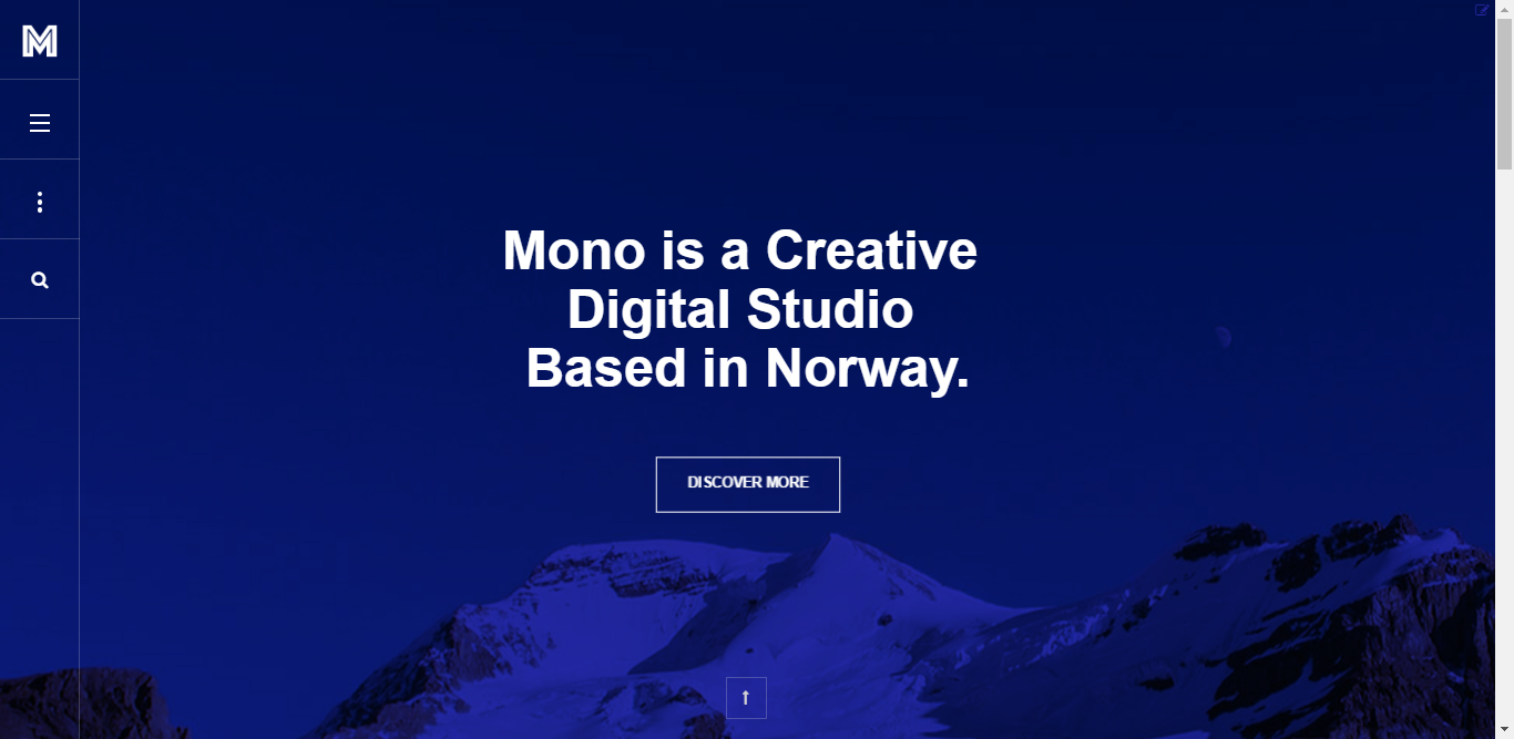
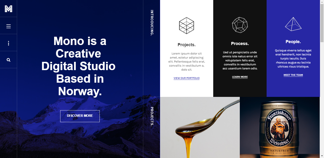
When I do the changes you propose, I see the first pic (attachment 1). What I really need to accomplish is that the view on picture 2 (attachment 2) to be the default view from 992px of width onwards.
I really hope I’m making myself clear. My english is not too good.
Thanks for your help!!
-
 Ninja Lead
Moderator
Ninja Lead
- Join date:
- November 2014
- Posts:
- 16064
- Downloads:
- 310
- Uploads:
- 2864
- Thanks:
- 341
- Thanked:
- 3854 times in 3563 posts
July 4, 2016 at 3:48 am #946466I tried to find the solution as your mentioned above but you will not able to show the layout as your expectation with the small layout (992px). I am so sorry about this.
July 11, 2016 at 10:34 am #948806Hello guys, is there a solution for what rabarrig asked? I have the same nedd, I have to make the medium layout the same as Large.
 Ninja Lead
Moderator
Ninja Lead
- Join date:
- November 2014
- Posts:
- 16064
- Downloads:
- 310
- Uploads:
- 2864
- Thanks:
- 341
- Thanked:
- 3854 times in 3563 posts
July 12, 2016 at 3:37 am #949079@zheeka: JA Mono template is a special template.
-
On big devices (bigger than 1400px), the layout is split into two main blocks, when users surf through the content with built-in navigation, new content will be displayed with smooth slide-in animation.
- On smaller screens, it’s a clean and simple design, with clever typography, big images and a lot of white spaces
My solution above only forces with the big screen and it does not adapt as your expectation.
Regards
-
AuthorPosts
Viewing 9 posts - 1 through 9 (of 9 total)This topic contains 8 replies, has 4 voices, and was last updated by
 Ninja Lead 8 years, 4 months ago.
We moved to new unified forum. Please post all new support queries in our New Forum
Jump to forum


