-
AuthorPosts
-
 Pankaj Sharma
Moderator
Pankaj Sharma
- Join date:
- February 2015
- Posts:
- 24589
- Downloads:
- 144
- Uploads:
- 202
- Thanks:
- 127
- Thanked:
- 4196 times in 4019 posts
May 16, 2017 at 1:49 am #1034301Hi
You can use A menu module and select menu in it. Now publish the menu module on head-currency or head-search position.Hope it helps.
Regards
Ch1vpH Friend
Ch1vpH
- Join date:
- February 2016
- Posts:
- 299
- Downloads:
- 21
- Uploads:
- 128
- Thanks:
- 29
- Thanked:
- 1 times in 1 posts
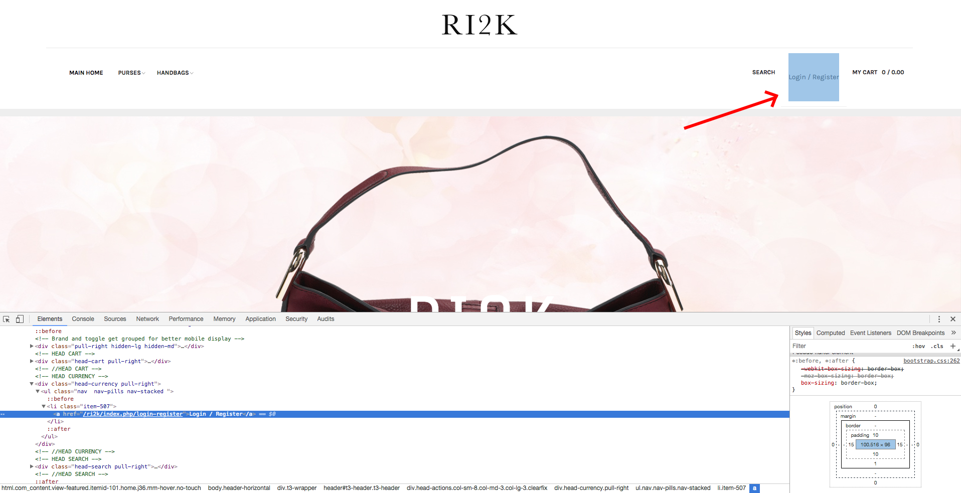
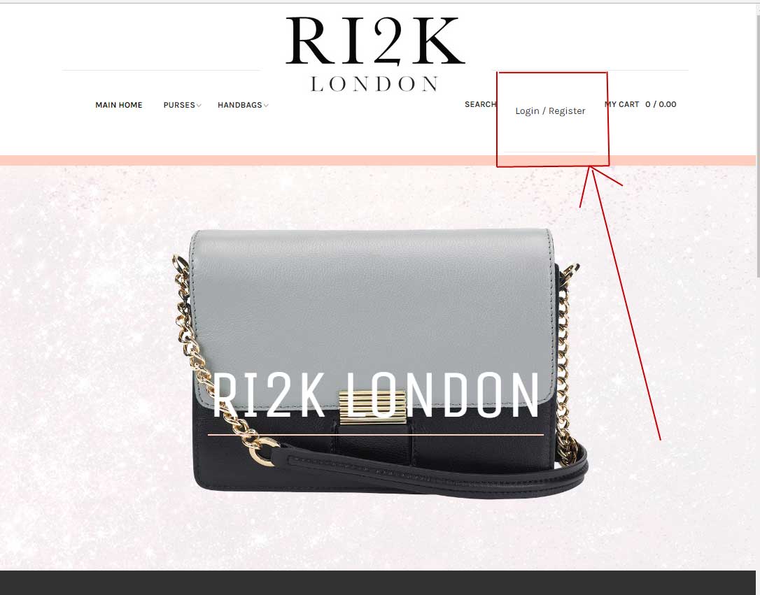
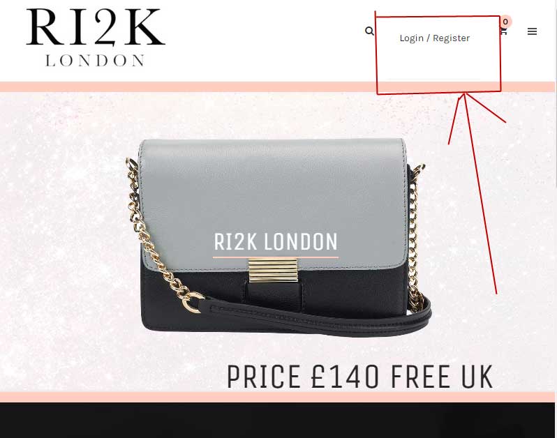
May 17, 2017 at 8:39 pm #1034857Hi, yes that did give me the option to add my login menu, but I had to remove the ‘currency’ module for it to fit inside the header – see image before I removed currency module – I may need to add this currency module back onto the site at some point…so would also need to now how to do that….
My main issue though is a problem with the padding around my new "Login’ menu which makes it out of line with the rest of the menus. I’ve tried this code but it does not remove the padding.
.t3-header-item#507 .head-currency {padding-top: 0px;}Can you also tell me how to remove this / display: block; / as the grey hover over block is to big at the moment.
Please advise
Thanks
 Pankaj Sharma
Moderator
Pankaj Sharma
- Join date:
- February 2015
- Posts:
- 24589
- Downloads:
- 144
- Uploads:
- 202
- Thanks:
- 127
- Thanked:
- 4196 times in 4019 posts
May 18, 2017 at 1:39 am #1034888Hi
You have to increase the size for the right side module position from header.php like i suggested in older posts
Set the size as given here http://prntscr.com/f93vho
Now the items in the right side are more so that they need more container size.Ch1vpH Friend
Ch1vpH
- Join date:
- February 2016
- Posts:
- 299
- Downloads:
- 21
- Uploads:
- 128
- Thanks:
- 29
- Thanked:
- 1 times in 1 posts
May 19, 2017 at 8:53 pm #1035499Ok thanks I made change as suggested in older post and it does now fit but my main issue is still the problem with the padding around my new "Login’ menu which makes it out of line with the rest of the menus. I’ve tried this code but it does not remove the padding. Can you please advise asap!
 Pankaj Sharma
Moderator
Pankaj Sharma
- Join date:
- February 2015
- Posts:
- 24589
- Downloads:
- 144
- Uploads:
- 202
- Thanks:
- 127
- Thanked:
- 4196 times in 4019 posts
May 20, 2017 at 2:31 am #1035541Hi
Add below code in custom.css file to fix this.head-currency .nav-pills > li > a { height: 96px; line-height: 96px; padding: 0 11.5px; color: #272727; font-size: 12px; font-weight: 700; text-transform: uppercase; border: 0; }Regards
Ch1vpH Friend
Ch1vpH
- Join date:
- February 2016
- Posts:
- 299
- Downloads:
- 21
- Uploads:
- 128
- Thanks:
- 29
- Thanked:
- 1 times in 1 posts
May 20, 2017 at 10:35 am #1035603Thank you so much this has be bugging me for weeks!!
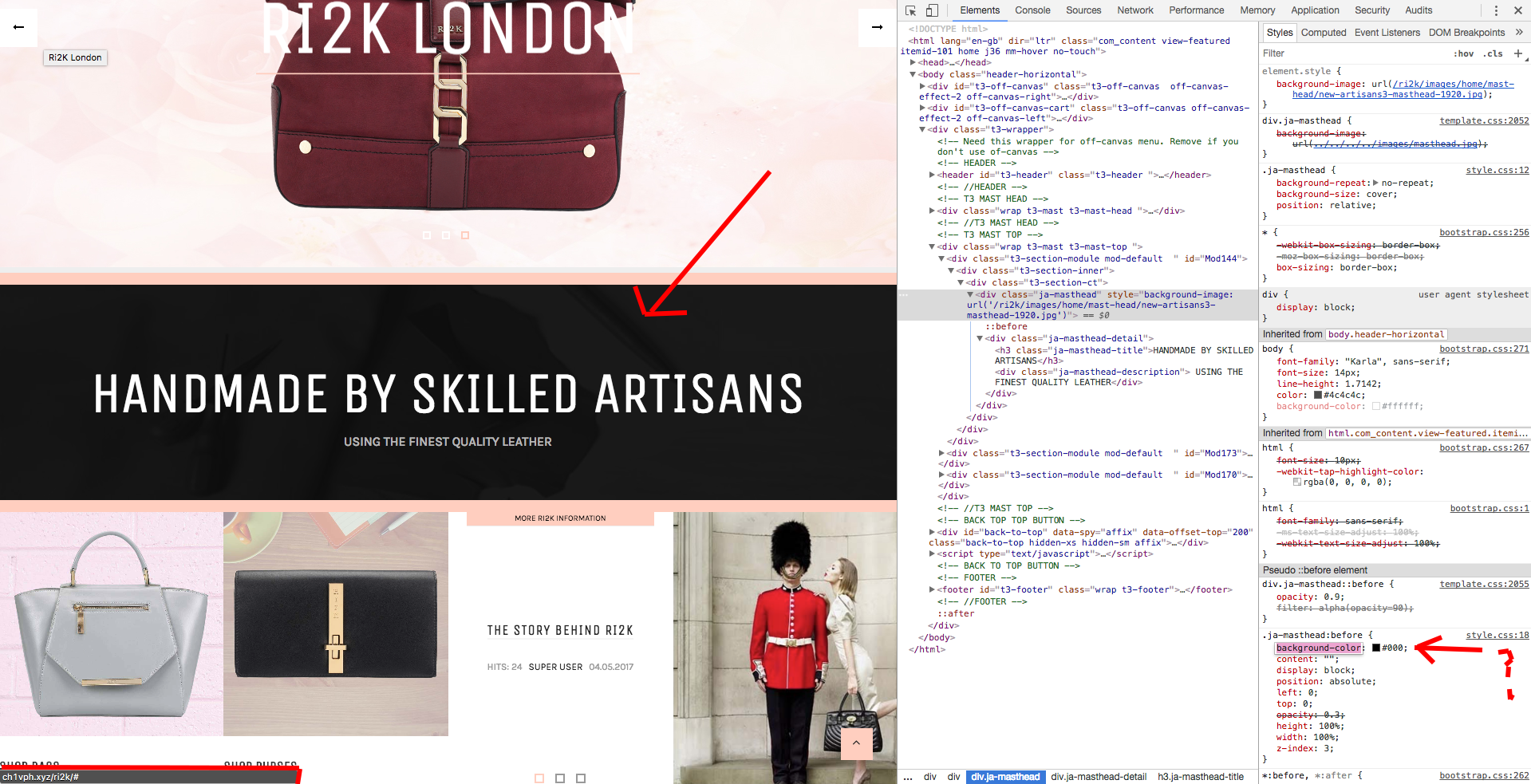
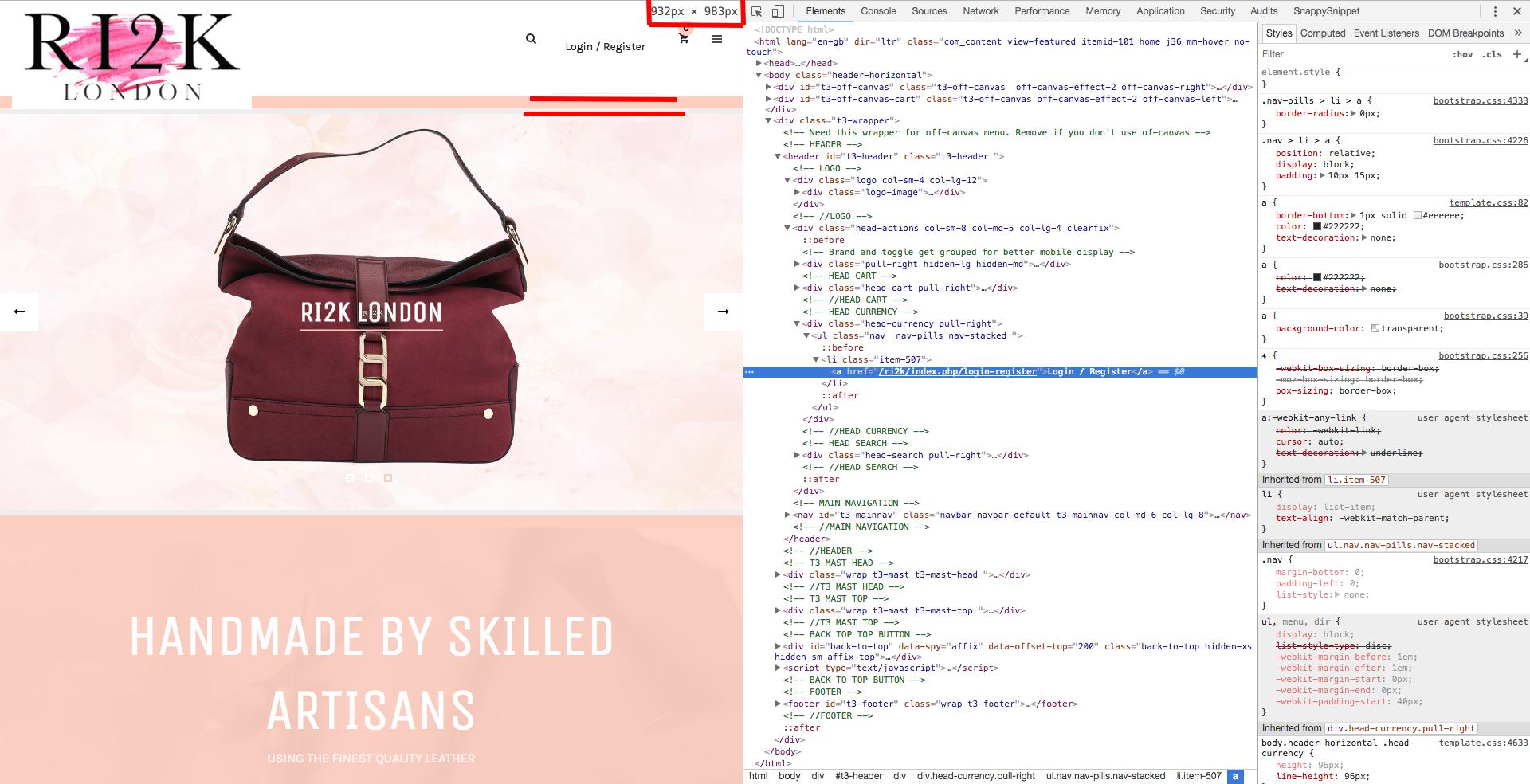
Although this similar problem I had with my menu images on small screen (you fixed yesterday) is occurring with the LOGIN MENU.
Query is when I test on a small and very small-screen it loses the above style, screenshots attached below of this problem occurring
-
 Pankaj Sharma
Moderator
Pankaj Sharma
- Join date:
- February 2015
- Posts:
- 24589
- Downloads:
- 144
- Uploads:
- 202
- Thanks:
- 127
- Thanked:
- 4196 times in 4019 posts
May 22, 2017 at 1:18 am #1035797Hi
For JA Builder issue kindly open a new thread on JA Builder forum page Here
In the screenshot, you shared its the logo that is on the navbar due to its bigger height.
If you will check in real devices it will work fine http://prntscr.com/fak8bwRegards
Ch1vpH Friend
Ch1vpH
- Join date:
- February 2016
- Posts:
- 299
- Downloads:
- 21
- Uploads:
- 128
- Thanks:
- 29
- Thanked:
- 1 times in 1 posts
May 22, 2017 at 9:04 am #1035939Hi there,
Not to sure about the JA Builder you mentioned above?? 😉
But just to confirm my query is an issue with the above code not fixing the ‘padding/font’ issue etc of my Login / Register Menu on small screens or extra small screens?
Screenshots of both attached….this is strange why is works in full screen view but not on smaller devices!
-
 Pankaj Sharma
Moderator
Pankaj Sharma
- Join date:
- February 2015
- Posts:
- 24589
- Downloads:
- 144
- Uploads:
- 202
- Thanks:
- 127
- Thanked:
- 4196 times in 4019 posts
May 22, 2017 at 9:36 am #1035961Hi
You should check the site again:)
Changes already working http://prntscr.com/fao28z
Kindly check your custom.css file to remove the media query.
see this http://prntscr.com/fao2vg
You applied Media queries so the code is only working in a large display.Regards
Ch1vpH Friend
Ch1vpH
- Join date:
- February 2016
- Posts:
- 299
- Downloads:
- 21
- Uploads:
- 128
- Thanks:
- 29
- Thanked:
- 1 times in 1 posts
May 22, 2017 at 7:39 pm #1036094Hi there, so I took that ‘media query’ out of the equation and all has been resolved…the only reason it was in the custom code as it was for my rotating owl-banner & mainly for its text size…as the code in the slideshow ‘owl’ modules style.css on it own didn’t force the change…I removed the owl banner now anyhow so all is fixed now…!
Many thanks again!!
 Pankaj Sharma
Moderator
Pankaj Sharma
- Join date:
- February 2015
- Posts:
- 24589
- Downloads:
- 144
- Uploads:
- 202
- Thanks:
- 127
- Thanked:
- 4196 times in 4019 posts
May 23, 2017 at 1:57 am #1036139You are welcome!
-
AuthorPosts
Viewing 11 posts - 1 through 11 (of 11 total)This topic contains 11 replies, has 2 voices, and was last updated by
 Pankaj Sharma 7 years, 7 months ago.
The topic ‘How to have a menu item top right’ is closed to new replies.
Jump to forum
How to have a menu item top right
Viewing 11 posts - 1 through 11 (of 11 total)


