-
AuthorPosts
-
 timtecsa
Friend
timtecsa
- Join date:
- October 2009
- Posts:
- 1382
- Downloads:
- 86
- Uploads:
- 327
- Thanks:
- 197
- Thanked:
- 132 times in 34 posts
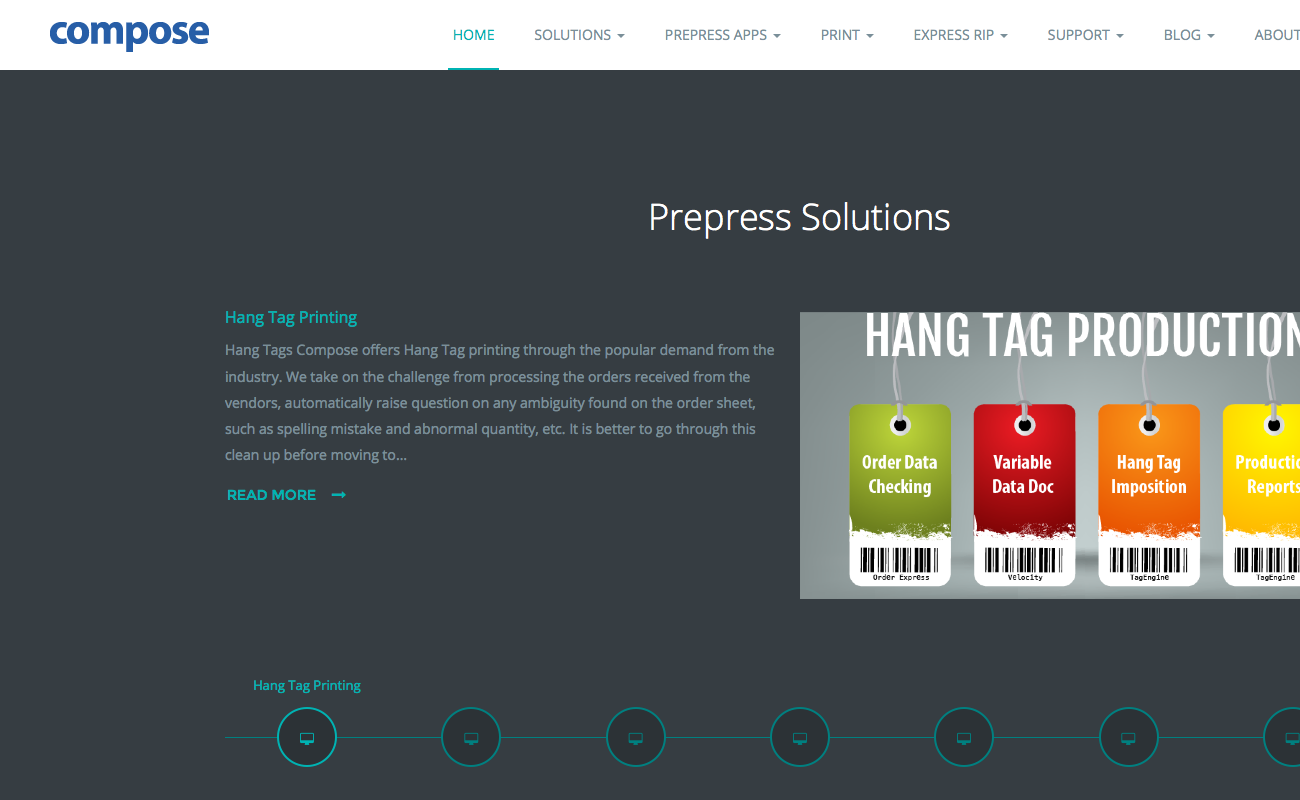
April 30, 2016 at 4:35 pm #924717On http://systems34.gpmnews.com/ the full top main menu starts to be cut off on right side at screen widths less than approximately 1600px.
On http://nuevo.gpmnews.com/ the menu remains fully visible down to 1280px wide.
What have I done to http://systems34.gpmnews.com to make such a drastic difference and how to fix it ? Both menus collapse at 1280px but http://systems34.gpmnews.com is not responsive between 1600 and 1280.
I realise that I have more main menu items but un-publishing about half of them seems to have no effect.
 Pankaj Sharma
Moderator
Pankaj Sharma
- Join date:
- February 2015
- Posts:
- 24589
- Downloads:
- 144
- Uploads:
- 202
- Thanks:
- 127
- Thanked:
- 4196 times in 4019 posts
May 3, 2016 at 5:18 am #925732Hi
Tim could you give me a screenshot and correct device width in which you are getting issue with menu items .
I do not have exact 1600px screen but i tested the site with different size
Like Here : http://prntscr.com/aznqxq
Did not found the problem in Menu items. Could u check it again and give me details with screenshots .Regards
 timtecsa
Friend
timtecsa
- Join date:
- October 2009
- Posts:
- 1382
- Downloads:
- 86
- Uploads:
- 327
- Thanks:
- 197
- Thanked:
- 132 times in 34 posts
May 3, 2016 at 12:21 pm #926072Hi Pankaj,
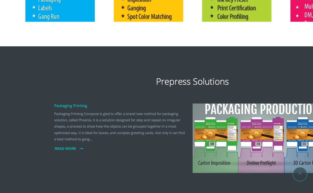
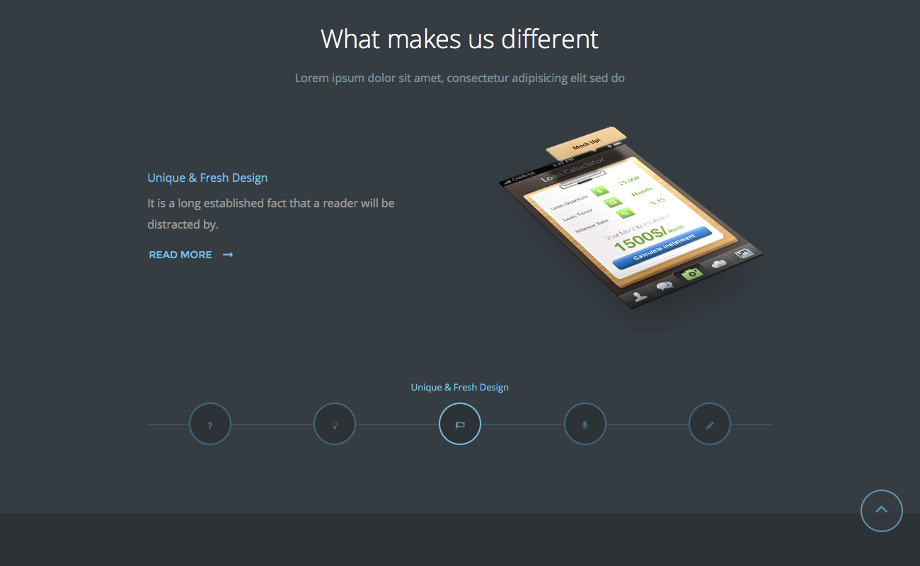
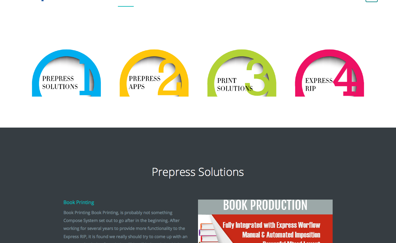
See screenshots below. One is my site with lots of menu items and the other is Joomlart nuevo demo content. My screen is a 1920 x 1200 Dell 2415 attached to an i7, 16GB DAM Mac mini. On the demo content the sliding modules shrink from 1600px down to 1280px smoothly. On my site they don’t shrink until they jump at 1280px.The screen shots are at 1300px wide. FF Responsive Design View.
-
 Pankaj Sharma
Moderator
Pankaj Sharma
- Join date:
- February 2015
- Posts:
- 24589
- Downloads:
- 144
- Uploads:
- 202
- Thanks:
- 127
- Thanked:
- 4196 times in 4019 posts
May 3, 2016 at 1:04 pm #926085This reply has been marked as private. timtecsa
Friend
timtecsa
- Join date:
- October 2009
- Posts:
- 1382
- Downloads:
- 86
- Uploads:
- 327
- Thanks:
- 197
- Thanked:
- 132 times in 34 posts
May 3, 2016 at 1:32 pm #926086In the screenshot below the Banner at the top of homepage (wrapper module in iframe set to 100% width) is disabled so all modules are now the same as on demo site. Made no difference.
 Pankaj Sharma
Moderator
Pankaj Sharma
- Join date:
- February 2015
- Posts:
- 24589
- Downloads:
- 144
- Uploads:
- 202
- Thanks:
- 127
- Thanked:
- 4196 times in 4019 posts
May 3, 2016 at 1:43 pm #926088Hi
i am getting this view when screen width is 1900px http://prntscr.com/azrk8l
No extra white space like in your screenshot
In firefox >>> http://prntscr.com/azrl8r
there is gap/white space because of the custom code added in custom.css file , that effect the container width . Remove the code and it solve this problem .1 user says Thank You to Pankaj Sharma for this useful post
 timtecsa
Friend
timtecsa
- Join date:
- October 2009
- Posts:
- 1382
- Downloads:
- 86
- Uploads:
- 327
- Thanks:
- 197
- Thanked:
- 132 times in 34 posts
May 3, 2016 at 2:20 pm #926096Well done. I’ve no idea why that custom css code was there. It looks like I need to have at least 1 fewer menu item too. 🙂
Many thanks.
P.S. Am still struggling with Wrapper auto height on homepage top module. Big white space under top banner on small screens.
 Pankaj Sharma
Moderator
Pankaj Sharma
- Join date:
- February 2015
- Posts:
- 24589
- Downloads:
- 144
- Uploads:
- 202
- Thanks:
- 127
- Thanked:
- 4196 times in 4019 posts
May 4, 2016 at 1:13 am #926239Hi
There is a fixed height in the iframe :http://prntscr.com/azzn9m
that creating the issue . Please check it . timtecsa
Friend
timtecsa
- Join date:
- October 2009
- Posts:
- 1382
- Downloads:
- 86
- Uploads:
- 327
- Thanks:
- 197
- Thanked:
- 132 times in 34 posts
May 4, 2016 at 1:33 am #926244OK, I removed it from http://systems34.gpmnews.com/administrator/index.php?option=com_modules&view=module&layout=edit&id=156 but it now defaults to 200px. And on small screens it still shows lots of unwanted whitespace below and above.
I’m wondering if wrapper auto height works if its not a Joomla article type that is being called.
 Pankaj Sharma
Moderator
Pankaj Sharma
- Join date:
- February 2015
- Posts:
- 24589
- Downloads:
- 144
- Uploads:
- 202
- Thanks:
- 127
- Thanked:
- 4196 times in 4019 posts
May 4, 2016 at 3:27 am #926305This reply has been marked as private. timtecsa
Friend
timtecsa
- Join date:
- October 2009
- Posts:
- 1382
- Downloads:
- 86
- Uploads:
- 327
- Thanks:
- 197
- Thanked:
- 132 times in 34 posts
May 4, 2016 at 10:14 am #926559This reply has been marked as private. Pankaj Sharma
Moderator
Pankaj Sharma
- Join date:
- February 2015
- Posts:
- 24589
- Downloads:
- 144
- Uploads:
- 202
- Thanks:
- 127
- Thanked:
- 4196 times in 4019 posts
May 4, 2016 at 11:24 am #926614You are welcome .
If there is something that need to be cusotmized from the core Joomla , i suggest you to post the question on Joomla forum with your script .I spent a lot of time on the site and tried hotfix for banner in mobiles .
Add below code in custom.css file to remove the extra space in mobiles .@media (max-width:468px) {#Mod158 iframe {height: auto;} #Mod158 {padding-bottom: 10px; padding-top: 10px;} }Kindly add the code in top of custom.css file .
Hope it helps .
AuthorPostsViewing 12 posts - 1 through 12 (of 12 total)This topic contains 11 replies, has 2 voices, and was last updated by
 Pankaj Sharma 8 years, 6 months ago.
We moved to new unified forum. Please post all new support queries in our New Forum
Jump to forum


