-
AuthorPosts
-
knerten Friend
knerten
- Join date:
- March 2013
- Posts:
- 80
- Downloads:
- 0
- Uploads:
- 13
- Thanks:
- 46
- Thanked:
- 1 times in 1 posts
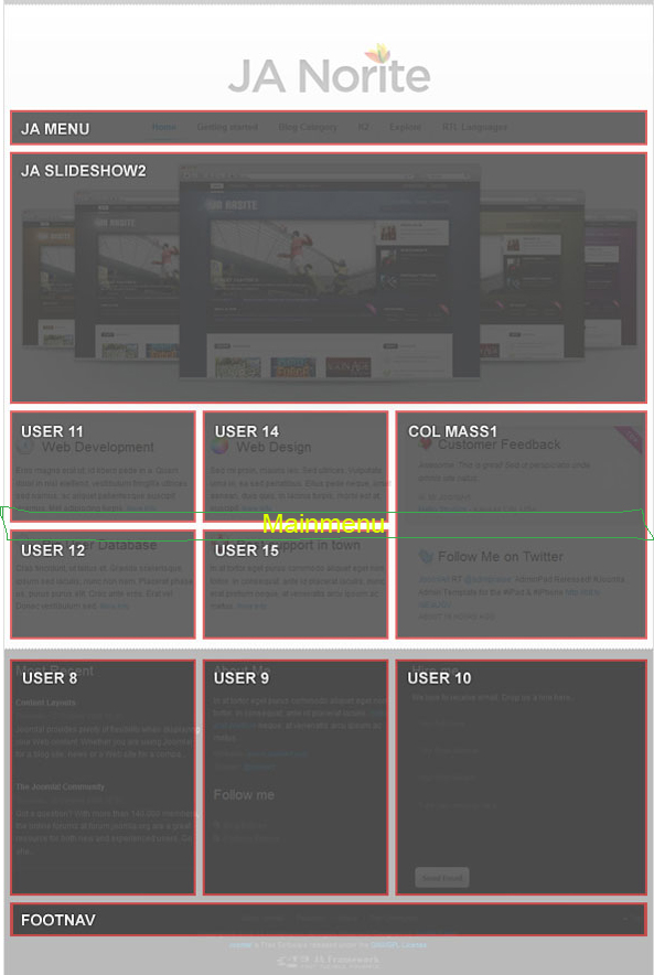
August 8, 2013 at 6:36 pm #189574Slowly my site is getting as I’d like it. The main problem now is the main menu. I’d like it underneath the module user 11 (the picture on the front page).
I got the background picture in place and now need the menu placed on the top part of the floor image (this image can I change so it comes underneath the menu, if I just get the menu in the middle of my page and not on the top).
Is this when I have to learn how to move modules? Or do I have to create a new module and place the main menu there?
Thanks 🙂
pavit Moderator
pavit
- Join date:
- September 2007
- Posts:
- 15749
- Downloads:
- 199
- Uploads:
- 2274
- Thanks:
- 417
- Thanked:
- 4028 times in 3778 posts
knerten Friend
knerten
- Join date:
- March 2013
- Posts:
- 80
- Downloads:
- 0
- Uploads:
- 13
- Thanks:
- 46
- Thanked:
- 1 times in 1 posts
August 8, 2013 at 7:57 pm #501650Strange. I found the User 11 on the module position layout in the tutorial section in Norite. And I followed some instructions in this forum to make this module and placed the picture there.
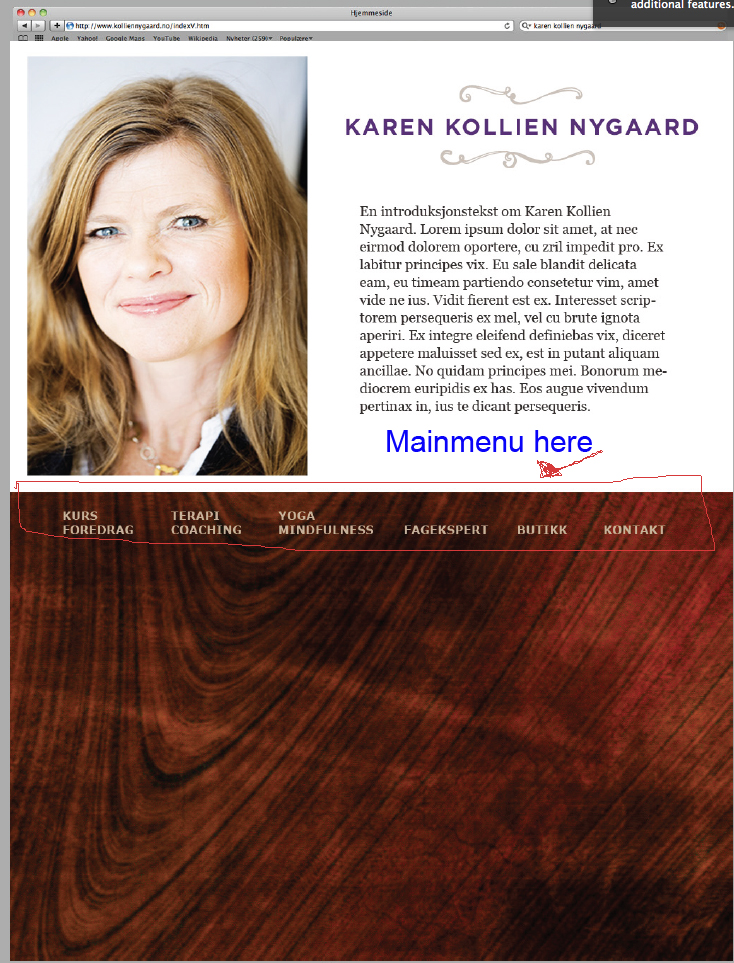
Please see the attached picture. This is of how I want the site to look in the end. Quite simple, but I’m having difficulties placing the mainmenu in the middle of the page. I’ve tried this for about a week, and read through all sorts of threads, without finding the answer.
The link to my site is: kkn.paydesign.no
I would really appreciate some tips on how to solve this problem 🙂
Thanks!
Anita
pavit Moderator
pavit
- Join date:
- September 2007
- Posts:
- 15749
- Downloads:
- 199
- Uploads:
- 2274
- Thanks:
- 417
- Thanked:
- 4028 times in 3778 posts
August 8, 2013 at 8:24 pm #501654It’s quite impossible to establish the exact position of your blocks
Could you PM me a super user temp account to your backend ?
Accessing your backend and verify directly your configuration may help to solve your problem
1 user says Thank You to pavit for this useful post
knerten Friend
knerten
- Join date:
- March 2013
- Posts:
- 80
- Downloads:
- 0
- Uploads:
- 13
- Thanks:
- 46
- Thanked:
- 1 times in 1 posts
August 8, 2013 at 8:39 pm #501660Yes off course I can 🙂
Just to try to explain here as well, I followed the attached picture and made User 11 and placed the picture there.
I’m planning to move the main menu under the picture and get rid of the whole logo on top so the page looks like the attachment in my last post.The problem for the moment is the moving of the menu.
I’ll pm you my login info.
Thank you for looking at this.
pavit Moderator
pavit
- Join date:
- September 2007
- Posts:
- 15749
- Downloads:
- 199
- Uploads:
- 2274
- Thanks:
- 417
- Thanked:
- 4028 times in 3778 posts
August 9, 2013 at 8:40 am #501740Hi
I checked your website
How is structured your layout now is impossible to obtain what you desire, a solution could be to create a new module position for the mainnav ( header position )and just below this new module position add the background as module
This because the mainnav ( header ) cannot be over the col-mass1 position
so it could be :<block> User11-user14-user15</block>
<block> your new position ( with mainnav )</block>
<block> User8-user9-user10 ( with customized brown background )</block>Hope was clear
1 user says Thank You to pavit for this useful post
knerten Friend
knerten
- Join date:
- March 2013
- Posts:
- 80
- Downloads:
- 0
- Uploads:
- 13
- Thanks:
- 46
- Thanked:
- 1 times in 1 posts
August 9, 2013 at 8:45 am #501741Thank you!
But I think you might have misunderstood me. I have placed the picture of the floor as background, not a module.
Considering I’m not using the col-mass position (am I?), won’t it be possible to place the main menu just blow user 11?The only modules I really need is user 11, user 14, mainmenu and footer. Nothing else on the whole page.
Or did you understand that I placed the floor picture as background? Does the background at all interfere with the modules?
pavit Moderator
pavit
- Join date:
- September 2007
- Posts:
- 15749
- Downloads:
- 199
- Uploads:
- 2274
- Thanks:
- 417
- Thanked:
- 4028 times in 3778 posts
August 9, 2013 at 9:03 am #501746It’s not a problem of background
Problem is in the positions – how is the layout now you cannot assign the mainnav just above the background as you showed in your image in the post above, because the mainnav will be always above content and will not be positioned how you desire it
So the solution is to have a new position with mainnav inside it and just below a new module with your image as background
in this way the mainnav will be showed as you wish
knerten Friend
knerten
- Join date:
- March 2013
- Posts:
- 80
- Downloads:
- 0
- Uploads:
- 13
- Thanks:
- 46
- Thanked:
- 1 times in 1 posts
August 9, 2013 at 10:14 am #501757But take a look at my page now. I’ve moved the maninmenu underneath the User 11 position and it is shown over the background as I want it. I just want it a bit further up on the page, but I guess I will make that happened if I get the T3 logo away and reduce the size of the header.
If you look at the attachment further up in this thread, you can see what I want the site to look like.
My english is quite bad, and I guess I didn’t explain it good enough.Do you understand what I’m trying to do?
The link again: http://www.kkn.paydesign.no
Thank you 🙂
Saguaros Moderator
Saguaros
- Join date:
- September 2014
- Posts:
- 31405
- Downloads:
- 237
- Uploads:
- 471
- Thanks:
- 845
- Thanked:
- 5346 times in 4964 posts
August 13, 2013 at 9:52 am #502070Hi knerten,
Try opening file: /templates/ja_norite/css/template.css
around line 1845:
.ja-home #ja-header {

    bottom: 375px;  <<< add this line & change to your desired value;

}
Line 1849:
.ja-home h1.logo {

    display: none;   <<< this helps to hide the logo;

}
Then clean JAT3 cache.
Hope it’s what you need 🙂
1 user says Thank You to Saguaros for this useful post
knerten Friend
knerten
- Join date:
- March 2013
- Posts:
- 80
- Downloads:
- 0
- Uploads:
- 13
- Thanks:
- 46
- Thanked:
- 1 times in 1 posts
August 19, 2013 at 5:44 pm #502718Thank you very much! It did help 🙂
AuthorPostsViewing 11 posts - 1 through 11 (of 11 total)This topic contains 11 replies, has 3 voices, and was last updated by
knerten 11 years, 4 months ago.
We moved to new unified forum. Please post all new support queries in our New Forum
Jump to forum


