-
AuthorPosts
-
chomzz0s Friend
chomzz0s
- Join date:
- December 2012
- Posts:
- 8
- Downloads:
- 0
- Uploads:
- 6
- Thanks:
- 3
- Thanked:
- 1 times in 1 posts
February 22, 2013 at 9:28 am #185198please kindly help me…
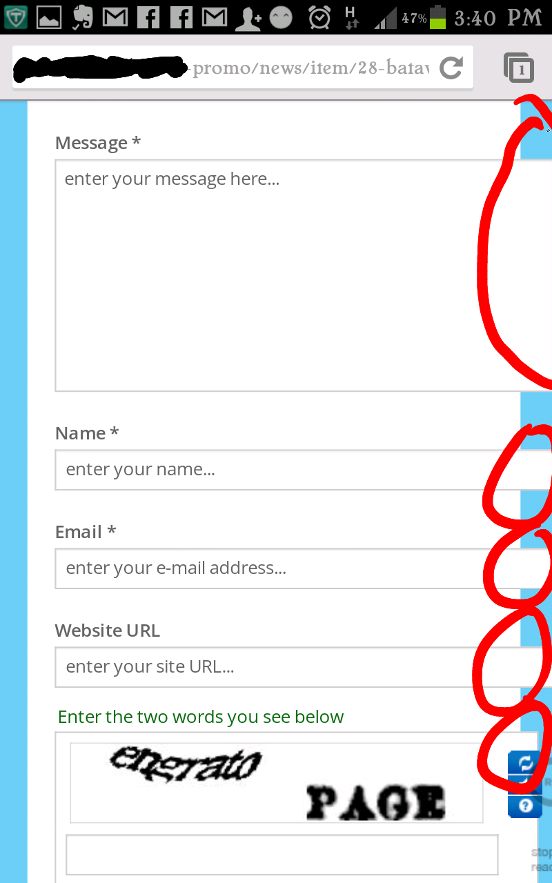
almost every article/item image and form in mobile/tablet view goes rabid :((
example in mobile / small tablet / portrait mode
example in mobile/tablet/landscape mode
phantom lines in desktop when clicking icons….
really need assistance a.s.a.p. it’s all about due dates T_T


chomzz0s Friend
chomzz0s
- Join date:
- December 2012
- Posts:
- 8
- Downloads:
- 0
- Uploads:
- 6
- Thanks:
- 3
- Thanked:
- 1 times in 1 posts
February 25, 2013 at 9:11 am #484411been several days since posting this problem…. no one from JoomlArt team read this?
WOW!!!Luna Garden Moderator
Luna Garden
- Join date:
- July 2011
- Posts:
- 2617
- Downloads:
- 80
- Uploads:
- 96
- Thanks:
- 78
- Thanked:
- 453 times in 425 posts
February 26, 2013 at 3:54 am #484529Hello,
Sorry for the delay.
Here is my solution for your problem:
1. Fix problem for image article view goes rabid:
Go to: <blockquote>templatesja_merohtmlcom_k2templatesja_meroitem.php</blockquote>
Find these lines:
<blockquote><a class=”modal” rel=”{handler: ‘image’}” href=”<?php echo $this->item->imageXLarge; ?>” title=”<?php echo JText::_(‘K2_CLICK_TO_PREVIEW_IMAGE’); ?>”>
<img src=”<?php echo $this->item->image; ?>” alt=”<?php if(!empty($this->item->image_caption)) echo K2HelperUtilities::cleanHtml($this->item->image_caption); else echo K2HelperUtilities::cleanHtml($this->item->title); ?>” style=”width:<?php echo $this->item->imageWidth; ?>px; height:auto;” />
</a></blockquote>
Remove the text class=”modal”2. Fix problem for comment form view goes rabid in mobile view:
Go to: <blockquote>templatesja_merocsscustom.css</blockquote>
add these lines:
@media (min-width: 320px) and (max-width: 450px) {

   div.itemCommentsForm form textarea.inputbox, div.itemCommentsForm form input.inputbox{

		width: 300px;

   }

}
3. example in mobile/tablet/landscape mode with JA Side news at Homepage:
Go to: <blockquote>templatesja_merocsscustom.css</blockquote>
add these lines:
.ja-slidenews-item img{

     width: 100%!importance;

}
4. Dot lines in desktop when clicking icons:
Go to: <blockquote>templatesja_merocsscustom.css</blockquote>
add these lines:
a.btn-icon {

    outline: 0 none;

}
Remember to backup your file before processing.
chomzz0s Friend
chomzz0s
- Join date:
- December 2012
- Posts:
- 8
- Downloads:
- 0
- Uploads:
- 6
- Thanks:
- 3
- Thanked:
- 1 times in 1 posts
February 27, 2013 at 9:44 am #484731Hello @luna-garden ,
thank you already tried that and yes some of the problems are settled except the picture view of JA Sidenews , when i accessing the site through landscape tablet view, the picture still on it’s 241×240 dimension, not resized / cropped as it should
as comment boxes, JA K2 filter, and contact forms still way out of the line when accessed through portrait tablet/mobileAny further suggestions, maybe?
splico123 Friend
splico123
- Join date:
- January 2007
- Posts:
- 339
- Downloads:
- 80
- Uploads:
- 7
- Thanks:
- 24
- Thanked:
- 93 times in 16 posts
February 27, 2013 at 11:00 am #484743<em>@chomzz0s 362050 wrote:</em><blockquote>Hello @luna-garden ,
thank you already tried that and yes some of the problems are settled except the picture view of JA Sidenews , when i accessing the site through landscape tablet view, the picture still on it’s 241×240 dimension, not resized / cropped as it should
as comment boxes, JA K2 filter, and contact forms still way out of the line when accessed through portrait tablet/mobileAny further suggestions, maybe?</blockquote>
Hopefully this all will be included in fix and version upgrade soon? Also would like to know if the new T3v3 will be supported in next version? when? Will this template get the megamenu?
thx for followups
Luna Garden Moderator
Luna Garden
- Join date:
- July 2011
- Posts:
- 2617
- Downloads:
- 80
- Uploads:
- 96
- Thanks:
- 78
- Thanked:
- 453 times in 425 posts
February 28, 2013 at 8:04 am #484876<em>@chomzz0s 362050 wrote:</em><blockquote>Hello [MENTION=247127]some of the problems are settled except the picture view of JA Sidenews , when i accessing the site through landscape tablet view, the picture still on it’s 241×240 dimension, not resized / cropped as it should
as comment boxes, JA K2 filter, and contact forms still way out of the line when accessed through portrait tablet/mobileAny further suggestions, maybe?</blockquote>
Please change what you add as my previous suggestion to file
templatesja_merocsscustom.cssto:
.ja-sidenews img{

     width: 100%!important;

}

  @media (min-width: 320px) and (max-width: 450px) {

   div.itemCommentsForm form textarea.inputbox, div.itemCommentsForm form input.inputbox{

		width: 250px;

   }

}
<em>@splico123 362066 wrote:</em><blockquote>Hopefully this all will be included in fix and version upgrade soon? Also would like to know if the new T3v3 will be supported in next version? when? Will this template get the megamenu?
</blockquote>Currently we’re processing upgrades of three templates JA Brisk, JA Mero, and JA Onepage to T3 Framework version 1.1.0. The version you mentioned is T3 framework, not T3v3. It’ll come with megamenu of course.
So maybe in the coming 1-2 weeks, these three templates will be released.
Stay tuned for our blog page or fanpage to get the release information.
AuthorPostsViewing 6 posts - 1 through 6 (of 6 total)This topic contains 6 replies, has 3 voices, and was last updated by
Luna Garden 11 years, 10 months ago.
We moved to new unified forum. Please post all new support queries in our New Forum
Jump to forum
image goes havoc in mobile view… and phantom lines when clicking icon T_T help….
Viewing 6 posts - 1 through 6 (of 6 total)


