-
AuthorPosts
-
Spell Friend
Spell
- Join date:
- September 2013
- Posts:
- 118
- Downloads:
- 113
- Uploads:
- 38
- Thanks:
- 33
- Thanked:
- 1 times in 1 posts
August 29, 2016 at 3:03 pm #963842First of all i would like to ask which image size is best to use in Teline V. Which proportions? 800×600 1200×765 etc.
Secondly which part of the code i have to edit and in which files to make the image placeholder size bigger or more retangle? css file?
For example i want to change the size of the slideshow. How do i do that?
Saguaros Moderator
Saguaros
- Join date:
- September 2014
- Posts:
- 31405
- Downloads:
- 237
- Uploads:
- 471
- Thanks:
- 845
- Thanked:
- 5346 times in 4964 posts
Spell Friend
Spell
- Join date:
- September 2013
- Posts:
- 118
- Downloads:
- 113
- Uploads:
- 38
- Thanks:
- 33
- Thanked:
- 1 times in 1 posts
August 30, 2016 at 8:12 pm #964351Ok starting making printscreens 🙂
Spell Friend
Spell
- Join date:
- September 2013
- Posts:
- 118
- Downloads:
- 113
- Uploads:
- 38
- Thanks:
- 33
- Thanked:
- 1 times in 1 posts
August 30, 2016 at 9:05 pm #964363Well, after some reading i found that i have the same problem in three sections (main page article view and blog view ) like others. I made a custom.css
I added this:
.magazine-featured-leading .magazine-item-media .item-image {
min-height:yourheightpx!important;
}
.article-intro-media .item-image {
max-height: 100%!important;}

.article-intro .item-image {
max-height: 100%!important; }
(made it in notepad++ and then upload it via filemanager. Has same folder permissions as other files in that folder)
Again it helped but not solved the issue. Following the answer here: https://www.joomlart.com/forums/topic/size-in-height-pictures/
i tried to add
.article-intro-media .item-image { min-height:XXXXXpx!important; }
where XXX the various sizes i tried. it worked for one image but not for a different size image in another article.
What i want to make as a result is to keep the aspect ratio when its resizes the images. And use the center of the image to do that. Is there a ”magic” piece of code you can share with me? Or i am missing something? "_" 🙂
and have it in blog view article view homepageview …Its weird., The image that loads for the videos it does it.
Also even if i upload an intro image for the video, it shows in list mode (left) but in full screen it still shows what the video has and its not overlaying it. 🙂
Spell Friend
Spell
- Join date:
- September 2013
- Posts:
- 118
- Downloads:
- 113
- Uploads:
- 38
- Thanks:
- 33
- Thanked:
- 1 times in 1 posts
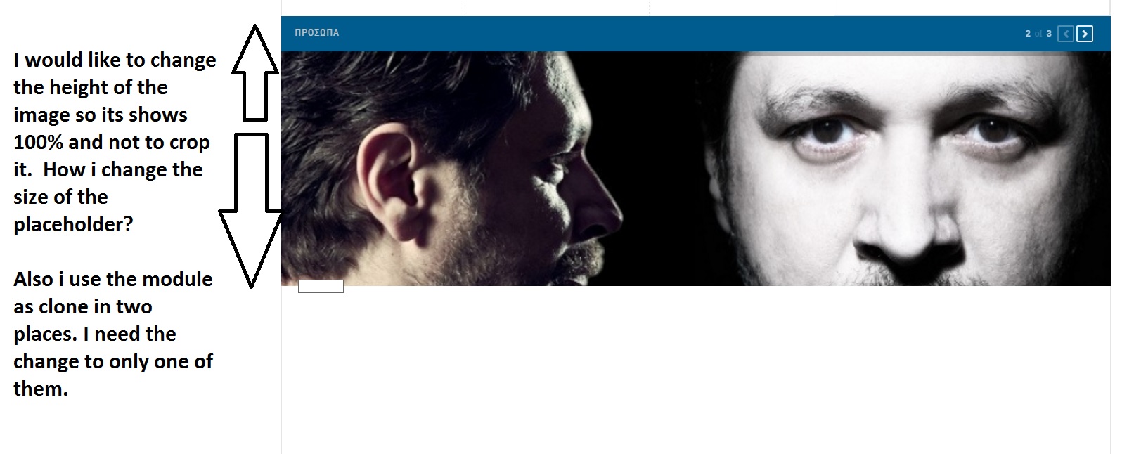
August 31, 2016 at 8:23 pm #964694I would like to make the ACM module bigger in the image placeholder though
-
Spell Friend
Spell
- Join date:
- September 2013
- Posts:
- 118
- Downloads:
- 113
- Uploads:
- 38
- Thanks:
- 33
- Thanked:
- 1 times in 1 posts
August 31, 2016 at 9:45 pm #964739Well i made it! it has to be a combination of solutions found in this forum.
So the custom.css must look like this:
p.ark_noblock , img.modal {
display: block !important;
}

.newback.t3-module {
background:#ffffff;
border:2px solid #c00;
}

.article-intro-media .item-image {
max-height: 100%!important;}

.magazine-categories .item-image {
    max-height: 100%!important;
}

.article-intro .item-image {
    max-height: 100%;
}

.article-intro-media .item-image {
max-height: 100%;
overflow: hidden;
}
And everything works fine. Hope it helps others 🙂
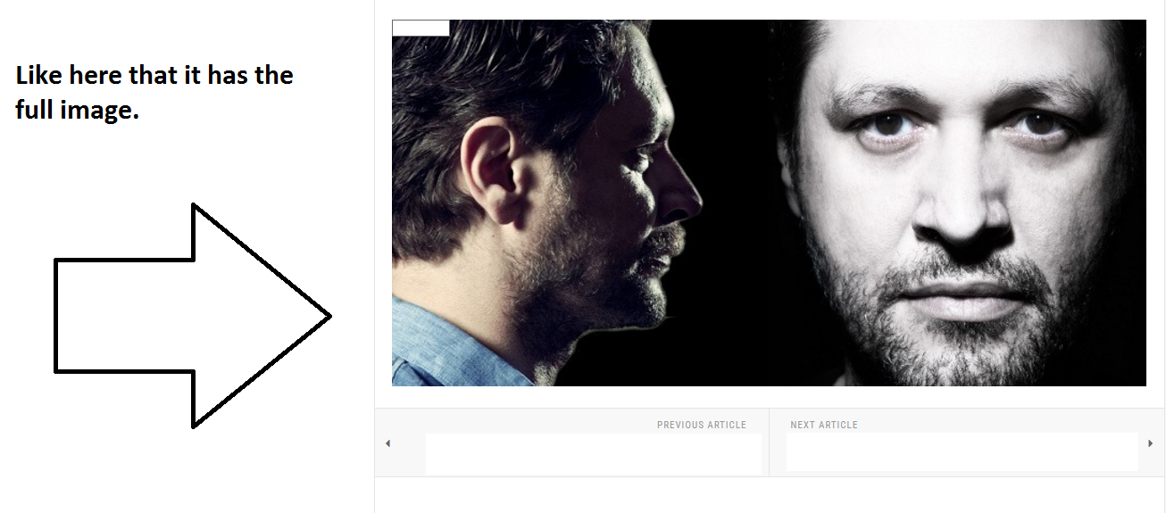
All fixed in blog view , article view, category view, media view. I just need to make the ACM image placeholder a bit larger… is it possible?
Saguaros Moderator
Saguaros
- Join date:
- September 2014
- Posts:
- 31405
- Downloads:
- 237
- Uploads:
- 471
- Thanks:
- 845
- Thanked:
- 5346 times in 4964 posts
September 1, 2016 at 9:15 am #964848Could you send URL of that page and screenshot highlighting the image you’re mentioning?
Spell Friend
Spell
- Join date:
- September 2013
- Posts:
- 118
- Downloads:
- 113
- Uploads:
- 38
- Thanks:
- 33
- Thanked:
- 1 times in 1 posts
September 1, 2016 at 11:50 am #964875This reply has been marked as private.Spell Friend
Spell
- Join date:
- September 2013
- Posts:
- 118
- Downloads:
- 113
- Uploads:
- 38
- Thanks:
- 33
- Thanked:
- 1 times in 1 posts
September 1, 2016 at 2:37 pm #964901Also another issue. All my banners are not showing. Image banners not code banners. :/
With the exception of header blog banner.
Saguaros Moderator
Saguaros
- Join date:
- September 2014
- Posts:
- 31405
- Downloads:
- 237
- Uploads:
- 471
- Thanks:
- 845
- Thanked:
- 5346 times in 4964 posts
September 5, 2016 at 12:51 am #965540Hi Spell,
You’ve contact with Ninja Lead? please check with him for banners.
For the image in your screenshot, you can open this file: ROOT/templates/ja_teline_v/local/acm/news-featured/css/style.css
Look for these declarations:
.magazine-carousel .magazine-item-media .item-image {
  height: 500px;
  background: #e5e5e5;
}

.magazine-featured-leading .magazine-item-media .item-image {
  margin-bottom: 24px;
  max-height: 500px;
}
change the value for the height to suit your needs
Then add this rule:
.magazine-featured-leading .magazine-item-media .item-image img {
    height: 100%;
}
1 user says Thank You to Saguaros for this useful post
-
AuthorPosts
Viewing 11 posts - 1 through 11 (of 11 total)This topic contains 10 replies, has 2 voices, and was last updated by
Spell 8 years, 4 months ago.
We moved to new unified forum. Please post all new support queries in our New Forum
Jump to forum


