-
AuthorPosts
-
August 31, 2017 at 10:05 pm #1059731
Hello
In Thememagic I have configured desktop layout with 1400px and the template looks good, but bottom scrollbar appears in some computers with an screen resolution beetween 970 and 1400px
Is there a way to configure Teline V grid layout to increase the width of the screen in desktop from 1170px to 1600px (better than 1400px), and remain be responsive, like JA_Company template is in all screen sizes?
Thank You
Saguaros Moderator
Saguaros
- Join date:
- September 2014
- Posts:
- 31405
- Downloads:
- 237
- Uploads:
- 471
- Thanks:
- 845
- Thanked:
- 5346 times in 4964 posts
September 1, 2017 at 3:33 am #1059783Hi peli,
You can change the width of container in template via this file: root/templates/ja_teline_v/less/variables.less
look for this declaration:
// Container sizes
// --------------------------------------------------

// Small screen / tablet
@container-tablet:             ((720px + @grid-gutter-width));
@container-sm:                 @container-tablet;

// Medium screen / desktop
@container-desktop:            ((940px + @grid-gutter-width));
@container-md:                 @container-desktop;

// Large screen / wide desktop
@container-large-desktop:      ((1140px + @grid-gutter-width));
@container-lg:                 @container-large-desktop;
and change the value for container-large-desktop variable.
In JA Company template, we define additional variable called ‘container-hd’ and it looks like this:
// Container sizes
// --------------------------------------------------

// Small screen / tablet
@container-tablet:             ((720px + @grid-gutter-width));
@container-sm:                 @container-tablet;

// Medium screen / desktop
@container-desktop:            ((940px + @grid-gutter-width));
@container-md:                 @container-desktop;

// Large screen / wide desktop
@container-large-desktop:      ((1140px + @grid-gutter-width));
@container-lg:                 @container-large-desktop;

// HD Screen
@container-hd:      1600px;
Remember that when you change via this less file, if your template is running with Development Mode (config via Template manager), just refresh to see the change. But if Dev Mode is OFF, you will have to compile less to css to see the change. And remember to backup all css files first before compiling.
September 1, 2017 at 6:15 am #1059821Hello,
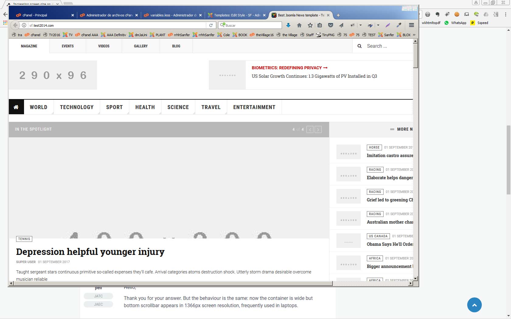
Thank you for your answer. But the behaviour is the same: now the container is wide but bottom scrollbar appears in 1366px screen resolution, frequently used in laptops.
Saguaros
- Join date:
- September 2014
- Posts:
- 31405
- Downloads:
- 237
- Uploads:
- 471
- Thanks:
- 845
- Thanked:
- 5346 times in 4964 posts
September 1, 2017 at 9:30 am #1059866It seems that you added a new block above the main content and this has margin: http://prntscr.com/gfqm00
Try to remove it and check again.
September 1, 2017 at 10:37 am #1059885I have create a new installation only with Quickstart package and made the changes you say:
The screen is now wider (1600px), but the bottom scroll bar appears. Is this template full responsive?
http://gesdi.com/responsivator/?site=sf.test2014.com
September 2, 2017 at 6:34 am #1059962Hello,
I have included this code in custom.css and it looks work fine.
Thank you
body .container {
  width: 100%;
  max-width: 1600px;
}
Saguaros
- Join date:
- September 2014
- Posts:
- 31405
- Downloads:
- 237
- Uploads:
- 471
- Thanks:
- 845
- Thanked:
- 5346 times in 4964 posts
September 5, 2017 at 6:36 am #1060368Glad to hear it works now!
Cheers!
AuthorPostsViewing 7 posts - 1 through 7 (of 7 total)This topic contains 6 replies, has 2 voices, and was last updated by
Saguaros 7 years, 4 months ago.
We moved to new unified forum. Please post all new support queries in our New Forum
Increasing screen size on desktop computers
Viewing 7 posts - 1 through 7 (of 7 total)