I’ve been a little stuck trying to choose a theme because what I’m building is for a Preschool. I pretty much settled down on Beryl, assuming a few changes. I found the slideshow/billboard mask and was going to put something else in it’s place. After checking things out, I saw a couple of things that I’m not to sure why they happen.
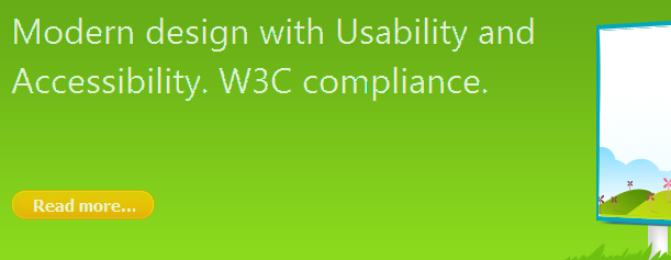
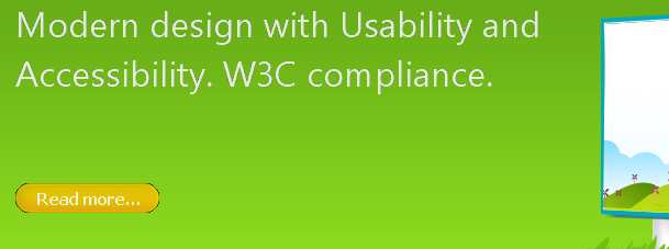
I’m referring to the jagged/pixelated text (as if some underlying color is coming through) and the dark color around the “read more” button below the text in the slideshow area.
Despite the low res image, you can see there is a noteable degredation in the IE8 image vs the FF image. Also, the read more button appears to have some dark layer seeping through and doesn’t look good at all. These screen shots were taken from the demo:
Firefox:

IE8:

BTW, same results in IE8 with compatiablilty turned on or off.
I haven’t gotten anywhere with this site yet because every time I pick a theme there’s some sort of issue….this is all I’ve been doing with my available time to work on this.
Update.. My own fault here, the reason was because the text in the slideshow module was set to an opacity of .8. Setting it to 1 makes it look the way it should (IMO).
fabrian 15 years, 1 month ago.

