-
AuthorPosts
-
 woluweb
Friend
woluweb
- Join date:
- October 2012
- Posts:
- 196
- Downloads:
- 18
- Uploads:
- 69
- Thanks:
- 68
- Thanked:
- 31 times in 3 posts
June 19, 2014 at 8:13 am #198974Hi there,
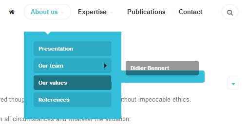
The layout of JA Biz for sub-submenus (ie third-level menus) is not ergonomic at all.
See image attached : when hovering submenu “Notre équipe”, its submenu appears… but much too low.Actually, I tried playing with the following parameter margin-top (being 25 px in this case), but it is obviously not the good solution because it impacts not only my sub-submenu but also the whole submenu block itself…
How to solve this and have sub-submenus showing just to the right of its parent… and not too low
It is not only for having a nice layout for the eyes, it is above all to avoid the whole submenu to disappear when moving the mouse to the sub-subitem.
Txs
// The Dropdown
// ————
.mega-dropdown-menu {
}.mega > .nav-child.mega-dropdown-menu {
border: none;
box-shadow: none;
color: @white;
background: @brand-primary;
margin-top: @t3-global-margin + 5px;
Adam M Moderator
Adam M
- Join date:
- May 2014
- Posts:
- 5159
- Downloads:
- 33
- Uploads:
- 66
- Thanks:
- 95
- Thanked:
- 1271 times in 1235 posts
June 20, 2014 at 7:37 am #539617You go the right direction, just update the declaration a little bit as follows:
.t3-megamenu .mega > .nav-child.mega-dropdown-menu {

	margin-top: 0;

}

.t3-megamenu .mega > .nav-child.mega-dropdown-menu .level3 {

	padding: 0;

	margin: -5px 0 0 -5px;

}
1 user says Thank You to Adam M for this useful post
 woluweb
Friend
woluweb
- Join date:
- October 2012
- Posts:
- 196
- Downloads:
- 18
- Uploads:
- 69
- Thanks:
- 68
- Thanked:
- 31 times in 3 posts
June 21, 2014 at 7:35 am #539719Hi,
Txs for helping !I tried the solution, but it does not work as expected in the sense that
– if you change the t3-megamenu .mega > .nav-child.mega-dropdown-menu
then the submenu block also moves up… and the carret is not place properly any more
– the .level3 seems to have no impact… and I realized that it should be replaced by .level2 to have impactSo I tried to build upon your suggestion with the following :
.t3-megamenu .mega > .nav-child.mega-dropdown-menu {

	margin-top: 25px;

}

.t3-megamenu .mega > .nav-child.mega-dropdown-menu .level2 {

	padding: 0;

	margin: -30px 0 0 10px;

}
As can be seen from screenshot hereafter, the carret of submenu block is now well positionned, and our last level of menu items shows just at the right place (just next to its parent item, not too low as originally)… but its blue background has not followed…
So could we fix that ?Txs,
Marc
PS : see here the live version : http://synthesix.com/en/about-us/team
Easier if you want to play with the console to test directly the suggestions 🙂Screenshot : “Team” is the parent item of “Didier”
Adam M Moderator
Adam M
- Join date:
- May 2014
- Posts:
- 5159
- Downloads:
- 33
- Uploads:
- 66
- Thanks:
- 95
- Thanked:
- 1271 times in 1235 posts
June 23, 2014 at 2:49 am #539798Hi Marc,
So you can try to apply top margin to 1st sub-level only by adding this declaration in CSS file:
.t3-megamenu > .navbar-nav > .mega > .mega-dropdown-menu {

	margin-top: 25px;

}
Then remove the bottom margin of sub-level menu item if there’s only 1 element by adding this rule:
.t3-megamenu .dropdown-menu .mega-nav > li:last-child > a {

     margin: 0;

}AuthorPostsViewing 4 posts - 1 through 4 (of 4 total)This topic contains 4 replies, has 2 voices, and was last updated by
Adam M 10 years, 6 months ago.
We moved to new unified forum. Please post all new support queries in our New Forum
Jump to forum


