-
AuthorPosts
-
Hung Dinh Friend
Hung Dinh
- Join date:
- September 2014
- Posts:
- 4408
- Downloads:
- 11
- Uploads:
- 189
- Thanks:
- 309
- Thanked:
- 3310 times in 3 posts
April 20, 2012 at 10:02 am #176311Ladies and gentlemen!
It’s been a while (almost 1,5 year now :D) we stopped giving preview for the coming release, starting this month, we will be doing it again !
JA Lens is our May template, and I will leave it to you guys to decide whether it is good or bad.
Just a few technical notes:
– It will be perfectly responsive like JA Wall
– It is adopting the Undesign & Minimal trend in which we will use the content to craft the beauty of the design.
– It will be looking good with standard content like JA WallIf you like it, leave your feedback and I will post the next screenshots, if not then this is the only sneak peak we have :p
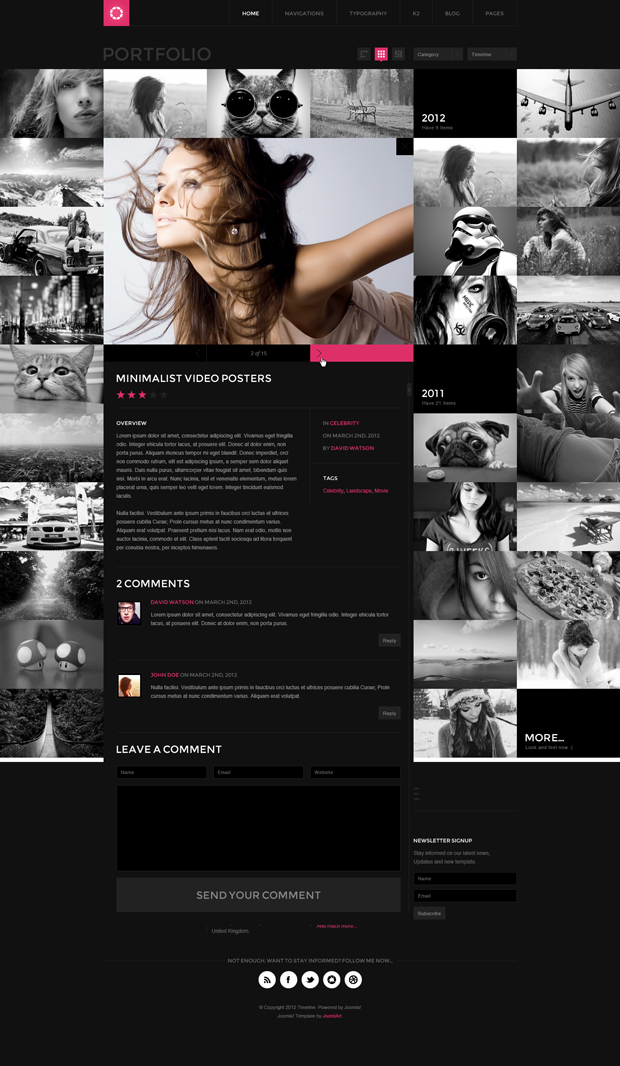
Sneak Peak1: K2/com_content Detailed page
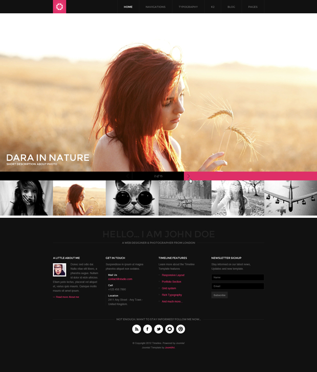
Sneak Peak2: Home
Sneak Peak3: Portfolio/Items Listing
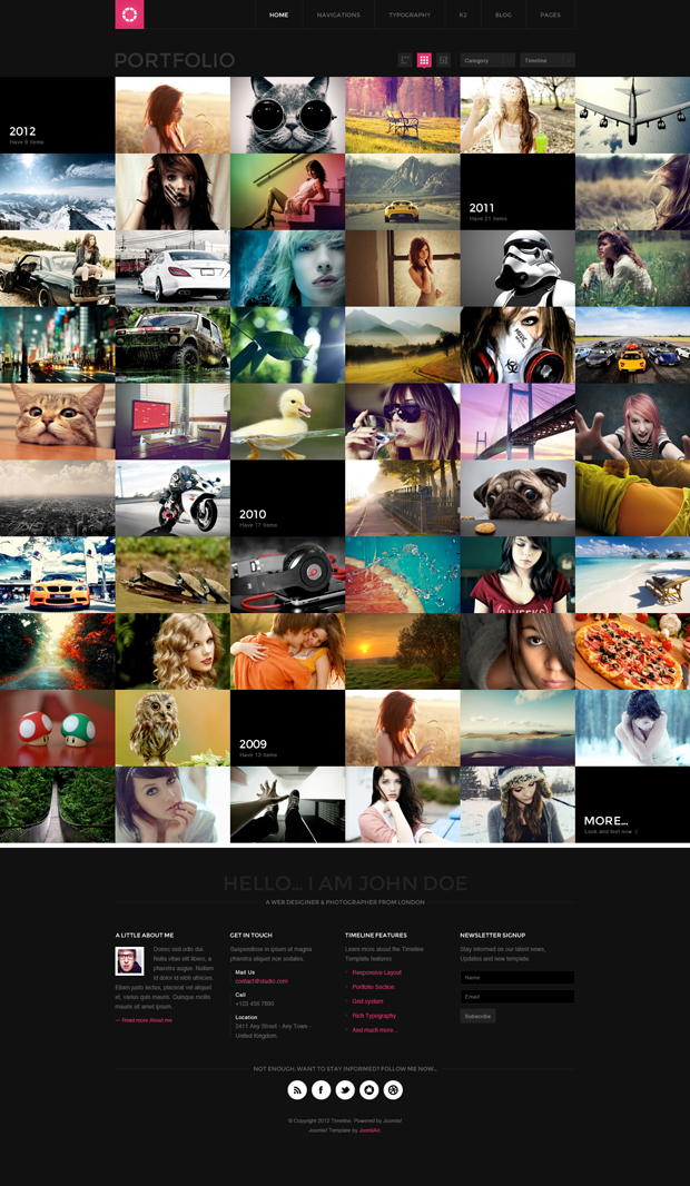
View the higher resolution Here
Sneak Peak4: Category/Blog View
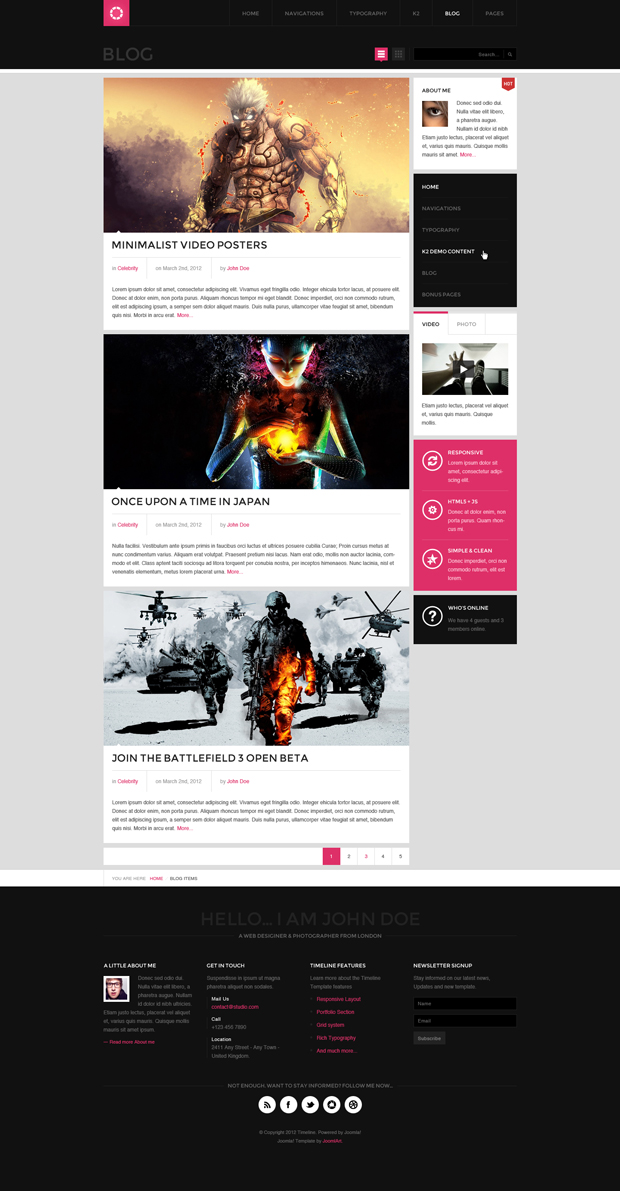
View the higher resolution Here
Sneak Peak5: Comment Page View
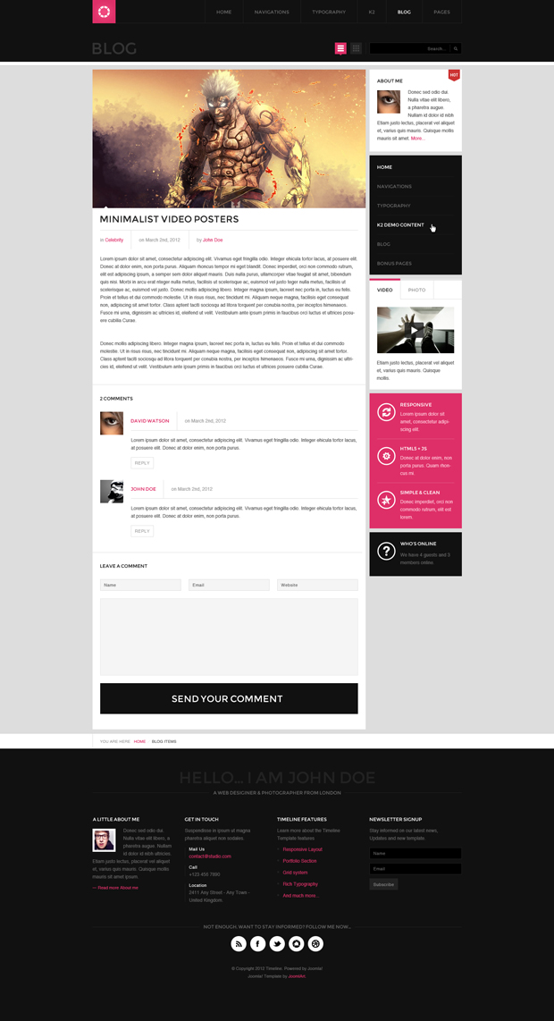
View the higher resolution Here
Sneak Peak6: 404 Page View
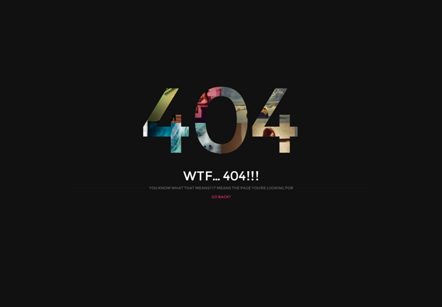
View the higher resolution Here
20 users say Thank You to Hung Dinh for this useful post
Blaine Friend
Blaine
- Join date:
- August 2007
- Posts:
- 1443
- Downloads:
- 0
- Uploads:
- 25
- Thanks:
- 98
- Thanked:
- 177 times in 154 posts
swissa Friend
swissa
- Join date:
- November 2011
- Posts:
- 1955
- Downloads:
- 7
- Uploads:
- 277
- Thanks:
- 175
- Thanked:
- 717 times in 572 posts
April 20, 2012 at 12:34 pm #449312Looks good and would love to see more images / sneak previews of it.
Can’t wait for Wall though. I take it that my beta invitation: – got lost in the post / the dog ate it!
😉
kyovev Friend
kyovev
- Join date:
- December 2010
- Posts:
- 144
- Downloads:
- 0
- Uploads:
- 18
- Thanks:
- 16
- Thanked:
- 6 times in 1 posts
April 20, 2012 at 12:36 pm #449314holy shit, this is amazing!
April 20, 2012 at 12:46 pm #449316Impressive indeed!
Blaine Friend
Blaine
- Join date:
- August 2007
- Posts:
- 1443
- Downloads:
- 0
- Uploads:
- 25
- Thanks:
- 98
- Thanked:
- 177 times in 154 posts
April 20, 2012 at 2:17 pm #449331Swissa, please check your PM from me
tfosnom Friend
tfosnom
- Join date:
- October 2010
- Posts:
- 742
- Downloads:
- 0
- Uploads:
- 31
- Thanks:
- 145
- Thanked:
- 200 times in 94 posts
April 20, 2012 at 2:41 pm #449334and what of my invitation also?
ShaneHung Dinh Friend
Hung Dinh
- Join date:
- September 2014
- Posts:
- 4408
- Downloads:
- 11
- Uploads:
- 189
- Thanks:
- 309
- Thanked:
- 3310 times in 3 posts
April 20, 2012 at 3:06 pm #449338More screenshots added to the first post…
swissa Friend
swissa
- Join date:
- November 2011
- Posts:
- 1955
- Downloads:
- 7
- Uploads:
- 277
- Thanks:
- 175
- Thanked:
- 717 times in 572 posts
April 20, 2012 at 3:34 pm #449341<em>@Blaine 314998 wrote:</em><blockquote>Swissa, please check your PM from me</blockquote>
Thank you for your mail Blaine. 🙂
With the new previews up here I’m sad that I’m useless with fotografie. Can’t wait to see what gets posted in the showcase with this one!
Merci vielmals!
iguinee Friend
iguinee
- Join date:
- December 2009
- Posts:
- 453
- Downloads:
- 10
- Uploads:
- 39
- Thanks:
- 58
- Thanked:
- 32 times in 1 posts
April 20, 2012 at 4:10 pm #449349It’s always a good idea.
I believe most people here like previews. And it helps plan future projects.
Do not stop it, please.
1 user says Thank You to iguinee for this useful post
 zao dao
Friend
zao dao
- Join date:
- September 2014
- Posts:
- 155
- Downloads:
- 160
- Uploads:
- 2
- Thanks:
- 12
- Thanked:
- 11 times in 1 posts
April 20, 2012 at 5:55 pm #449371don’t like this dark template
www.8media.com
www.zaodao.comBlaine Friend
Blaine
- Join date:
- August 2007
- Posts:
- 1443
- Downloads:
- 0
- Uploads:
- 25
- Thanks:
- 98
- Thanked:
- 177 times in 154 posts
April 20, 2012 at 8:17 pm #449386Well colours can always be adjusted through CSS but I think the styling is the main point here zaodao. And as always, with lots of colours on a site, black makes them “pop”! IMHO
joev Friend
joev
- Join date:
- December 2008
- Posts:
- 108
- Downloads:
- 0
- Uploads:
- 17
- Thanks:
- 5
- Thanked:
- 10 times in 1 posts
April 20, 2012 at 9:43 pm #449392I have to say that between JA Wall and now JA Lens, that the team is finally back on track again. I’m happy to see JA embracing responsive designs, especially the cleaner design style. JA Lens looks great so far. I’m glad that the blog page is showing some lighter colors. My initial concern is that it may be to dark, as most users would probably like to use this for business themes also. Maybe it’s the module styles that look so dark. Can’t wait to see more previews.
2 users say Thank You to joev for this useful post
joev Friend
joev
- Join date:
- December 2008
- Posts:
- 108
- Downloads:
- 0
- Uploads:
- 17
- Thanks:
- 5
- Thanked:
- 10 times in 1 posts
April 20, 2012 at 9:56 pm #449394By the way, does the Portfolio page have sorting where items can be sorted (jquery ajax effect) without reloading the page. Seems like most WordPress themes offer this effect. Also, can you change the size and layout of the images. Is there an overlay effect when hovering over. Thanks.
-
AuthorPosts
This topic contains 92 replies, has 38 voices, and was last updated by bubbletech 12 years, 6 months ago.
We moved to new unified forum. Please post all new support queries in our New Forum


