-
AuthorPosts
-
 woluweb
Friend
woluweb
- Join date:
- October 2012
- Posts:
- 196
- Downloads:
- 18
- Uploads:
- 69
- Thanks:
- 68
- Thanked:
- 31 times in 3 posts
August 12, 2014 at 9:23 am #200448Hi,
A few days ago, an update of JA Muzic was released, with many little improvements.
For example, the addition of carrets on the (first-level) menu items when there are submenus.But even after that very recent update, I still face the following :
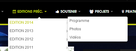
sub-menus have 0 left-padding, which is not very nice
Note that the sub-sub-menu items just show nicely, with a little left-paddingI illustrate this on the following screenshot.
what I would consider as a “bug” (I would not call it a “feature” 🙂
I have implementented a quick workaround :
.t3-megamenu .mega-nav > li a, .t3-megamenu .dropdown-menu .mega-nav > li a {

padding: 5px 0px 5px 5px;

}
NB : the padding was originally this
padding: 5px 0;But this is not a proper solution, because it also impacts the sub-sub-menu items, which now have a “double” padding.
So one question and one suggestion :
* question : could you please suggest the best css solution to that layout caveat of the template ?
* suggestion : could you integrate that solution in the next release. I think nobody wants a 0 left-padding on the submenus (I would call this a bug, not a feature 🙂Txs a lot !
Marc
chavan Friend
chavan
- Join date:
- October 2014
- Posts:
- 4612
- Downloads:
- 0
- Uploads:
- 110
- Thanked:
- 1440 times in 1290 posts
August 12, 2014 at 11:48 am #545633can you please post your site Url. so I could suggest you right
 woluweb
Friend
woluweb
- Join date:
- October 2012
- Posts:
- 196
- Downloads:
- 18
- Uploads:
- 69
- Thanks:
- 68
- Thanked:
- 31 times in 3 posts
August 12, 2014 at 12:04 pm #545636Sure.
The site I am working on is http://www.fesdig.com/fr (but there, I have already added a line in custom.css as mentionned, as a temporary solution).Otherwise, it is not specific to my site, on any JA Muzic site you have the problem.
See for example
http://8f2cf5b61037348fa984a3f14b51a326.site.joomlart.com/
or build your own Demo site with Joomlart Site BuilderIf you make groups in Megamenu Manager, then of course you have a specific layout.
But I am speaking here of a regular menu (even Megamenu with icons etc), but WITHOUT playing with “groups” in MegamenuI hope it helps,
Marc
chavan Friend
chavan
- Join date:
- October 2014
- Posts:
- 4612
- Downloads:
- 0
- Uploads:
- 110
- Thanked:
- 1440 times in 1290 posts
August 12, 2014 at 12:24 pm #545641Yes, sure will update the development team.
georgeroth Friend
georgeroth
- Join date:
- March 2014
- Posts:
- 29
- Downloads:
- 2
- Uploads:
- 3
- Thanks:
- 3
- Thanked:
- 7 times in 3 posts
August 13, 2014 at 11:31 am #545831Note that it’s not really double padding. There is a padding-left: 20px; given to the .t3-megamenu .mega-col-nav .dropdown-menu .mega-nav.level2.
If you want to have the same padding for your sub-sub menu items, place this inside of your custom.css:
.t3-megamenu .mega-col-nav .dropdown-menu .mega-nav.level2 {

     padding-left: 0px;

     }
Let us know how you’re getting on.
1 user says Thank You to georgeroth for this useful post
 woluweb
Friend
woluweb
- Join date:
- October 2012
- Posts:
- 196
- Downloads:
- 18
- Uploads:
- 69
- Thanks:
- 68
- Thanked:
- 31 times in 3 posts
August 13, 2014 at 11:38 am #545833georgeroth Friend
georgeroth
- Join date:
- March 2014
- Posts:
- 29
- Downloads:
- 2
- Uploads:
- 3
- Thanks:
- 3
- Thanked:
- 7 times in 3 posts
August 13, 2014 at 1:49 pm #545846No problem at all, glad that I could help!
AuthorPostsViewing 7 posts - 1 through 7 (of 7 total)This topic contains 7 replies, has 3 voices, and was last updated by
georgeroth 10 years, 4 months ago.
We moved to new unified forum. Please post all new support queries in our New Forum
Jump to forum


