-
AuthorPosts
-
Hung Dinh Friend
Hung Dinh
- Join date:
- September 2014
- Posts:
- 4408
- Downloads:
- 11
- Uploads:
- 189
- Thanks:
- 309
- Thanked:
- 3310 times in 3 posts
March 14, 2010 at 3:12 pm #149498Dear Members,
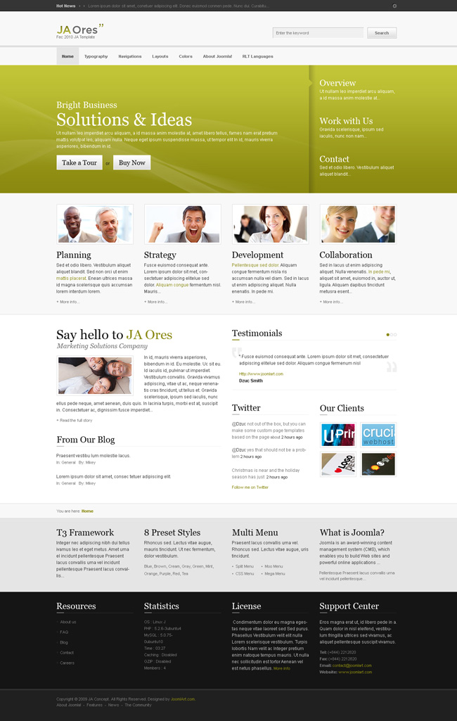
JA Ores is the March 2010 Template and comes with K2 Component 😮 (New feature) Support. It comes with 16 Colors and a rich blog layout 😮 (New feature). The screenshots for the color options are given below. Please note, some elements might change as the development on template is finished.
Live Demo : As on 19/03/2010. All Colors updated on the Demo
Color Styles :
1. Blue : Check the High Resolution Image HERE.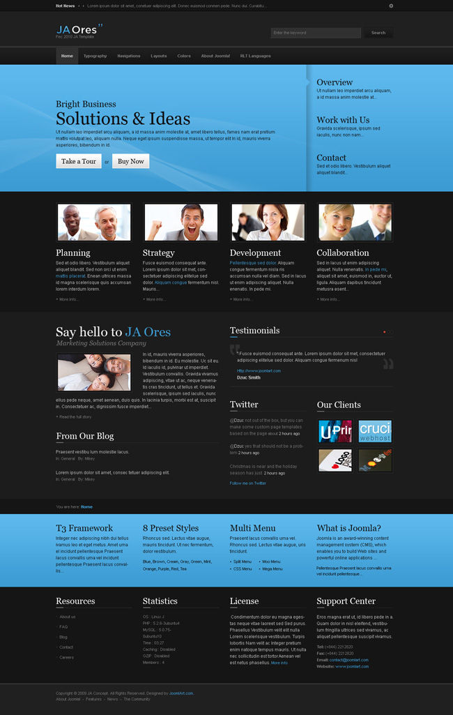
2. Blue Light : Check the High Resolution Image HERE.
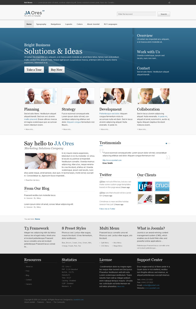
3. Cream : Check the High Resolution Image HERE.

4. Cream Light : Check the High Resolution Image HERE.
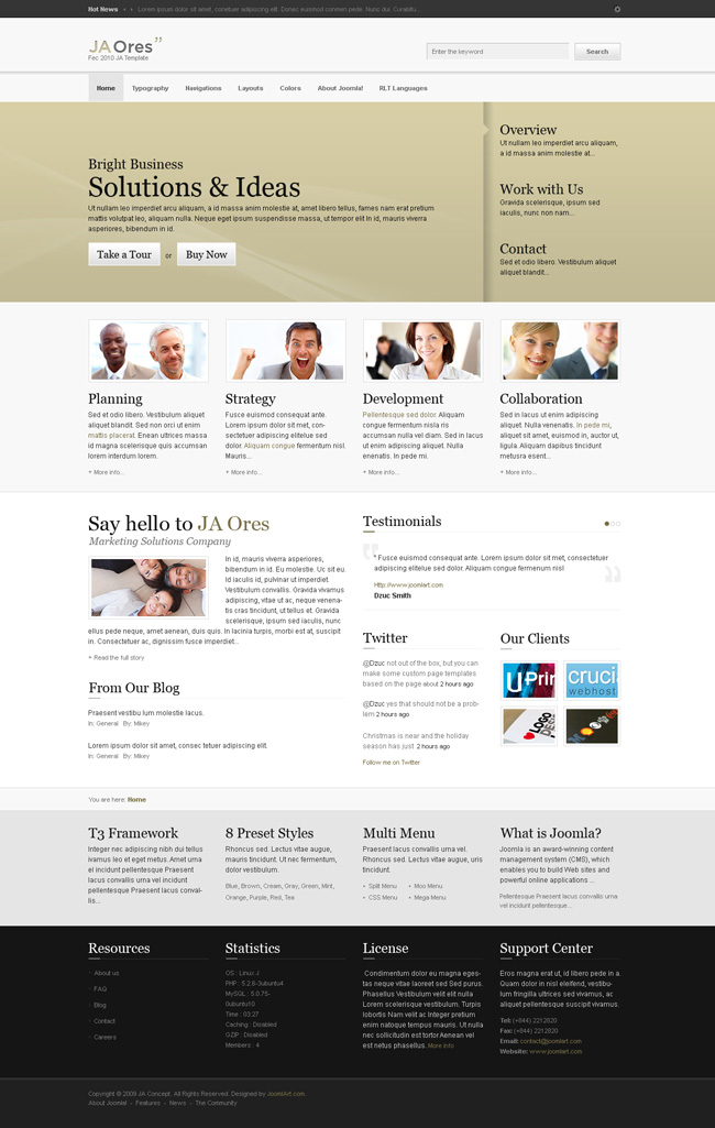
5. Gray : Check the High Resolution Image HERE.

6. Gray Light : Check the High Resolution Image HERE.
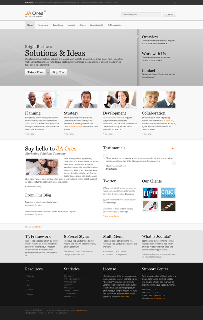
7. Green : Check the High Resolution Image HERE.

8. Green Light : Check the High Resolution Image HERE.
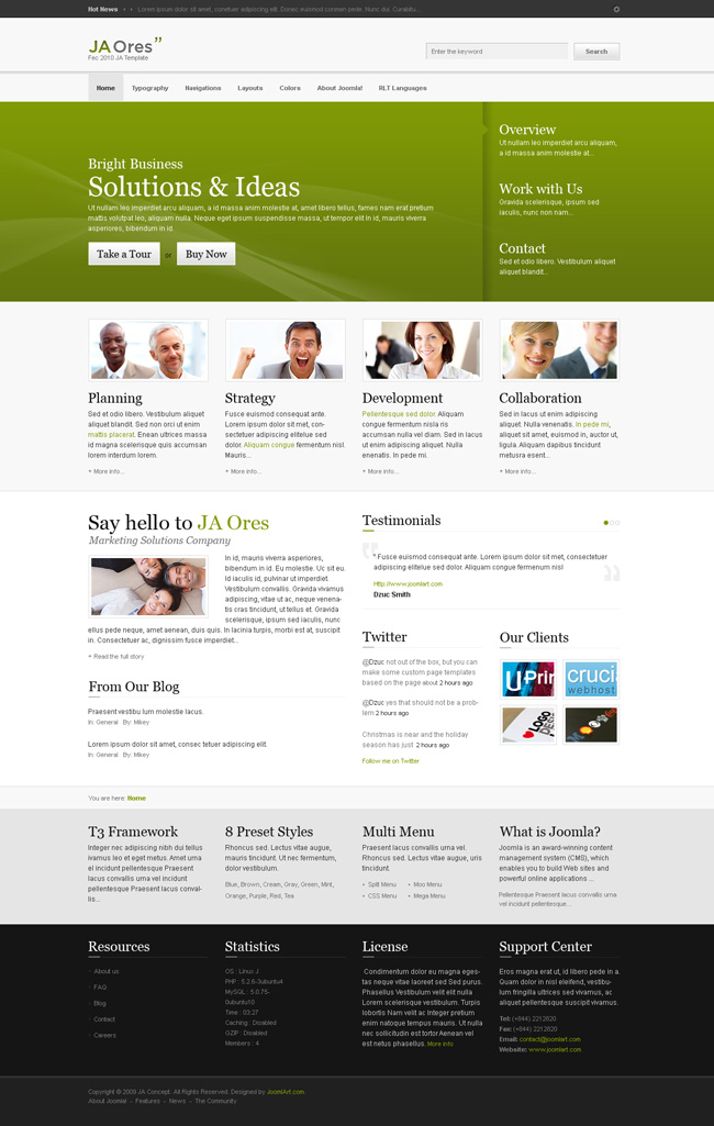
9. Orange : Check the High Resolution Image HERE.
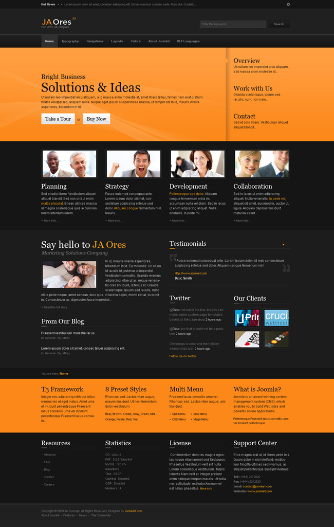
10. Orange Light : Check the High Resolution Image HERE.

11. Red : Check the High Resolution Image HERE.
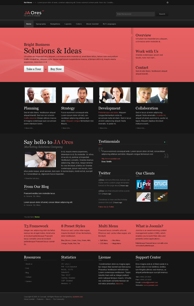
12. Red Light : Check the High Resolution Image HERE.

13. Teal : Check the High Resolution Image HERE.
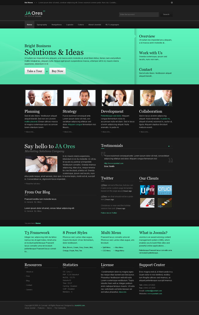
14. Teal Light : Check the High Resolution Image HERE.
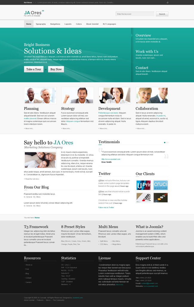
15. Yellow : Check the High Resolution Image HERE.

16. Yellow Light : Check the High Resolution Image HERE.
BLOG LAYOUT :
1. Blog layout : Check the High Resolution Image HERE.

2. Blog layout Light Color : Check the High Resolution Image HERE.

SUB PAGE LAYOUTS:
1. Sub Page Layout : Check the High Resolution Image HERE.
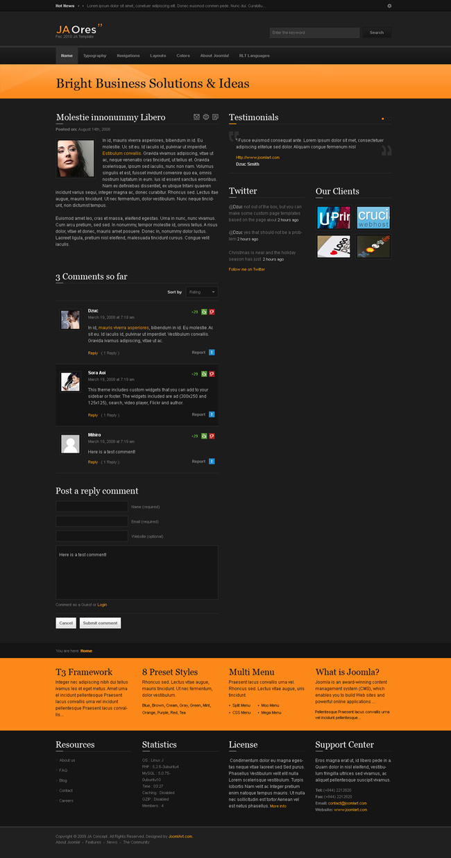
2. Sub Page Layout One Column : Check the High Resolution Image HERE.

Please Note, that color styles may be decreased or increased and we hope to get this template out in the next 7-10 days, it might be earlier or later to this estimate.
Demo Site, will be updated regularly as and when the colors or fixes are being made. Any errors can be posted here.
Hung Dinh
++++++++++++
updated on 15/03/2010 with Screenshots for Color Styles etc….
16 users say Thank You to Hung Dinh for this useful post
prakash Friend
prakash
- Join date:
- October 2008
- Posts:
- 439
- Downloads:
- 0
- Uploads:
- 1
- Thanks:
- 2
- Thanked:
- 146 times in 115 posts
March 14, 2010 at 3:30 pm #336155Hi,
The theme definitely looks a bit different from the current ones you have launched.
One thing i noticed for the testimonials scroller is that the text scrolls over the quote:

In case of drop line menu – I think most users would like the black blank part below the menu to be hidden in case there are no menu items – only show up the black section when the menu has child menus. else keep it hidden.
One more suggestion would be rather than wasting the entire top section just for the logo and search bar, I would take the search bar above to where the scrolling news is. This would allow me lots of space next to the logo to play with where in one could incorporate say – 728X90 top banner.
Secondly the slideshow the separator does not look “polished”. I would have loved to see some proper bifercation between the main item and the 3 links that are visible. Right now it looks like all text on a single column without any designing.
Will update in case I find anything else to comment upon or once all color schemes are launched.
Thanks
cjmicro Friend
cjmicro
- Join date:
- June 2008
- Posts:
- 501
- Downloads:
- 3
- Uploads:
- 0
- Thanks:
- 198
- Thanked:
- 81 times in 10 posts
March 15, 2010 at 12:49 am #336173I like it!
nihues Friend
nihues
- Join date:
- December 2009
- Posts:
- 69
- Downloads:
- 0
- Uploads:
- 2
- Thanks:
- 17
- Thanked:
- 15 times in 5 posts
March 15, 2010 at 1:57 am #336178Nice template with k2 support! But didn’t like the orange with black… seems like something is missing maybe add other color… but overall a nice template!
we2solutions Friend
we2solutions
- Join date:
- September 2014
- Posts:
- 526
- Downloads:
- 0
- Uploads:
- 21
- Thanks:
- 136
- Thanked:
- 100 times in 1 posts
Hung Dinh Friend
Hung Dinh
- Join date:
- September 2014
- Posts:
- 4408
- Downloads:
- 11
- Uploads:
- 189
- Thanks:
- 309
- Thanked:
- 3310 times in 3 posts
March 15, 2010 at 11:47 am #336257Preview thread Updated with all the proposed color styles and other layouts. Demo Site will be updated as and when features are updated.
thatcomputerdude Friend
thatcomputerdude
- Join date:
- December 2008
- Posts:
- 280
- Downloads:
- 0
- Uploads:
- 9
- Thanks:
- 67
- Thanked:
- 32 times in 1 posts
March 15, 2010 at 1:03 pm #336262Very nice looking template package! I am impressed – thank you JA Team for a very usable template!
1 user says Thank You to thatcomputerdude for this useful post
nihues Friend
nihues
- Join date:
- December 2009
- Posts:
- 69
- Downloads:
- 0
- Uploads:
- 2
- Thanks:
- 17
- Thanked:
- 15 times in 5 posts
March 15, 2010 at 2:07 pm #336270<em>@Hung Dinh 169480 wrote:</em><blockquote>Preview thread Updated with all the proposed color styles and other layouts. Demo Site will be updated as and when features are updated.</blockquote>
The white feels much better than the black one, now it’s a killer template :-*
The black is too black/boring I think!
Thanks for this awesome work! And there is a new comment plugin that does not use online comment tools? I see the K2 comment, but the normal blog pages uses what comment plugin?March 15, 2010 at 2:32 pm #336273Good Job ! When i can download ?
Omar Ramos JAEC
Omar Ramos
- Join date:
- September 2014
- Posts:
- 93
- Downloads:
- 154
- Uploads:
- 12
- Thanked:
- 15 times in 1 posts
March 15, 2010 at 4:00 pm #336282Just noticed on the K2 Category Listing view the RSS icon in the top right is not the best type of icon to display on a dark background…hopefully you guys can update your template override so that the image used is better :-).
March 15, 2010 at 5:09 pm #336286Very nice and modern looking template! Thank you Joomlart!
santoshalom Friend
santoshalom
- Join date:
- February 2009
- Posts:
- 119
- Downloads:
- 0
- Uploads:
- 22
- Thanks:
- 67
- Thanked:
- 14 times in 1 posts
March 15, 2010 at 7:36 pm #336310nice looking template
mneese Friend
mneese
- Join date:
- November 2008
- Posts:
- 148
- Downloads:
- 19
- Uploads:
- 0
- Thanks:
- 36
- Thanked:
- 7 times in 1 posts
March 15, 2010 at 7:58 pm #336313What components are used for the Blog?
Are the blog components and the K2 extra money? If so, how much extra…is there a discount from the regular K2 price?
damian Friend
damian
- Join date:
- May 2008
- Posts:
- 154
- Downloads:
- 0
- Uploads:
- 8
- Thanks:
- 70
- Thanked:
- 20 times in 1 posts
March 16, 2010 at 2:21 am #336352<em>@mneese 169553 wrote:</em><blockquote>What components are used for the Blog?
Are the blog components and the K2 extra money? If so, how much extra…is there a discount from the regular K2 price?</blockquote>
K2 is Free 😀 .
-
AuthorPosts
This topic contains 53 replies, has 30 voices, and was last updated by Hung Dinh 14 years, 9 months ago.
We moved to new unified forum. Please post all new support queries in our New Forum

