-
AuthorPosts
-
Hung Dinh Friend
Hung Dinh
- Join date:
- September 2014
- Posts:
- 4408
- Downloads:
- 11
- Uploads:
- 189
- Thanks:
- 309
- Thanked:
- 3310 times in 3 posts
December 7, 2009 at 8:57 am #146649Dear Members,
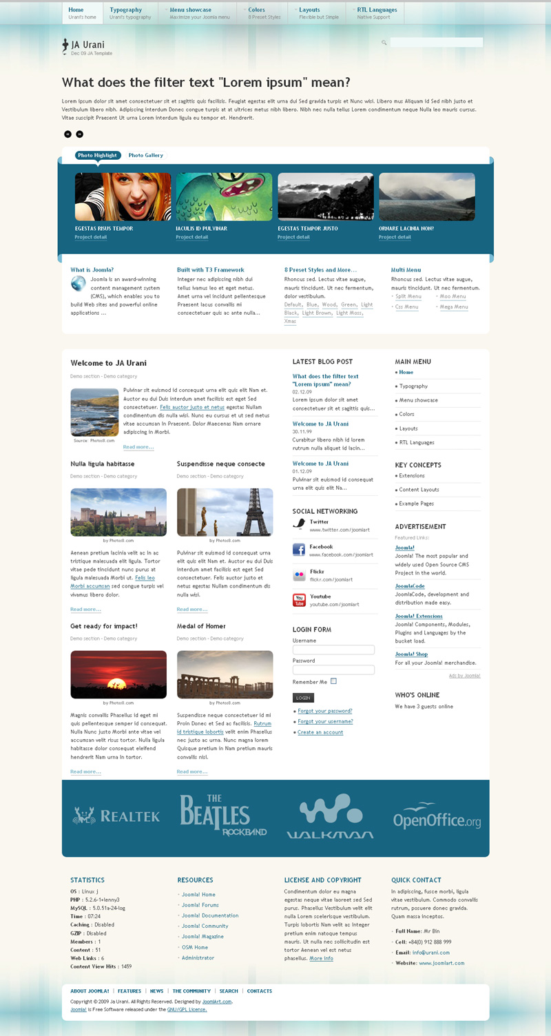
JA Urani is the December Template for JATC Club. Looking towards the X-mas month, It also comes with an x-mas special preset option. The preview screenshots are made from the live site and Live Demo and Downloads are available.
1. X-mas – View High Resolution image HERE.

2. Blue – View High Resolution image HERE.
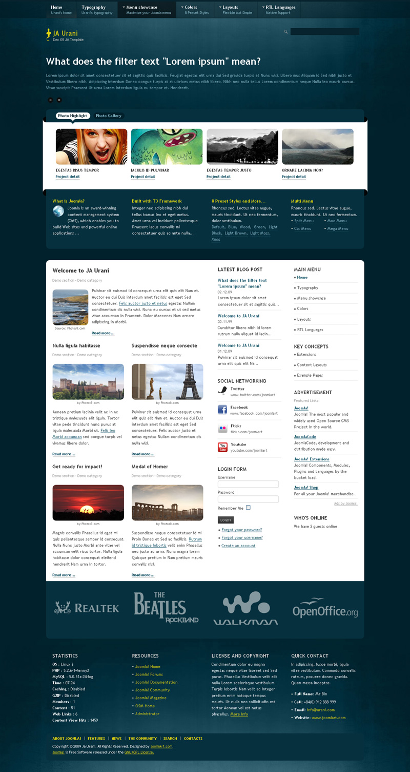
3. Black – View High Resolution image HERE.
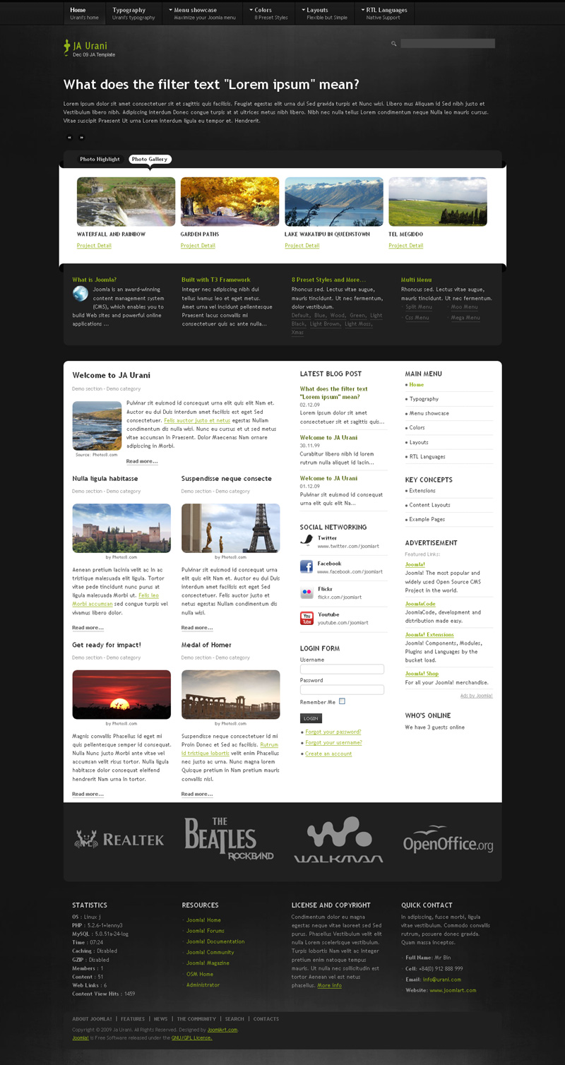
4. Green – View High Resolution image HERE.
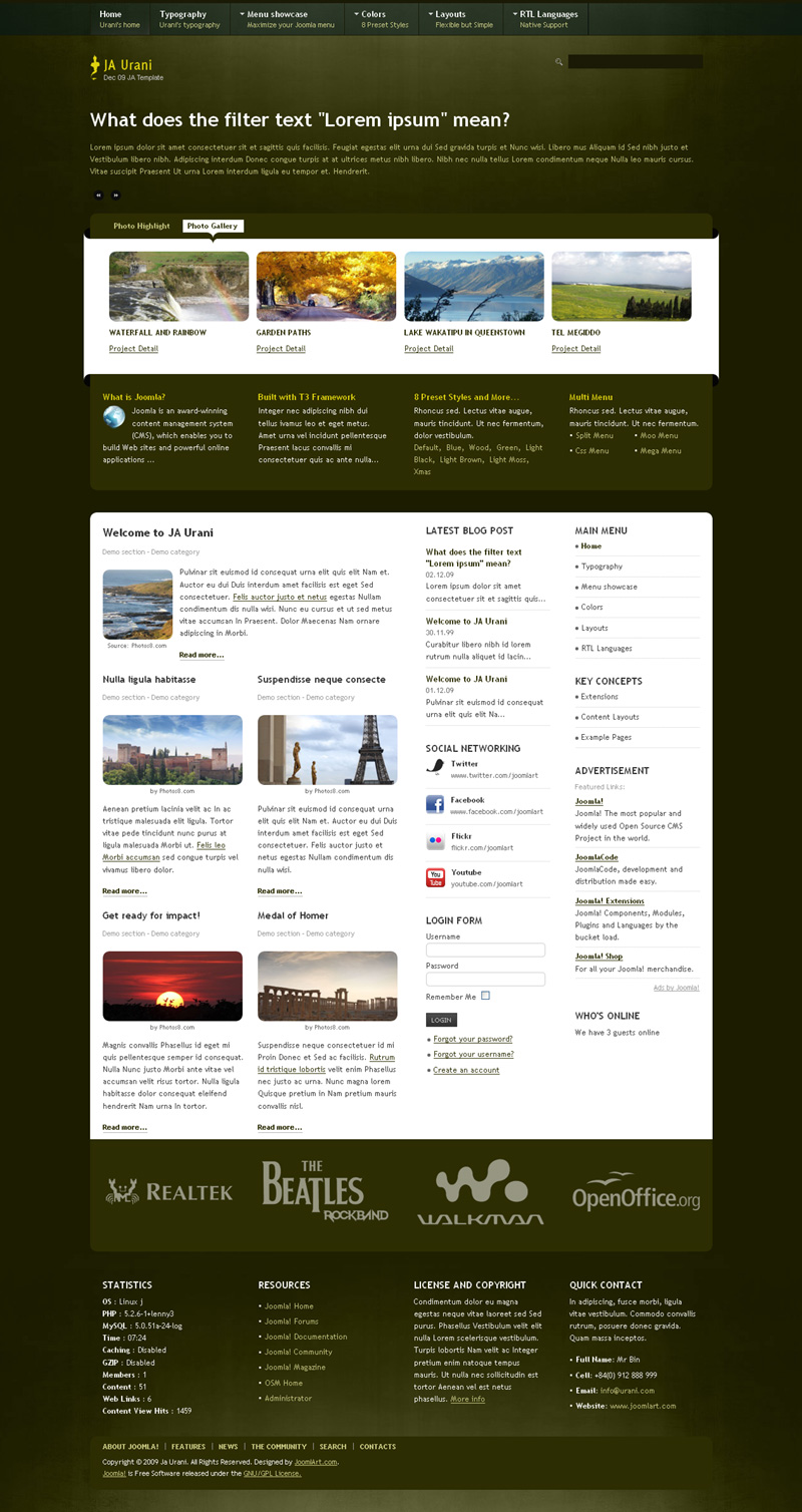
5. Wood – View High Resolution image HERE.
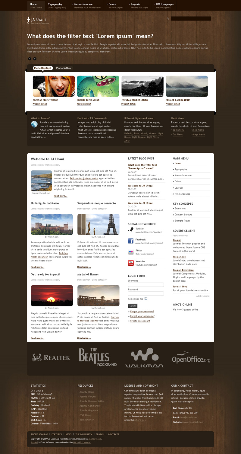
6. Light Black – View High Resolution image HERE.
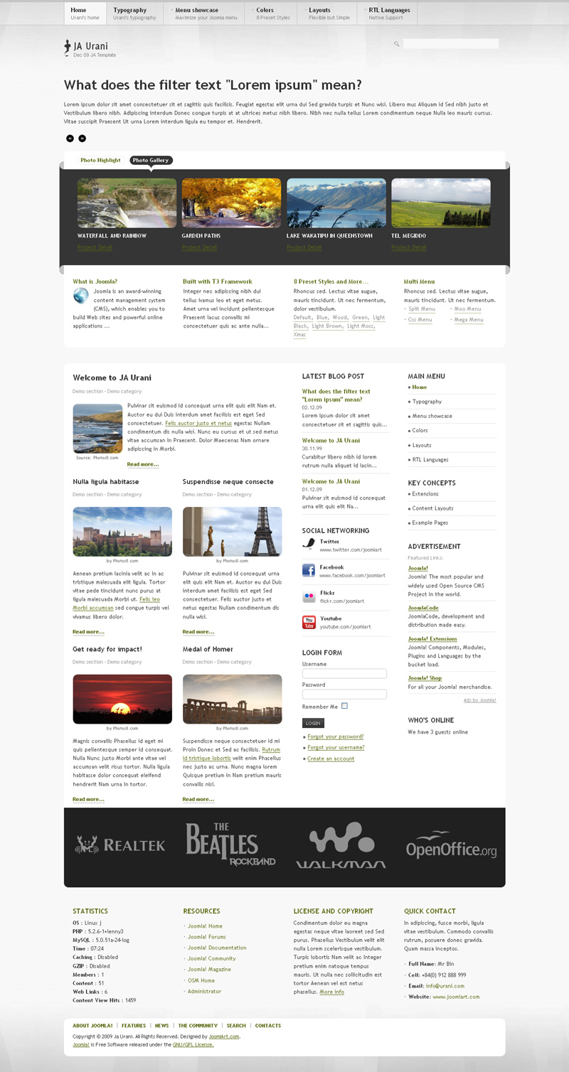
7. Light brown – View High Resolution image HERE.

8. Light Moss – View High Resolution image HERE.
Hung Dinh
5 users say Thank You to Hung Dinh for this useful post
December 7, 2009 at 9:22 am #325892Very nice 🙂
filser Friend
filser
- Join date:
- September 2008
- Posts:
- 4
- Downloads:
- 0
- Uploads:
- 0
- Thanked:
- 4 times in 1 posts
December 7, 2009 at 10:48 am #325908This is VERY promising ! Very nice color layouts ! Keep up the good work !
codestream Friend
codestream
- Join date:
- January 2007
- Posts:
- 31
- Downloads:
- 0
- Uploads:
- 0
- Thanks:
- 14
- Thanked:
- 7 times in 1 posts
December 7, 2009 at 11:51 am #325911Looks pretty nice..
I think you should have made the “Black” style “completely dark” though, just like you made a completely light version… All the template companies seem to be afraid of creating dark themes – yet they are very popular in the creative communities. . .Photographers, artists, musicians, graphic artists, multimedia, etc… They’re all Open source users & advocates that seem to be getting ignored… Now that the new framework is established, addressing this market segment will do wonders for JA market share… The creative community shares information way more rapidly then most…
Looking forward. . .
mihirc Friend
mihirc
- Join date:
- December 2008
- Posts:
- 597
- Downloads:
- 0
- Uploads:
- 3
- Thanks:
- 62
- Thanked:
- 95 times in 39 posts
December 7, 2009 at 1:05 pm #325925wow wow wow!!!
mfcphil Friend
mfcphil
- Join date:
- September 2007
- Posts:
- 2866
- Downloads:
- 3
- Uploads:
- 218
- Thanks:
- 211
- Thanked:
- 388 times in 133 posts
December 7, 2009 at 1:26 pm #325929You know what…I think this is one of those templates that the preview is not going to give full justice.
Got a feeling this will look even better live!! 😉Arvind Chauhan Moderator
Arvind Chauhan
- Join date:
- September 2014
- Posts:
- 3835
- Downloads:
- 74
- Uploads:
- 92
- Thanks:
- 1240
- Thanked:
- 1334 times in 848 posts
December 7, 2009 at 1:43 pm #325933Unlike earlier previews, this preview is from live site. Demo will come up by tomorrow or max day after tomorrow. Downloads will be available almost immediately post demo link.
Arvind
mfcphil Friend
mfcphil
- Join date:
- September 2007
- Posts:
- 2866
- Downloads:
- 3
- Uploads:
- 218
- Thanks:
- 211
- Thanked:
- 388 times in 133 posts
December 7, 2009 at 2:20 pm #325938On a less positive note!!!
Every time I see a great template it does not appear to have the hidden away LOG-IN form….I really hate the old type of log-in box, really wastes good template space!! :((
Arvind Chauhan Moderator
Arvind Chauhan
- Join date:
- September 2014
- Posts:
- 3835
- Downloads:
- 74
- Uploads:
- 92
- Thanks:
- 1240
- Thanked:
- 1334 times in 848 posts
December 7, 2009 at 2:28 pm #325939Guys. Demo is Here.
http://templates.joomlart.com/ja_urani
Xmas theme and megamenu will be updated tomorrow. Seems to be some problem with it.
Arvind
December 7, 2009 at 2:40 pm #325941This looks to be quite promising. I am really looking forward to being able to install and explore this one.
thatcomputerdude Friend
thatcomputerdude
- Join date:
- December 2008
- Posts:
- 280
- Downloads:
- 0
- Uploads:
- 9
- Thanks:
- 67
- Thanked:
- 32 times in 1 posts
December 7, 2009 at 3:01 pm #325942Outstanding work, JA Team!
amitkn Friend
amitkn
- Join date:
- April 2008
- Posts:
- 20
- Downloads:
- 0
- Uploads:
- 0
- Thanks:
- 5
- Thanked:
- 3 times in 1 posts
December 7, 2009 at 4:59 pm #325952Congratulations for Joomlart.
I’m just thinking how someone can create such good-looking and such appealing Template ?
And the recent templates from Joomlart, have more then one colour choice…
Another thing I noticed, is that 3 column Templates are out of fashion….but the left module position is still there…and this Look is much better than other.
Keep up the good work.Amit
 TomC
Moderator
TomC
- Join date:
- October 2014
- Posts:
- 14077
- Downloads:
- 58
- Uploads:
- 137
- Thanks:
- 948
- Thanked:
- 3155 times in 2495 posts
December 7, 2009 at 6:33 pm #325960mfcphil;155941On a less positive note!!!
Every time I see a great template it does not appear to have the hidden away LOG-IN form….I really hate the old type of log-in box, really wastes good template space!! :((
I agree with you on this one, Phil. JA has their cool “JA Login” module that they don’t seem to use all that much. I’ve had to integrate it myself into the templates I work with – and not without glitches that had to be addressed.
It’s a great “real estate saving” module – not to mention a nice little effect.
I wonder why JA doesn’t offer it as an option more often.P.S.
(It is a nice looking template with some cool graphical elements. Not something I will likely use, but a nice addition to the JA library nonetheless). TomC
Moderator
TomC
- Join date:
- October 2014
- Posts:
- 14077
- Downloads:
- 58
- Uploads:
- 137
- Thanks:
- 948
- Thanked:
- 3155 times in 2495 posts
December 7, 2009 at 6:37 pm #325961codestream;155909Looks pretty nice..
I think you should have made the “Black” style “completely dark” though, just like you made a completely light version… All the template companies seem to be afraid of creating dark themes – yet they are very popular in the creative communities. . .VERY easy to modify within the CSS – basically, just a tweak of a small handful of “background color” styles.
😎
prakash Friend
prakash
- Join date:
- October 2008
- Posts:
- 439
- Downloads:
- 0
- Uploads:
- 1
- Thanks:
- 2
- Thanked:
- 146 times in 115 posts
December 8, 2009 at 2:41 am #325985With regards the query Tom & Phil have raised, I think now with the MegaMenu, this can be easily achieved by calling the Login Form inside the mega menu where ever you want.
Though the earlier version of Login is great, I think with MegaMenu this would give better flexibility that if it were integrated like the previous Login Menu.
<em>@tcraw1010 155971 wrote:</em><blockquote>
Quote:
Originally Posted by mfcphil
On a less positive note!!!Every time I see a great template it does not appear to have the hidden away LOG-IN form….I really hate the old type of log-in box, really wastes good template space!!
I agree with you on this one, Phil. JA has their cool “JA Login” module that they don’t seem to use all that much. I’ve had to integrate it myself into the templates I work with – and not without glitches that had to be addressed.
It’s a great “real estate saving” module – not to mention a nice little effect.
I wonder why JA doesn’t offer it as an option more often.P.S.
(It is a nice looking template with some cool graphical elements. Not something I will likely use, but a nice addition to the JA library nonetheless).
</blockquote> -
AuthorPosts
This topic contains 21 replies, has 15 voices, and was last updated by godil 15 years ago.
We moved to new unified forum. Please post all new support queries in our New Forum

