-
AuthorPosts
-
August 23, 2016 at 7:43 am #962293
JA_Intranet – collapse navigation for small screens off mode on default layout only removes the icons not the menu canvas but on wall layout it works fine. I’ve tested this on your quick-start and our development site. How can I remove the canvas and make all layouts work correctly to their settings?
Saguaros Moderator
Saguaros
- Join date:
- September 2014
- Posts:
- 31405
- Downloads:
- 237
- Uploads:
- 471
- Thanks:
- 845
- Thanked:
- 5346 times in 4964 posts
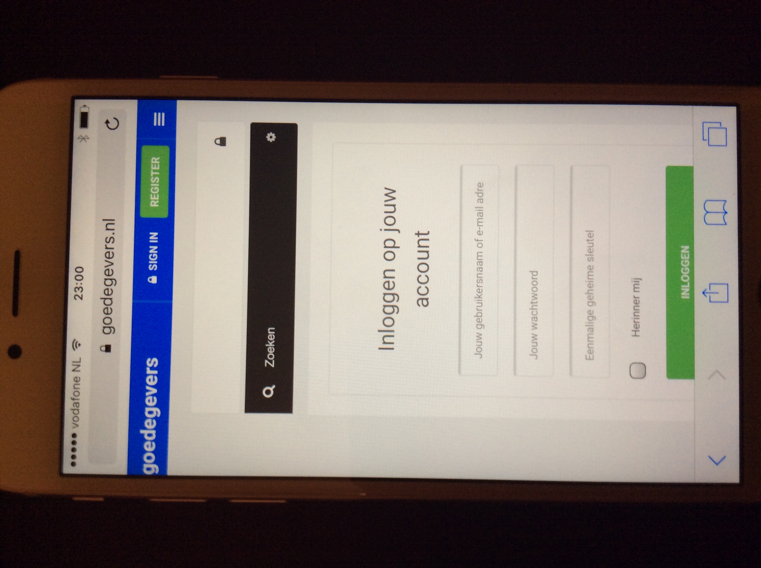
August 29, 2016 at 9:08 pm #963950I think I have the same issue. Please have a look at the attachment. The login form that shows on the picture is not in the middle. It is a bit too much to the right.
It is solved when I login, but when I logout it is off again.How can it be fixed?
thanks.
Saguaros
- Join date:
- September 2014
- Posts:
- 31405
- Downloads:
- 237
- Uploads:
- 471
- Thanks:
- 845
- Thanked:
- 5346 times in 4964 posts
August 30, 2016 at 1:34 am #964052You can provide the URL and login info of your site via private reply, I will check for you.
August 30, 2016 at 8:04 pm #964348This reply has been marked as private.Saguaros
- Join date:
- September 2014
- Posts:
- 31405
- Downloads:
- 237
- Uploads:
- 471
- Thanks:
- 845
- Thanked:
- 5346 times in 4964 posts
September 1, 2016 at 9:24 am #964850It’s weird as when I logout, the form still looks good, check attached screenshot.
September 4, 2016 at 9:49 am #965433Sorry, I was working on the website and did put Collapse navigation for small screens to On. Now it is Off and you can see that the login form is not in the middle. See screenshot of my post of August 29, 2016 at 9:08 pm.
I would like to;
For mobile: use off canvas menu only, with a fixed header.
For tablet: use off canvas menu and mainmenu.My questions are;
1a- Set Collapse navigation for small screens to On and hide the mainnav for mobile. Or 1b, set Collapse navigation for small screens to Off and use mainnav for tablet. How can I do 1a or 1b?
2- The header is not fixed on mobile view. On tablet and desktop view there is fixed header, which is good. How can I get a fixed header for mobile view also?
Thanks!Thanks
September 5, 2016 at 5:19 am #965631I have tried every option to hide .mCustomScrollBox on mobiles but nothing seems to work.
Saguaros
- Join date:
- September 2014
- Posts:
- 31405
- Downloads:
- 237
- Uploads:
- 471
- Thanks:
- 845
- Thanked:
- 5346 times in 4964 posts
September 6, 2016 at 7:13 am #965974In the template manager section, you will see Navigation tab and Add-ons tab. In Navigation tab, you can have option to enable collapse nav for small screen and option to enable Off-canvas under Add-ons tab.
To have sticky header in mobile, you can use this rule:
@media (max-width: 767px) {
  .t3-header {
    position: fixed;
  }
}
1 user says Thank You to Saguaros for this useful post
AuthorPostsViewing 9 posts - 1 through 9 (of 9 total)This topic contains 8 replies, has 3 voices, and was last updated by
Saguaros 8 years, 3 months ago.
We moved to new unified forum. Please post all new support queries in our New Forum
Jump to forum

