Viewing 4 posts - 1 through 4 (of 4 total)
-
AuthorPosts
-
September 26, 2016 at 8:55 pm #971176
Hi,
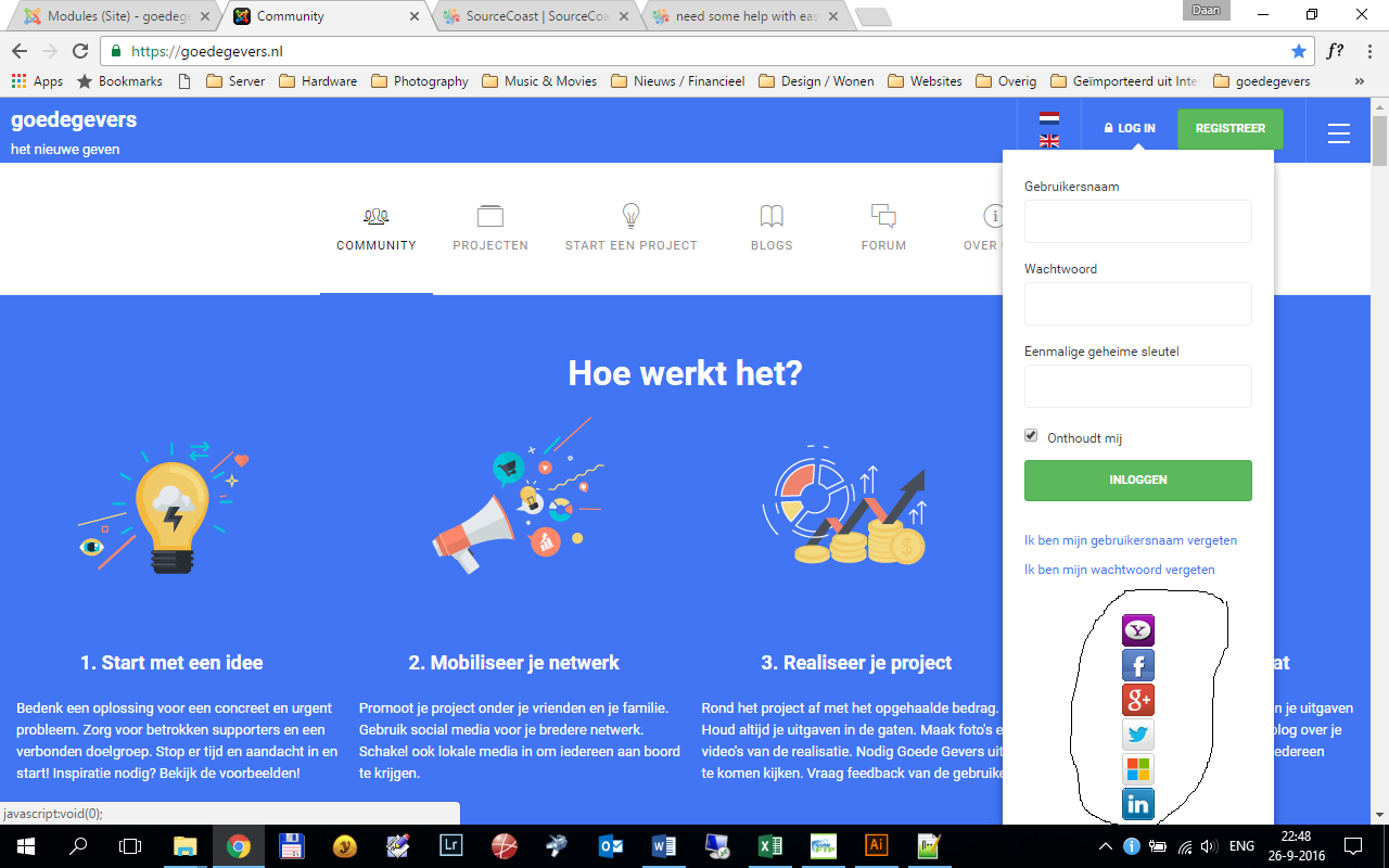
I have a question about styling. Please have a look at the attachment. Can you advise how to display the jfbconnect buttons in a horizontal way instead of vertically?
Thanks
Saguaros Moderator
Saguaros
- Join date:
- September 2014
- Posts:
- 31405
- Downloads:
- 237
- Uploads:
- 471
- Thanks:
- 845
- Thanked:
- 5346 times in 4964 posts
September 27, 2016 at 8:03 am #971361Hi
You can try this tweak:
- Go to file: ROOT/templates/ja_intranet/css/custom.css (create this file if it doesn’t exist)
- Add this css rule:
.jfbconnect-wrapper .login .social-login {
display: inline;
}
1 user says Thank You to Saguaros for this useful post
September 27, 2016 at 9:19 pm #971509Thanks that worked great!
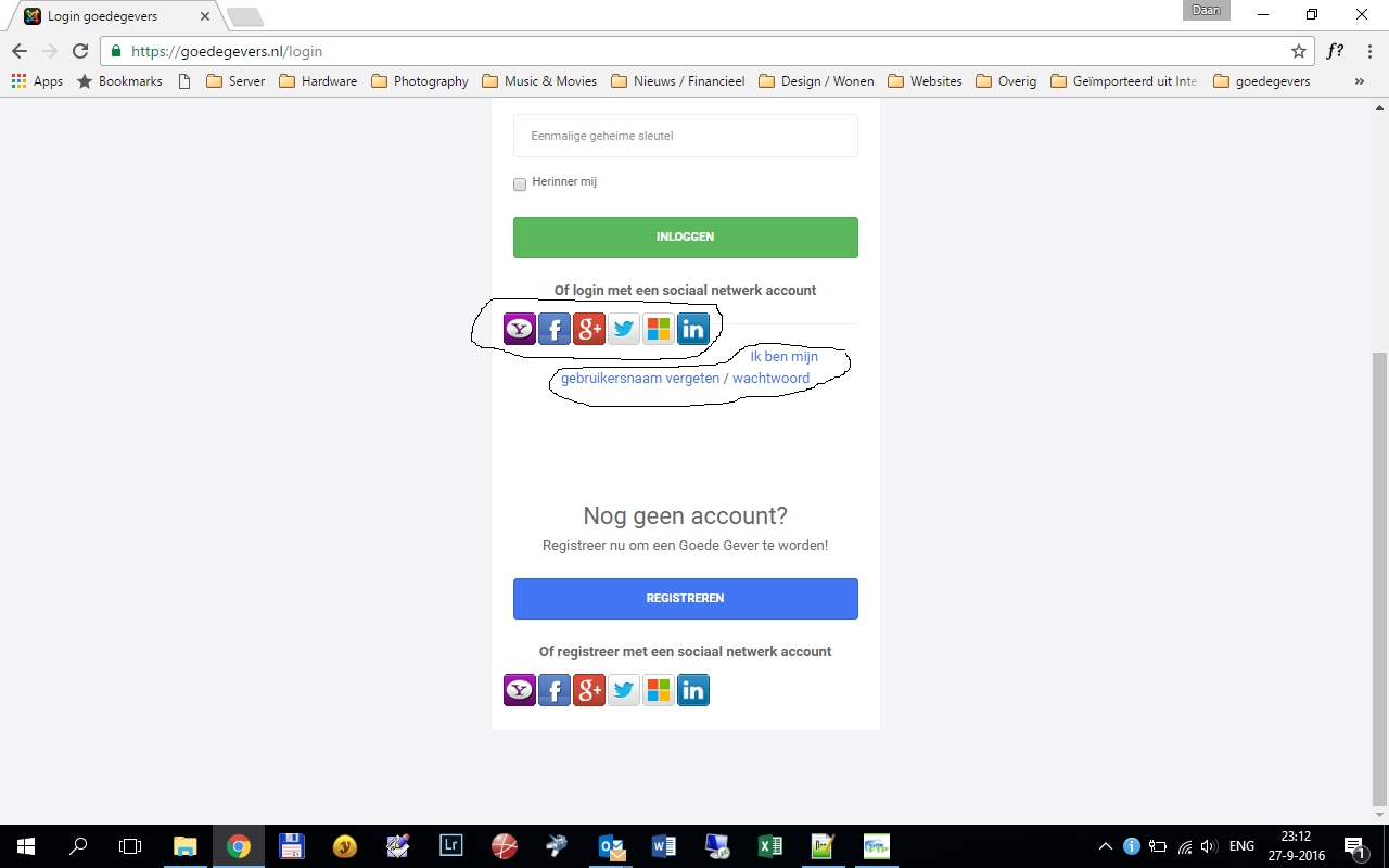
Would it be just as easy to have the buttons centered in the login template as well?
And to start the text "Ik ben mijn gebruikersnaam…" on a new line?
Please see the attachment.Thanks.
Saguaros Moderator
Saguaros
- Join date:
- September 2014
- Posts:
- 31405
- Downloads:
- 237
- Uploads:
- 471
- Thanks:
- 845
- Thanked:
- 5346 times in 4964 posts
September 28, 2016 at 1:50 am #971529You can try with this css rule:
.view-login .jfbconnect-wrapper {
    left: 135px;
    position: absolute;
}
1 user says Thank You to Saguaros for this useful post
AuthorPostsViewing 4 posts - 1 through 4 (of 4 total)This topic contains 3 replies, has 2 voices, and was last updated by
Saguaros 8 years, 2 months ago.
We moved to new unified forum. Please post all new support queries in our New Forum
Jump to forum


