-
AuthorPosts
-
filmlover Friend
filmlover
- Join date:
- March 2013
- Posts:
- 14
- Downloads:
- 0
- Uploads:
- 2
- Thanks:
- 3
- Thanked:
- 2 times in 1 posts
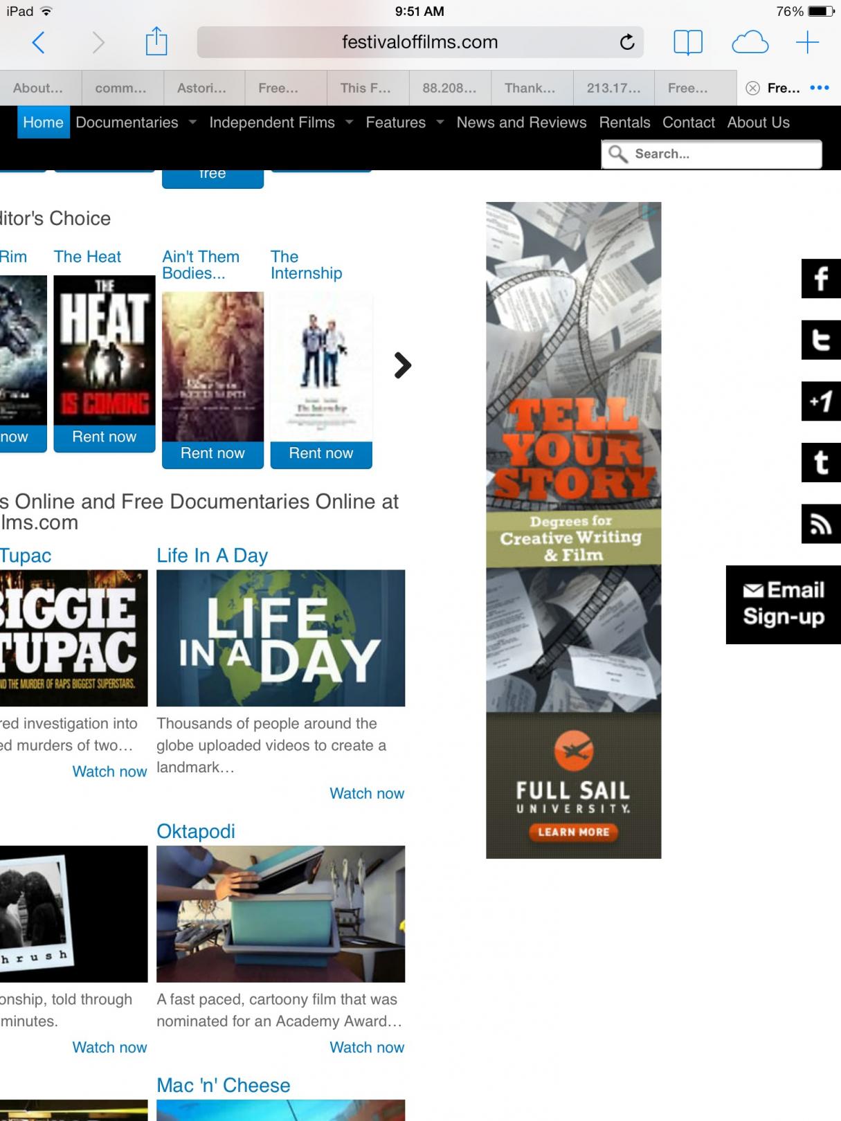
November 19, 2013 at 7:54 pm #192395festivaloffilmsdotcom displays correctly in testing online, but is not displaying correctly on the actual ipad device in portrait mode (768×1024). Please see attached screen shots and advise.
Thanks,
Filmlover-
phong nam Friend
phong nam
- Join date:
- May 2015
- Posts:
- 3779
- Downloads:
- 1
- Uploads:
- 587
- Thanks:
- 499
- Thanked:
- 974 times in 888 posts
November 20, 2013 at 8:04 am #512814Hi Filmlover,
Thank you for making the snapshots. However, can you tell me more clear what are the problems with your T3 blank site on iPad portrait view and how do you want to achieve ? By that way, we can give you more accurate suggestion in this case.
filmlover Friend
filmlover
- Join date:
- March 2013
- Posts:
- 14
- Downloads:
- 0
- Uploads:
- 2
- Thanks:
- 3
- Thanked:
- 2 times in 1 posts
December 11, 2013 at 10:58 pm #515145I’m guessing what I need to do is change the breakpoint for for small and regular tablets to display the collapsed nav menu under 800px. How do I do that?
phong nam Friend
phong nam
- Join date:
- May 2015
- Posts:
- 3779
- Downloads:
- 1
- Uploads:
- 587
- Thanks:
- 499
- Thanked:
- 974 times in 888 posts
December 12, 2013 at 3:19 am #515170Hi,
On our T3 templates (i.e T3 blank), the collapsed menu will automatically display on the device screens under 767px with the off-canvas turned off.
However, the portrait view of iPad width is 768px, the template still displays the desktop view layout with normal navigation. And we do integrate the Boostrap responsive feature on our T3 system plugin, so that it will not good idea to override the default feature of our framework on template.
austenn01 Friend
austenn01
- Join date:
- August 2010
- Posts:
- 175
- Downloads:
- 115
- Uploads:
- 14
- Thanked:
- 33 times in 1 posts
December 19, 2013 at 11:28 pm #516003<em>@Leo Burnetts 398653 wrote:</em><blockquote>Hi Filmlover,
Thank you for making the snapshots. However, can you tell me more clear what are the problems with your T3 blank site on iPad portrait view and how do you want to achieve ? By that way, we can give you more accurate suggestion in this case.</blockquote>
Not to be rude, but its clear that ONE of the issues is that the template doesn’t FIT on the iPad…IE: you can clearly see that parts of the website are being cut off (missing) of the left and right.
phong nam Friend
phong nam
- Join date:
- May 2015
- Posts:
- 3779
- Downloads:
- 1
- Uploads:
- 587
- Thanks:
- 499
- Thanked:
- 974 times in 888 posts
December 20, 2013 at 3:10 am #516020Hi,
This issue is caused the big width of the Google Adsense ads on the right sidebar when it pushes the website body to left. As you can see that this ads format is flash type so that it can not be forced to be responsive as normal image.
In this case, it will be better when you can reduce the width of that ads like its beneath Google ads or remove it.
AuthorPostsViewing 6 posts - 1 through 6 (of 6 total)This topic contains 6 replies, has 3 voices, and was last updated by
phong nam 11 years ago.
We moved to new unified forum. Please post all new support queries in our New Forum
Jump to forum


