-
AuthorPosts
-
November 26, 2015 at 8:23 am #756311
After almost a year of blood, sweat and tears, we are proud to present our latest masterpiece, the JoomlArt 3.0 site. This is a major change in both our backend and frontend user experience. With hand on heart I can say this is the beginning of a new era for JoomlArt where we will endeavour to bring you the best products and support experience available.
We have a more friendly forum
1. Beautiful and simple UI
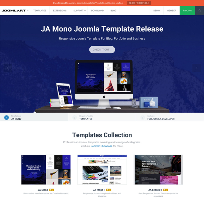
New UI of JoomlArt 2016
All new user experience with a simple and efficient design. Every aspect has been re-designed to give you ease of navigation, information-rich view, and lot of time saving features in our stunning new forum.
2. Brand new forum interface and tools
2.1. Easy navigation system
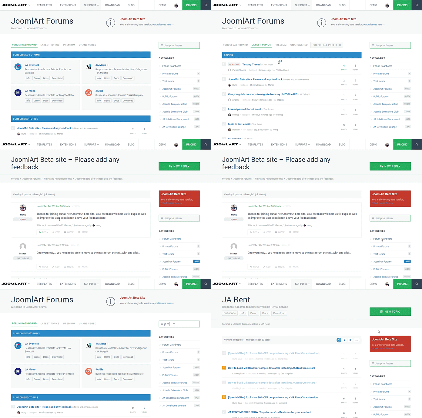
2.2. Clean and intuitive concept
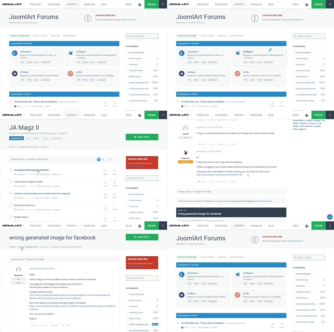
2.3. Improved support for our customers
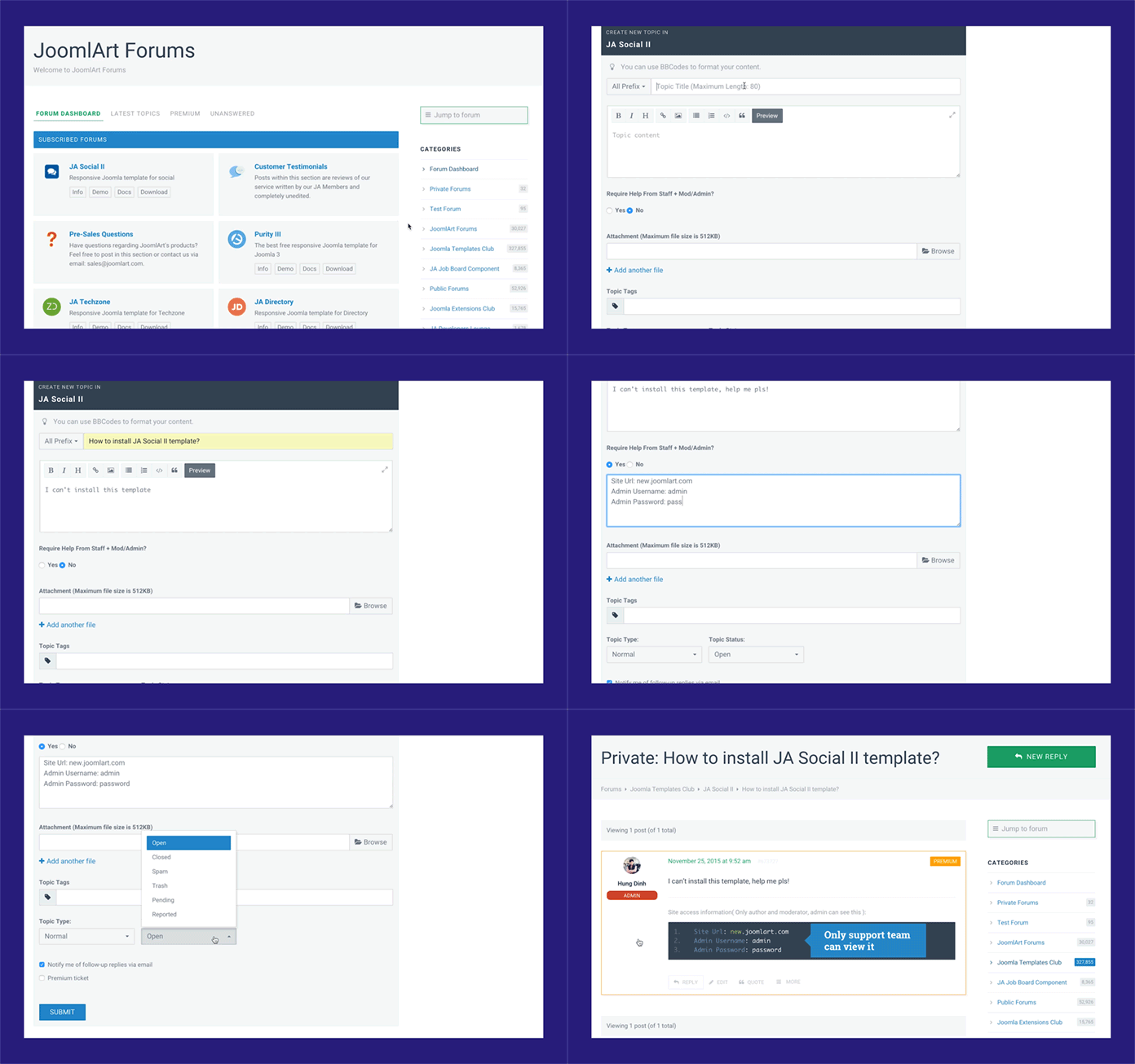
The navigation system has been redesigned with a better structure for quick access to all areas of the forum. With ease of access to your subscribed threads, no longer will you have to wade through many pages to your posts. We are also proud to introduce a new and intuitive way to quickly submit your topic to the forum and the new ticket system. Security for your precious support information has all been taken care of in our new system.
3. Instant search results for the whole page
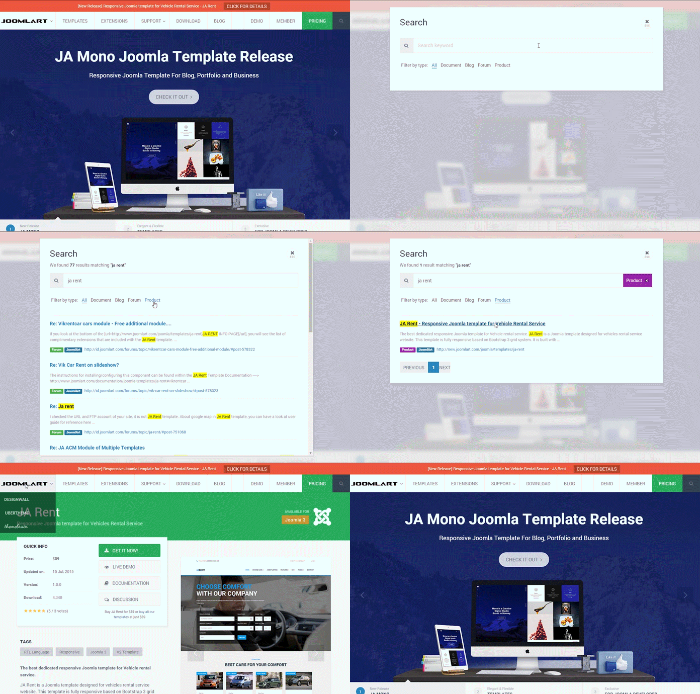
We use the “Elastic Search Engine” to help you find the most relevant results with ease and speed.
4. New Download Manager
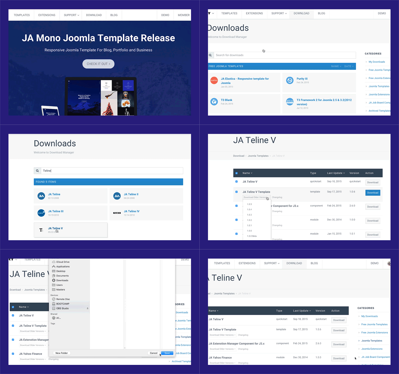
Our new and improved download dashboard makes all our downloads just a click away. With all file and download information in one clean view no longer is it a chore to get the files you need.
5. Beautiful user profile
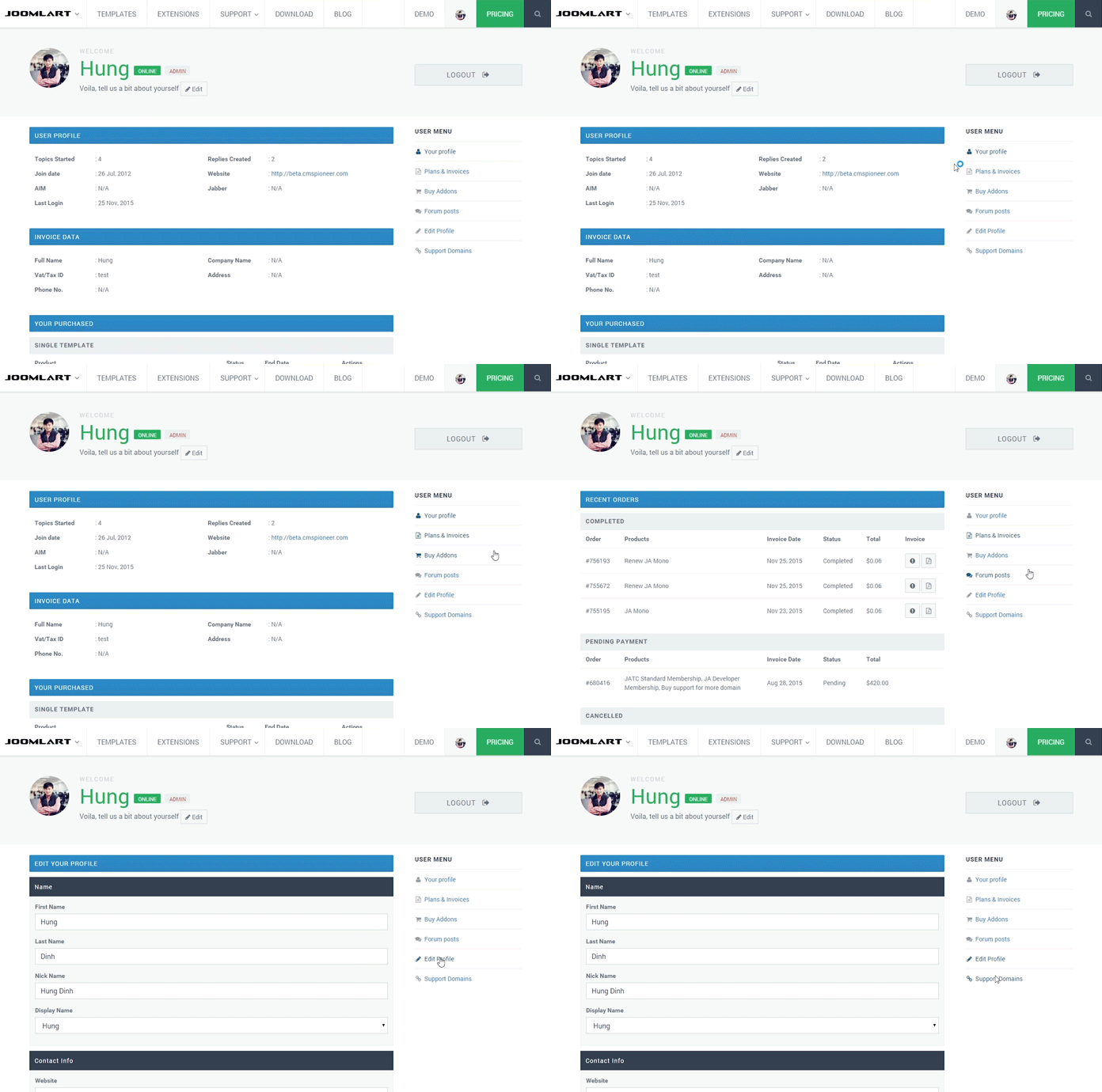
Improved membership plans bringing better value than ever.

New pricing and membership plans of JoomlArt 2016
6. Flexible Single purchases
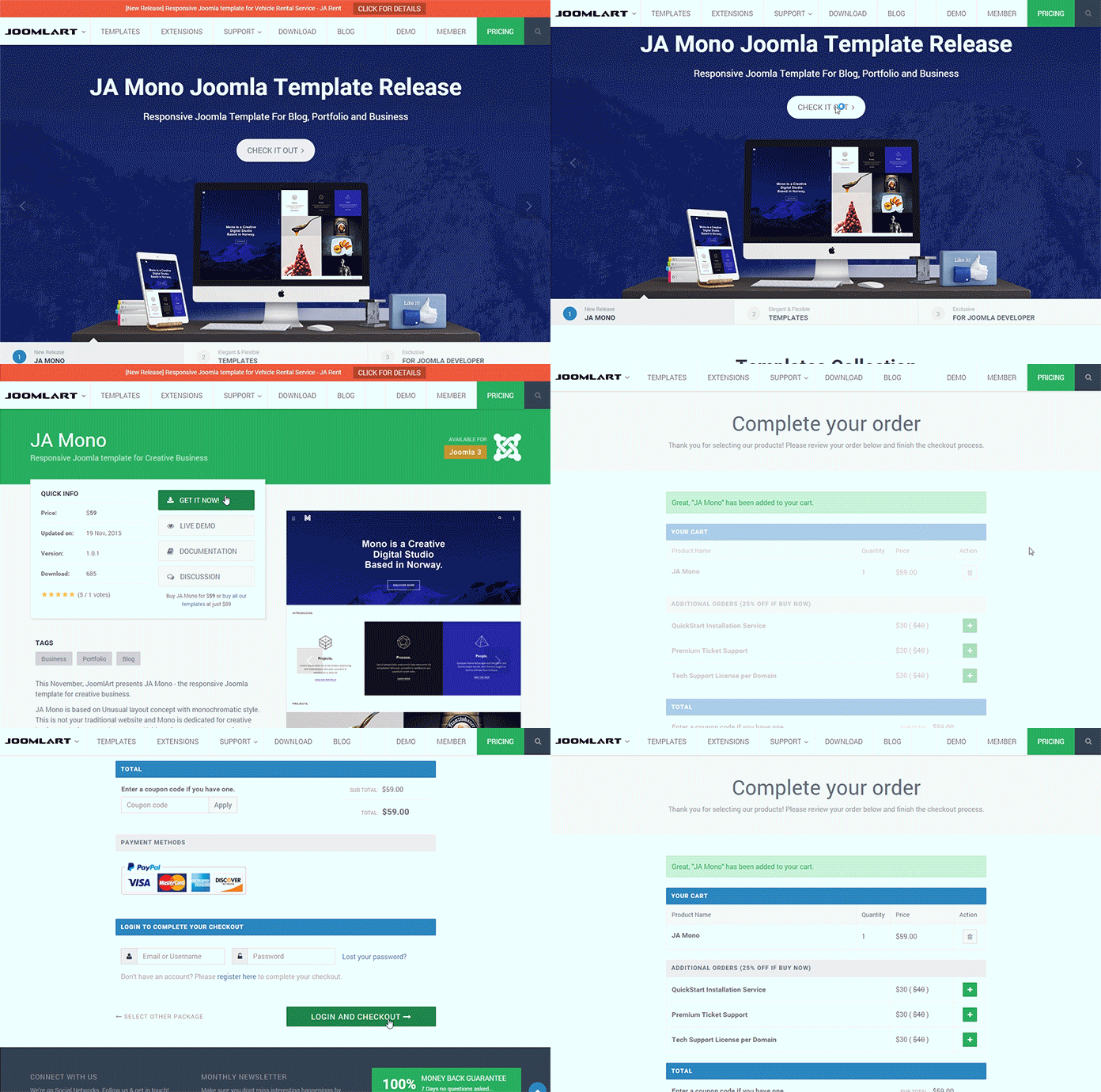
Single template purchase are now available from the product details page.
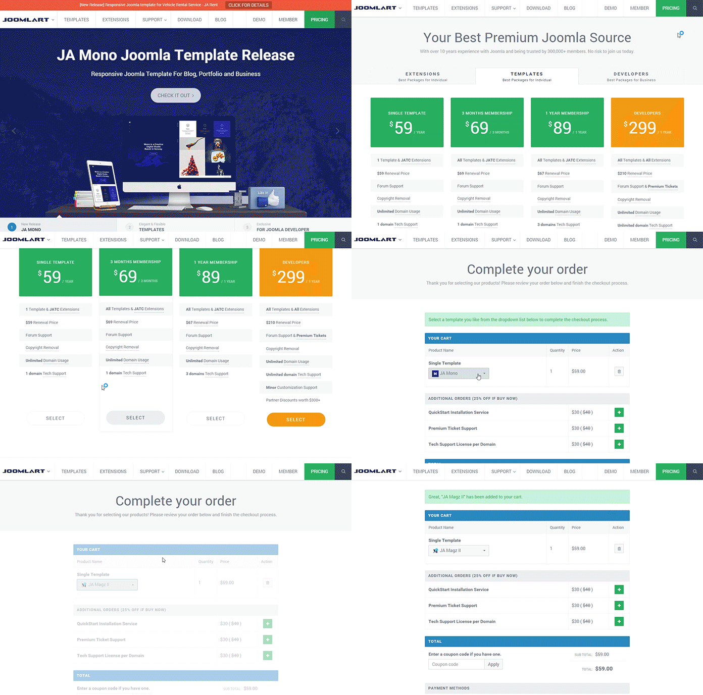
Or, via the pricing page with single template option to checkout
7. Premium Tickets
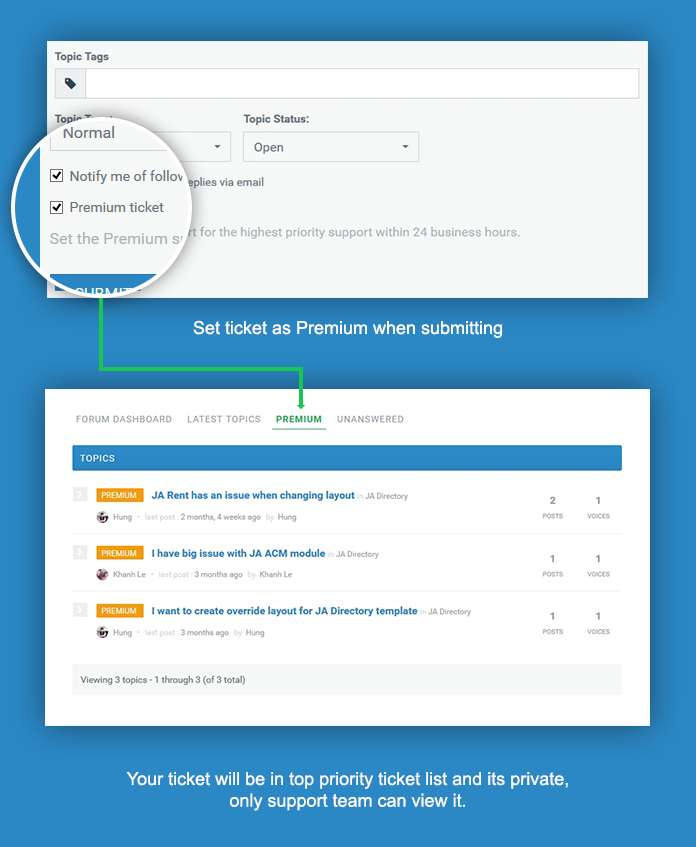
Developer members can now avail themselves of our “Premium Ticket System” as a special benefit that developer subscription brings.
8. Free to remove Copyrights and unlimited domain usage
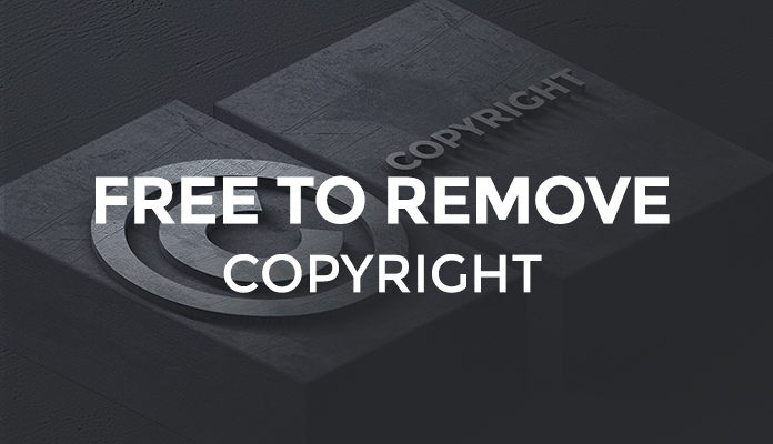
Finally, you no longer have to purchase copyright removal and with unlimited domain usage membership has never been better value.
9. Technical domain support license
With unlimited domain usage we do not want to overload our support teams and consequently affect our customers. As such we now limit support to registered domains depending on your level of membership. This will allow us to provide the best level of support to all eligible members while reducing the resolution time.
10. Multiple login – Coming soon
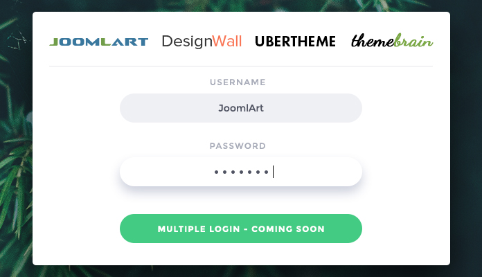
That’s 10 things you need to know about JoomlArt 3.0. We would love you to join us in a bright new future for JoomlArt and our customers.
November 26, 2015 at 9:53 am #756761Please let me know how do you feel with this new version of JoomlArt 3.0 🙂
So that we can better keep track of bugs, kindly report bugs/issues at this thread
http://id.joomlart.com/forums/topic/joomlart-beta-site-please-add-any-feedback/November 26, 2015 at 7:15 pm #756835Best wishes! It looks nice, frienly it is always better.
November 26, 2015 at 7:23 pm #756836Looks Great. It not only is very clean, easy to navigate with a clear sense of direction but the performance is phenomenal! I think it is safe to say that your old/current site was a bit tough to get around and the look was somewhat overwhelming. Now you have one of the cleanest sites joomla shops out there! Great job to everyone that was involved.
daveburstein Friend
daveburstein
- Join date:
- December 2013
- Posts:
- 125
- Downloads:
- 227
- Uploads:
- 22
- Thanks:
- 43
- Thanked:
- 12 times in 2 posts
November 26, 2015 at 7:27 pm #756837The improvement of the interface is welcome, but the real strength of Joomlart is the speed and quality of the responses. Most of the time I get answers within 12 hours; the other day, my answer came in 12 minutes.
One suggestion: Put dates on the documentation. Several times I’ve been very confused by outdated docs. In particular, the docs the support people link should be current.
Of course having all the docs current would be even better.
November 26, 2015 at 7:32 pm #756840Congratulations.. very nice UX .. clean … i like it…
Just one point : some docs like this page http://new.joomlart.com/docume… … we cant access the all right menu if the resolution of my monitor is normal (Height 768px) …
See here the issue http://awesomescreenshot.com/0…Congrtulations again
 mediaoff
Friend
mediaoff
- Join date:
- November 2015
- Posts:
- 13
- Downloads:
- 26
- Uploads:
- 3
- Thanks:
- 3
- Thanked:
- 1 times in 1 posts
November 26, 2015 at 7:44 pm #756843I love the new streamlined design! Navigating the site with the previous design was sort of "good luck in finding it…". Also on mobile devices it has improved a lot! The design reflects a lot the new type of templates you stand for.
Congrats!
November 26, 2015 at 7:56 pm #756844I like what has been offered here. I’ve been a customer for years now and appreciate everything you offer and support!
James G Friend
James G
- Join date:
- September 2014
- Posts:
- 130
- Downloads:
- 104
- Uploads:
- 4
- Thanks:
- 20
- Thanked:
- 40 times in 6 posts
November 26, 2015 at 7:59 pm #756845So far it looks very good.
I have taken a look around and everything seems smooth and easy to find.I have had doubts recently about how you have dealt with the released templates to users like myself but hopefully now you can push on from here and bring us a variety of better templates.
I will take another look tomorrow to see if theres any bugs or suggestions for improvements.
November 26, 2015 at 8:15 pm #756846Hi,
First of all, congratulations for the amazing job !
UI feels clean, fluid and responsive.
I work with your products for 2 years, and will work on 🙂 !
Regards.
Alainjp Friend
jp
- Join date:
- April 2012
- Posts:
- 105
- Downloads:
- 14
- Uploads:
- 32
- Thanks:
- 32
- Thanked:
- 5 times in 2 posts
November 26, 2015 at 8:50 pm #756847Like it!
Don’t see any faults but have a suggestion
The download page. Can there be an option to sort latest templates and not latest update?
I enjoy the new forum layout. instant access to my (subscribed) post
Regards
jpbaetens_b Friend
baetens_b
- Join date:
- August 2006
- Posts:
- 7
- Downloads:
- 22
- Uploads:
- 1
- Thanks:
- 2
- Thanked:
- 2 times in 1 posts
November 26, 2015 at 9:29 pm #756848This reply has been marked as private. kernel64
Friend
kernel64
- Join date:
- January 2007
- Posts:
- 41
- Downloads:
- 206
- Uploads:
- 1
- Thanks:
- 3
- Thanked:
- 13 times in 4 posts
November 26, 2015 at 9:42 pm #756849Nice and clean design. Indeed a 3.0 version, ready for the next level. Keep it up 🙂
November 26, 2015 at 10:08 pm #756851Love the new design, have been member since 2009. Joomlart has always been one of my favorites. I think it is now time to buy the developer membership.
Keep up the great work.
Thanks
 thefc_uk
Friend
thefc_uk
- Join date:
- May 2007
- Posts:
- 143
- Downloads:
- 89
- Uploads:
- 15
- Thanks:
- 55
- Thanked:
- 20 times in 2 posts
November 27, 2015 at 12:18 am #756874Great improvement and nice to see Joomlart using a style of template and technology of your latest designs ?
I’ll take a good look round and note any issues I find.
Welcome to 3.0!
-
AuthorPosts
This topic contains 82 replies, has 62 voices, and was last updated by ![]() timtecsa 8 years, 11 months ago.
timtecsa 8 years, 11 months ago.
We moved to new unified forum. Please post all new support queries in our New Forum

