-
AuthorPosts
-
June 15, 2016 at 5:28 am #940682
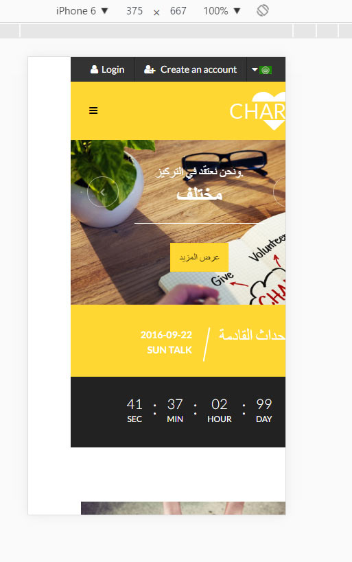
It is a problem, when opening template on mobile in RTL mode (Chrome):
there is a padding at the left (all the content moved to the right). When you start scrolling content moves as it should be
It can be simply reproduces on demo version (chrome, small screen size, Arabic language and reload the page).
Anybody knows how to solve it?
 Pankaj Sharma
Moderator
Pankaj Sharma
- Join date:
- February 2015
- Posts:
- 24589
- Downloads:
- 144
- Uploads:
- 202
- Thanks:
- 127
- Thanked:
- 4196 times in 4019 posts
June 15, 2016 at 5:39 am #940684Hi
Could u check it again and refresh the page after selecting mobile view .
It seems fine : http://prntscr.com/bgjrgl
Also check the same in real devices.June 15, 2016 at 5:49 am #940687Yes,
I checked it again on real device in Chrome mobile,
it loads with left padding,
after I start scrolling (or resize the page by rotation the device) all the content "jumps" as it should be.The same in chrome on the computer (and in Opera also).
 Pankaj Sharma
Moderator
Pankaj Sharma
- Join date:
- February 2015
- Posts:
- 24589
- Downloads:
- 144
- Uploads:
- 202
- Thanks:
- 127
- Thanked:
- 4196 times in 4019 posts
June 15, 2016 at 8:47 am #940737Hi I sent the report to JA Development team for further investigation and fix. I will inform you here once i get response from concern team . Thanks for reporting this issue .
Update :
You can track it here : http://pm.joomlart.com/browse/JACHARITY-111
It will be fixed in next version of template . Pankaj Sharma
Moderator
Pankaj Sharma
- Join date:
- February 2015
- Posts:
- 24589
- Downloads:
- 144
- Uploads:
- 202
- Thanks:
- 127
- Thanked:
- 4196 times in 4019 posts
July 13, 2016 at 11:50 am #949716Hi
the issue is fixed and will be added the fix in the next version of template .
Meanwhile ,You can add below hotfix in your custom.css file@media screen and (max-width: 767px) { div.t3-wrapper { overflow: hidden; } }Regards
AuthorPostsViewing 5 posts - 1 through 5 (of 5 total)This topic contains 4 replies, has 2 voices, and was last updated by
 Pankaj Sharma 8 years, 4 months ago.
We moved to new unified forum. Please post all new support queries in our New Forum
Left padding on mobile
Viewing 5 posts - 1 through 5 (of 5 total)


