-
AuthorPosts
-
 carlosboni
Friend
carlosboni
- Join date:
- October 2016
- Posts:
- 16
- Downloads:
- 38
- Uploads:
- 11
- Thanks:
- 7
- Thanked:
- 1 times in 1 posts
November 15, 2017 at 10:50 am #1074525Hello,
I´m using JA-Builder from scratch.
When using a Header 5.5, I want to customize the logo so that it spreads below the menu row. I have a big logo and if it completely fits into the header module it scales down and can´t be read.You can see here the desired appearence at https://www.worldwildlife.org/
My page is https://savethechildren-zika.org/I appreciate your help.
Thankyou, Pankaj Sharma
Moderator
Pankaj Sharma
- Join date:
- February 2015
- Posts:
- 24589
- Downloads:
- 144
- Uploads:
- 202
- Thanks:
- 127
- Thanked:
- 4196 times in 4019 posts
November 16, 2017 at 2:03 am #1074612Hi
In the Builder header, you can set the logo height from settings.
On your site the menu items are more so they appear in the 2nd line and it increases the height of the header. http://prntscr.com/hb1pkg
If you have a big size logo you can add it and I will help you to make it like you show in the example site URL.Regards
VariFrame Friend
VariFrame
- Join date:
- November 2015
- Posts:
- 76
- Downloads:
- 10
- Uploads:
- 1
- Thanks:
- 6
- Thanked:
- 3 times in 2 posts
 carlosboni
Friend
carlosboni
- Join date:
- October 2016
- Posts:
- 16
- Downloads:
- 38
- Uploads:
- 11
- Thanks:
- 7
- Thanked:
- 1 times in 1 posts
November 16, 2017 at 12:13 pm #1074758Hi Pankaj, As you can see now, the layout of the header is fluid, so in my 16:9 monitor it shows the menu in a single line. Even though I didn´t put a height in my logo, it is being reduced. If I put real size (120px tall) then the full header goes wider.
So, I am ready to get your help, please, in order to have the effect shown in WWF web.
AND, also, te remove the white bar between header and images carrousel.. I removed paddings already , the white bar does not show in preview as it does online.
Thanks, Carlos
-
This reply was modified 7 years ago by
 carlosboni.
 Pankaj Sharma
Moderator
Pankaj Sharma
- Join date:
- February 2015
- Posts:
- 24589
- Downloads:
- 144
- Uploads:
- 202
- Thanks:
- 127
- Thanked:
- 4196 times in 4019 posts
November 17, 2017 at 1:54 am #1074846Hi
Open the custom css block in the builder (when u edit the page it will be under custom code)
And add below code.jub-block .navbar-brand>img { min-height: 80px; }save and check.
Regards
VariFrame Friend
VariFrame
- Join date:
- November 2015
- Posts:
- 76
- Downloads:
- 10
- Uploads:
- 1
- Thanks:
- 6
- Thanked:
- 3 times in 2 posts
November 17, 2017 at 11:04 am #1074993This won’t help at all… I tried it but as expected its still a relative position object so the header keeps getting wider with this css script. I wanted to use absolute position – works every time but I am affraid its gonna mess up on different screen resolutions. (that the logo will keep its dimensions but header might not…)
 carlosboni
Friend
carlosboni
- Join date:
- October 2016
- Posts:
- 16
- Downloads:
- 38
- Uploads:
- 11
- Thanks:
- 7
- Thanked:
- 1 times in 1 posts
November 17, 2017 at 12:11 pm #1075013Hi Pankaj,
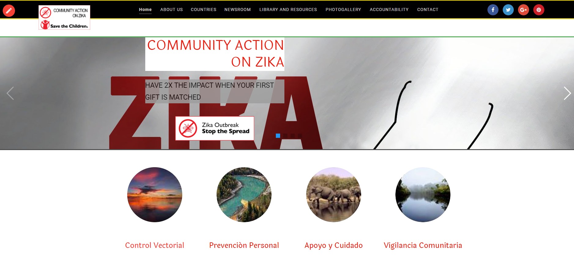
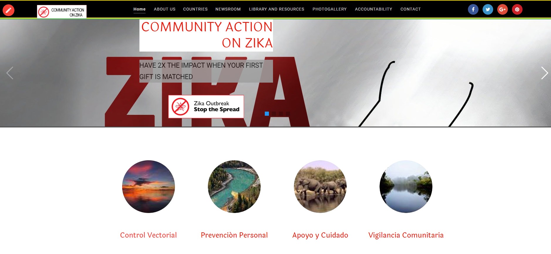
it does not work for me either. I attach 2 screenshots.After your solution, the logo did increased its height, but it is not overlapped onto the CONTAINER-SLIDESHOW module.
I then tried, just to check, to move that container from the content into the heading part of the page, and now the logo is big, but its bottom part is hidden behind the slideshow.
For if it helps, I added colored border on top and bottom (in advanced tag at each module).
Is there a solution for this, to match the "panda" web? https://www.worldwildlife.org/
Thank you,
Carlos-
 Pankaj Sharma
Moderator
Pankaj Sharma
- Join date:
- February 2015
- Posts:
- 24589
- Downloads:
- 144
- Uploads:
- 202
- Thanks:
- 127
- Thanked:
- 4196 times in 4019 posts
November 20, 2017 at 1:46 am #1075195Hi
it’s not an issue of the code, the code is working fine.
space is from the page heading.
Open Menu > Main Menu > Home > Page display > Show page heading > No.
save and check,Regards
1 user says Thank You to Pankaj Sharma for this useful post
 carlosboni
Friend
carlosboni
- Join date:
- October 2016
- Posts:
- 16
- Downloads:
- 38
- Uploads:
- 11
- Thanks:
- 7
- Thanked:
- 1 times in 1 posts
November 20, 2017 at 4:21 am #1075270Thanks Pankaj, it worked!
I appreciate your good support, sorry for my newbie question 🙂 Pankaj Sharma
Moderator
Pankaj Sharma
- Join date:
- February 2015
- Posts:
- 24589
- Downloads:
- 144
- Uploads:
- 202
- Thanks:
- 127
- Thanked:
- 4196 times in 4019 posts
November 20, 2017 at 4:34 am #1075274You are welcome!
Do not hesitate to open thread on the forum if you have any issue with the products.Regards
-
AuthorPosts
Viewing 10 posts - 1 through 10 (of 10 total)This topic contains 9 replies, has 3 voices, and was last updated by
 Pankaj Sharma 6 years, 12 months ago.
We moved to new unified forum. Please post all new support queries in our New Forum
Jump to forum


