-
AuthorPosts
-
sebbs Friend
sebbs
- Join date:
- February 2006
- Posts:
- 529
- Downloads:
- 0
- Uploads:
- 62
- Thanks:
- 164
- Thanked:
- 6 times in 2 posts
April 8, 2014 at 7:40 pm #196575Hi there, site: http://baico.dev.dnsnetworks.ca/
Would it be possible to make the menu (top black and blue banner) always stay visible when the user scrolls down?newsun11026 Friend
newsun11026
- Join date:
- May 2012
- Posts:
- 62
- Downloads:
- 14
- Uploads:
- 7
- Thanks:
- 6
- Thanked:
- 19 times in 13 posts
sebbs Friend
sebbs
- Join date:
- February 2006
- Posts:
- 529
- Downloads:
- 0
- Uploads:
- 62
- Thanks:
- 164
- Thanked:
- 6 times in 2 posts
April 9, 2014 at 7:25 pm #530177I add what the documention suggested … in my header.php file…. therefor it looked like:
<!– MAIN NAVIGATION –>
<nav id=”t3-mainnav” class=”col-xs-12 col-md-9 t3-mainnav navbar navbar-default hidden-sm navbar-collapse-fixed-top navbar-fixed-top “>but it definitely didn’t work ..
looked like :
Anyone know what I did wrong?
 TomC
Moderator
TomC
- Join date:
- October 2014
- Posts:
- 14077
- Downloads:
- 58
- Uploads:
- 137
- Thanks:
- 948
- Thanked:
- 3155 times in 2495 posts
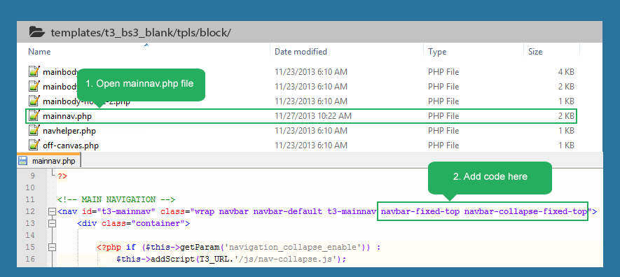
April 9, 2014 at 7:29 pm #530179Did/Do you have a “mainnav.php” file? I think this is where the instructions indicated the modification should be.
Sticky main menu[/h]
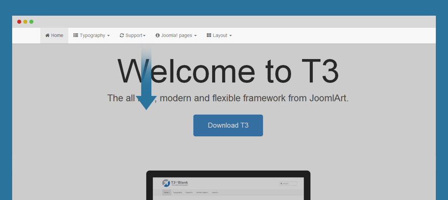
Sticky main menu, also known as fixed menu is basically a website menu that is locked into place so that it does not disappear when the user scrolls down the page; in other words, it is accessible from anywhere on the website without having to scroll.
Steps to make main menu sticky:
#1: upgrade T3 Framework plugin[/h] This feature can only operated with T3 Framework version 1.2.1, so you have to upgrade to the version. Check out upgrade documentation.
#2: add class to sticky menu[/h] You can select to make menu sticky on desktop layout or small screens or both.
To sticky menu, add class navbar-collapse-fixed-top (for collapse menu like mobile and tablet) and navbar-fixed-top (for desktop) to #t3-mainnav div (in the file: mainnav.php located in: templatesja_merotplsblocks). You may need update the margin-left & margin-right for the mainnav div

- <nav id=”t3-mainnav” class=”wrap navbar navbar-default t3-mainnav navbar-fixed-top navbar-collapse-fixed-top”>

1 user says Thank You to TomC for this useful post
sebbs Friend
sebbs
- Join date:
- February 2006
- Posts:
- 529
- Downloads:
- 0
- Uploads:
- 62
- Thanks:
- 164
- Thanked:
- 6 times in 2 posts
April 9, 2014 at 7:32 pm #530181I don’t have that file, so that’s why I figured I should put it in my header.php file… it has main nav code in the file…
<!– MAIN NAVIGATION –>
<nav id=”t3-mainnav” class=”col-xs-12 col-md-9 t3-mainnav navbar navbar-default hidden-sm”><!– Brand and toggle get grouped for better mobile display –>
<div class=”navbar-header”>Nazario A Friend
Nazario A
- Join date:
- April 2013
- Posts:
- 1183
- Downloads:
- 0
- Uploads:
- 406
- Thanks:
- 91
- Thanked:
- 284 times in 263 posts
April 10, 2014 at 10:24 am #530313@ sebbs,
Here is the solution for you.
1 user says Thank You to Nazario A for this useful post
sebbs Friend
sebbs
- Join date:
- February 2006
- Posts:
- 529
- Downloads:
- 0
- Uploads:
- 62
- Thanks:
- 164
- Thanked:
- 6 times in 2 posts
April 10, 2014 at 8:02 pm #530414I added a question for you in this thread
 TomC
Moderator
TomC
- Join date:
- October 2014
- Posts:
- 14077
- Downloads:
- 58
- Uploads:
- 137
- Thanks:
- 948
- Thanked:
- 3155 times in 2495 posts
April 10, 2014 at 8:06 pm #530416<em>@sebbs 421099 wrote:</em><blockquote>I added a question for you in this thread</blockquote>
Which/What element(s) are you seeing as being “off?”
AuthorPostsViewing 8 posts - 1 through 8 (of 8 total)This topic contains 8 replies, has 4 voices, and was last updated by
 TomC 10 years, 9 months ago.
We moved to new unified forum. Please post all new support queries in our New Forum
Main menu to stay when scrolling down
Viewing 8 posts - 1 through 8 (of 8 total)


