-
AuthorPosts
-
regin Friend
regin
- Join date:
- March 2007
- Posts:
- 117
- Downloads:
- 2
- Uploads:
- 60
- Thanks:
- 28
- Thanked:
- 1 times in 1 posts
August 18, 2013 at 9:28 pm #189837Hi
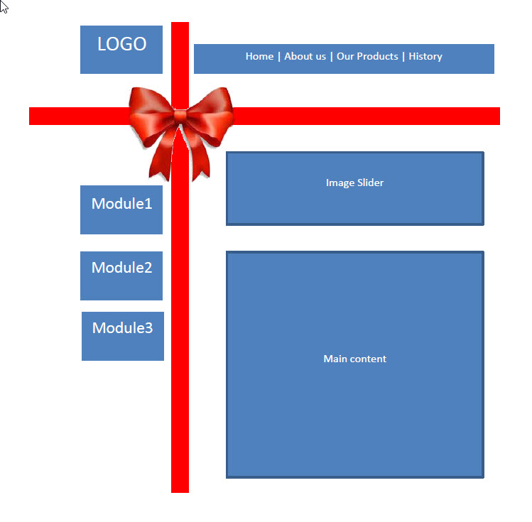
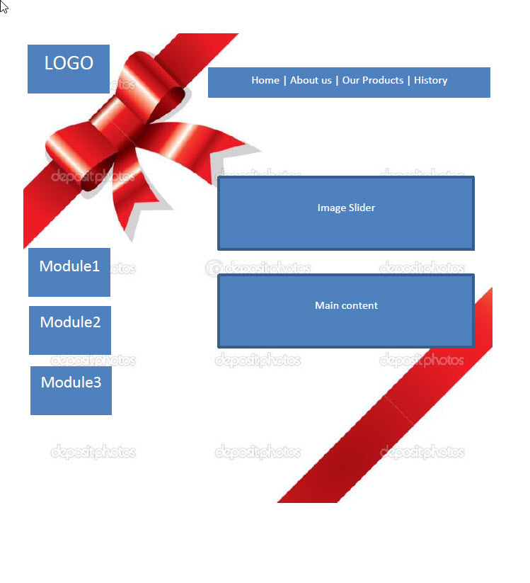
For a client I’ve been asked to build a responsive template. The biggest “concern” I have, is that he wants the website to look like a present, with a ribbon on it. I am having difficulties in seeing how I can produce that. I know and do CSS, but not sure if I can see exactly how I can build the design, or what template to use to base the design on. I have been looking at Beranis as an option, but not quite sure how the ribbon could be made responsive.
I was hoping that someone could tell/advice me, how the design could be done, so it reflects one of the two mock-ups attached. The important part, is of course, that the ribbon is present on the site, even when shown on an Ipad. For a smartphone it is not important, but for tablets it would be.
Anyone got some ideas?
Regards
Regin-
phong nam Friend
phong nam
- Join date:
- May 2015
- Posts:
- 3779
- Downloads:
- 1
- Uploads:
- 587
- Thanks:
- 499
- Thanked:
- 974 times in 888 posts
August 20, 2013 at 9:49 am #502847Hey Regin,
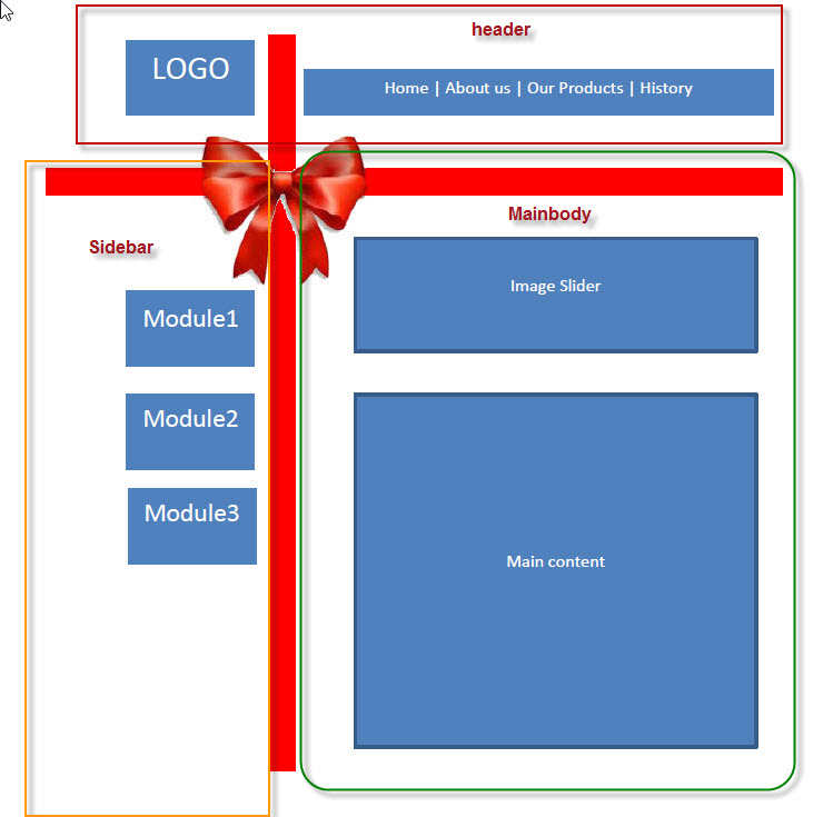
I think you can try to separate your website layout into few main sections:
– Header: Logo and main menu .
Logo: span4
Main menu: span8– Sidebar: Modules 1-3.
The sidebar can be span4 too.– Mainbody: This block contains the image slider and main content.
These will help you easier to customize our JA Beranis template, and with your extra css styles you can get your awesome present ! :p
In addition, you can refer our document below to be familiar with customizing our templates’ layout running on our T3 framework at http://t3-framework.org/documentation/layout-system.html -
AuthorPosts
Viewing 2 posts - 1 through 2 (of 2 total)This topic contains 2 replies, has 2 voices, and was last updated by phong nam 11 years, 3 months ago.
We moved to new unified forum. Please post all new support queries in our New Forum
Jump to forum