-
AuthorPosts
-
thatcomputerdude Friend
thatcomputerdude
- Join date:
- December 2008
- Posts:
- 280
- Downloads:
- 0
- Uploads:
- 9
- Thanks:
- 67
- Thanked:
- 32 times in 1 posts
March 23, 2011 at 6:00 pm #161844http://dev.joomgo.com/clients/tig/
I’d like to shift the entire drop down to the left further. Right now when I look at it in Firebug, the element.style has a margin-left: -35px;
Where can I edit that to make it more, say -75px – the goal is to shift the drop downs further to the left. This should correct a problem in Chrome with the drop downs where they are aligned to the right more.
I’m using the latest Blank template for this design.
 Ninja Lead
Moderator
Ninja Lead
- Join date:
- November 2014
- Posts:
- 16064
- Downloads:
- 310
- Uploads:
- 2864
- Thanks:
- 341
- Thanked:
- 3854 times in 3563 posts
March 25, 2011 at 3:02 am #383175you should be more specific in order to help us address the issue easier. I looked at your site and was confused about what was the “drop down” you mentioned. Can you name that section? or post a screenshot with anotations on it?
thatcomputerdude Friend
thatcomputerdude
- Join date:
- December 2008
- Posts:
- 280
- Downloads:
- 0
- Uploads:
- 9
- Thanks:
- 67
- Thanked:
- 32 times in 1 posts
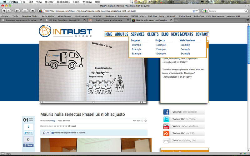
March 29, 2011 at 12:39 am #383719If you hover over Services in the mega menu, 2nd and 3rd level menu items that drop down. It’s a 3 column group and I want the the drop down to be shifted to the left…. I wasn’t sure what controlled where the first column of a multi column drop down starts – rather it be directly under the main menu item or is shifted to the left or right.
Here is a screen shot…
 Ninja Lead
Moderator
Ninja Lead
- Join date:
- November 2014
- Posts:
- 16064
- Downloads:
- 310
- Uploads:
- 2864
- Thanks:
- 341
- Thanked:
- 3854 times in 3563 posts
March 30, 2011 at 6:58 am #383947to control the left magin of the dropdown submenu, open template.css, add this:
.childcontent.cols3  {

  margin-left: -30px !important;

}
you can change the number to what you want.1 user says Thank You to Ninja Lead for this useful post
AuthorPostsViewing 4 posts - 1 through 4 (of 4 total)This topic contains 4 replies, has 2 voices, and was last updated by
 Ninja Lead 13 years, 9 months ago.
We moved to new unified forum. Please post all new support queries in our New Forum
Mega menu Dropdown’s – shifting to left?
Viewing 4 posts - 1 through 4 (of 4 total)


