-
AuthorPosts
-
April 17, 2013 at 3:27 am #186831
Hi,
My drop down menu was gone once I click on the Menu button on my mobile phone. and there is a white column on left hand side that look like sidebar. Any ideas to solve this? Thank you.
April 18, 2013 at 2:24 pm #490323Any solution for this? I have to complete my website asap.
 Ninja Lead
Moderator
Ninja Lead
- Join date:
- November 2014
- Posts:
- 16064
- Downloads:
- 310
- Uploads:
- 2864
- Thanks:
- 341
- Thanked:
- 3854 times in 3563 posts
April 19, 2013 at 3:26 am #490372Right now its difficult to guess the issue and give solution to you. I would need to take a closer look at your site. Please include your site URL here for further investigation
April 25, 2013 at 11:23 am #491036Hi Ninja,
I had pm you my website url. Kindly advise me how to solve the issue. Thank you.
 Ninja Lead
Moderator
Ninja Lead
- Join date:
- November 2014
- Posts:
- 16064
- Downloads:
- 310
- Uploads:
- 2864
- Thanks:
- 341
- Thanked:
- 3854 times in 3563 posts
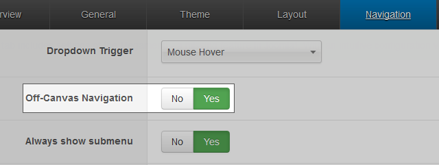
April 26, 2013 at 1:47 am #491083From URL link of your site, this is not bug, we’ve just added Off-canvas navigation feature into T3 framework (see this blog post for more info). Hence, if you want to use the previous type of navigation for collapsed menu in small device, you can simply switch off the Off-canvas navigation option in template manager

Regards
April 27, 2013 at 1:13 am #491184Hi Ninja,
I had decided to use the off-canvas navigation. However, when I click the menu on mobile view, it’s doesn’t align correctly. Kindly advise on this. Thank you.
 Ninja Lead
Moderator
Ninja Lead
- Join date:
- November 2014
- Posts:
- 16064
- Downloads:
- 310
- Uploads:
- 2864
- Thanks:
- 341
- Thanked:
- 3854 times in 3563 posts
April 29, 2013 at 4:43 am #491285You can change back to turn on-canvas and fix white column on left hand side that look like sidebar this way
+ Open templates/ja_onepage/css/themes/metro/off-canvas.css file
From
#off-canvas-nav .t3-mainnav {

  background: #fff;

  width: 200px !important;

}
#off-canvas-nav .t3-mainnav .nav-collapse .nav > li > a,
#off-canvas-nav .t3-mainnav .nav-collapse .dropdown-menu a {
border-bottom: 1px solid #ddd;
color: #666
font-weight: bold;
padding-left: 20px;
}change to
#off-canvas-nav .t3-mainnav {

  background: #000;

  width: 200px !important;

}
#off-canvas-nav .t3-mainnav .nav-collapse .nav > li > a,
#off-canvas-nav .t3-mainnav .nav-collapse .dropdown-menu a {
border-bottom: 1px solid #222;
color: #666
font-weight: bold;
padding-left: 20px;
}+ Open templates/ja_onepage/css/themes/metro/template.css file
from
body {

  background: #fff;

  font-family: 'Open Sans', sans-serif;

  color: #666

}
change to
body {

  background: #000;

  font-family: 'Open Sans', sans-serif;

  color: #666

}April 29, 2013 at 2:56 pm #491370Hi Ninja,
I know how to style the off-canvas menu. BUT what I means is when I click the menu on my mobile phone, it’s doesn’t scroll down to the correct place. For example, when I click on Portfolio menu, it’s suppose to scroll till the title of Portfolio but it’s scroll even further more.
Hope you do understand what I said. Tq.
 Ninja Lead
Moderator
Ninja Lead
- Join date:
- November 2014
- Posts:
- 16064
- Downloads:
- 310
- Uploads:
- 2864
- Thanks:
- 341
- Thanked:
- 3854 times in 3563 posts
April 30, 2013 at 7:54 am #491413You can fix this problem on mobile this way
Open templates/ja_onepage/css/custom.css file
Add new script below
 @media  (min-width: 768px) {

	.introducing .container {

		padding-top: 180px;

	}
.hero-unit .container {
padding-top: 120px;
}.portfolio .container {
padding-top: 180px;
}.hero-unit-2 .container {
padding-top: 180px;
}.clients .container {
padding-top: 180px;
}
.onepage.contact .container {
padding-top: 180px;
}
}
April 30, 2013 at 8:22 am #491417Hi Ninja,
Yes, thank you very much for your help.
AuthorPostsViewing 10 posts - 1 through 10 (of 10 total)This topic contains 10 replies, has 2 voices, and was last updated by
kywong85 11 years, 7 months ago.
We moved to new unified forum. Please post all new support queries in our New Forum
Menu disappear on Mobile
Viewing 10 posts - 1 through 10 (of 10 total)


