-
AuthorPosts
-
rodro Friend
rodro
- Join date:
- November 2011
- Posts:
- 125
- Downloads:
- 18
- Uploads:
- 68
- Thanks:
- 35
- Thanked:
- 1 times in 1 posts
June 13, 2017 at 10:19 pm #1041669Hello,
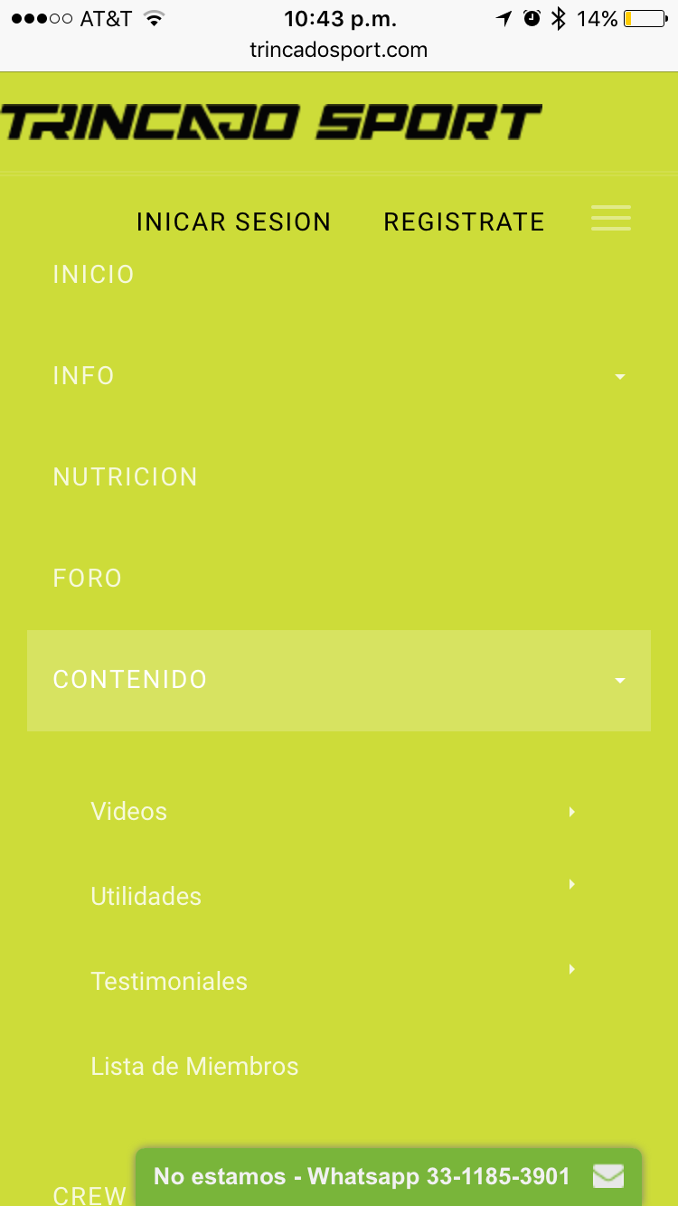
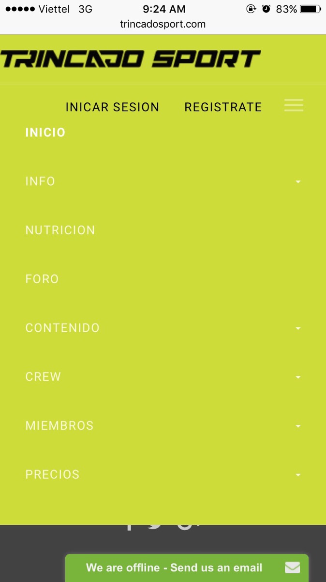
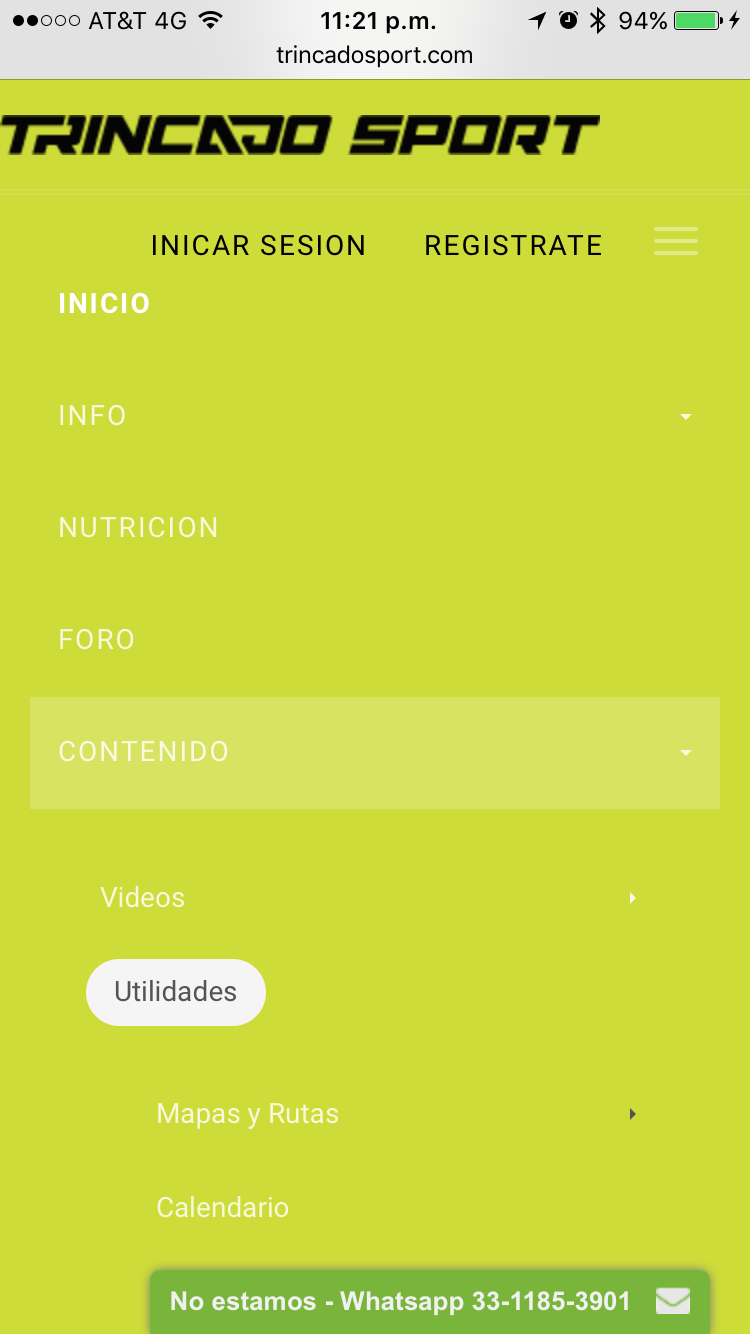
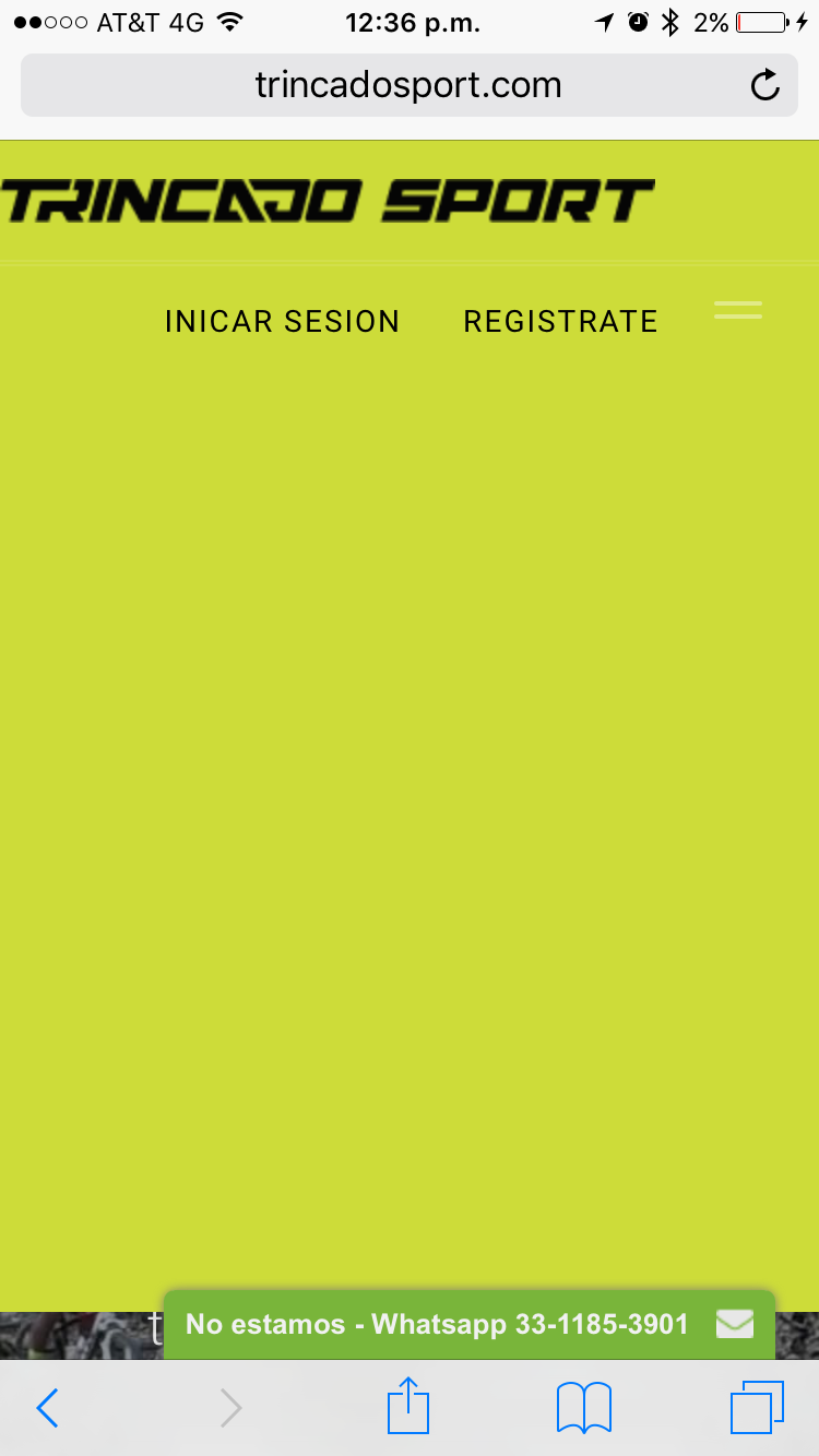
For the second time I´m having the same issue, The menu is not working on mobiles. I´m using Header 3.
Please I need help ASAP because all users are complaining about it.
Thanks!
-
1 user says Thank You to rodro for this useful post
Saguaros Moderator
Saguaros
- Join date:
- September 2014
- Posts:
- 31405
- Downloads:
- 237
- Uploads:
- 471
- Thanks:
- 845
- Thanked:
- 5346 times in 4964 posts
June 14, 2017 at 4:06 am #1041739Hi,
I added this css:
<style>
@media (max-width: 480px) {
  .jub-block .header .topbar { position: relative; z-index: 100;}
  .jub-block .header .navbar-collapse.in { width: 100%; }
}
</style>
into the custom code tab in JA Builder template, it’s working now.
Regards
rodro Friend
rodro
- Join date:
- November 2011
- Posts:
- 125
- Downloads:
- 18
- Uploads:
- 68
- Thanks:
- 35
- Thanked:
- 1 times in 1 posts
June 29, 2017 at 3:49 am #1044894Hello, thanks.. it is working but it can´t be scrolled. If there´s more items in the menu, it´s not possible to reach them.
Saguaros Moderator
Saguaros
- Join date:
- September 2014
- Posts:
- 31405
- Downloads:
- 237
- Uploads:
- 471
- Thanks:
- 845
- Thanked:
- 5346 times in 4964 posts
July 3, 2017 at 2:26 am #1045573rodro Friend
rodro
- Join date:
- November 2011
- Posts:
- 125
- Downloads:
- 18
- Uploads:
- 68
- Thanks:
- 35
- Thanked:
- 1 times in 1 posts
July 3, 2017 at 4:22 am #1045599Saguaros Moderator
Saguaros
- Join date:
- September 2014
- Posts:
- 31405
- Downloads:
- 237
- Uploads:
- 471
- Thanks:
- 845
- Thanked:
- 5346 times in 4964 posts
July 4, 2017 at 4:12 pm #1046050Let me check in local site and see how it goes with default template.
rodro Friend
rodro
- Join date:
- November 2011
- Posts:
- 125
- Downloads:
- 18
- Uploads:
- 68
- Thanks:
- 35
- Thanked:
- 1 times in 1 posts
July 12, 2017 at 7:59 pm #1048180Hello, I’m still with the mobile menu issue.. Is there any solution yet? Thanks
Saguaros Moderator
Saguaros
- Join date:
- September 2014
- Posts:
- 31405
- Downloads:
- 237
- Uploads:
- 471
- Thanks:
- 845
- Thanked:
- 5346 times in 4964 posts
July 13, 2017 at 9:51 am #1048395I updated this css rule into custom code field:
@media (max-width: 480px) {
.jub-block .header .navbar-collapse.in {
    height: 480px;
    overflow: auto;
}
}
Kindly check.
rodro Friend
rodro
- Join date:
- November 2011
- Posts:
- 125
- Downloads:
- 18
- Uploads:
- 68
- Thanks:
- 35
- Thanked:
- 1 times in 1 posts
July 13, 2017 at 5:38 pm #1048509Saguaros Moderator
Saguaros
- Join date:
- September 2014
- Posts:
- 31405
- Downloads:
- 237
- Uploads:
- 471
- Thanks:
- 845
- Thanked:
- 5346 times in 4964 posts
July 17, 2017 at 3:20 am #1048990I added above css rule only, you can try to remove it and see that it doesn’t effect on the display of menu on mobile.
Did you update something recently?
July 25, 2017 at 4:42 pm #1051494Hi,
I have the same prroblem on JA Platon Template, In mobile devices I can´t see the menu, how can I fix this issue?
Thanks
Saguaros Moderator
Saguaros
- Join date:
- September 2014
- Posts:
- 31405
- Downloads:
- 237
- Uploads:
- 471
- Thanks:
- 845
- Thanked:
- 5346 times in 4964 posts
AuthorPostsViewing 12 posts - 1 through 12 (of 12 total)This topic contains 11 replies, has 3 voices, and was last updated by
Saguaros 7 years, 4 months ago.
We moved to new unified forum. Please post all new support queries in our New Forum
Jump to forum
Mobile Menu not working AGAIN
Viewing 12 posts - 1 through 12 (of 12 total)


