

-
AuthorPosts
-
 Ninja Lead
Moderator
Ninja Lead
Moderator
Ninja Lead
- Join date:
- November 2014
- Posts:
- 16064
- Downloads:
- 310
- Uploads:
- 2864
- Thanks:
- 341
- Thanked:
- 3854 times in 3563 posts
October 18, 2016 at 7:23 am #977461Hi
Menu mobile on your site will show with width is less 992px, if you want to change that you have to change that, you can apply my solution below
-
Backup all CSS styles on your site
- Open templates/ja_megastore/less/variables.less file
find and change
@grid-float-breakpoint: @screen-md;to
@grid-float-breakpoint: @screen-sm;- Click Compile LESS to CSS button after changing
Regards
djsmooth5 Friend
djsmooth5
- Join date:
- March 2015
- Posts:
- 60
- Downloads:
- 149
- Uploads:
- 7
- Thanks:
- 13
- Thanked:
- 2 times in 2 posts
October 18, 2016 at 11:18 am #977647Hi, thank you for the above, but it did not work.
I unfortunately still have this showing up, I have set the view to disable and even set the position to None and it still shows up.Ninja Lead
Moderator
Ninja Lead
- Join date:
- November 2014
- Posts:
- 16064
- Downloads:
- 310
- Uploads:
- 2864
- Thanks:
- 341
- Thanked:
- 3854 times in 3563 posts
October 19, 2016 at 2:02 am #977918@djsmooth5: If you want to remove off-canvas button / navbar category menu, you can go to admin site -> ja_megastore – Default -> Add-ons tab and set Off-canvas Sidebar OFF .
This will hide the off-canvas button .
If you want to hide the only position , in that case, go to template styles > ja_megastore – Default -> Layout > Responsive layout > Large > click on eye icon near off-canvas module position to hide it in that view .Hope it helps .
Regards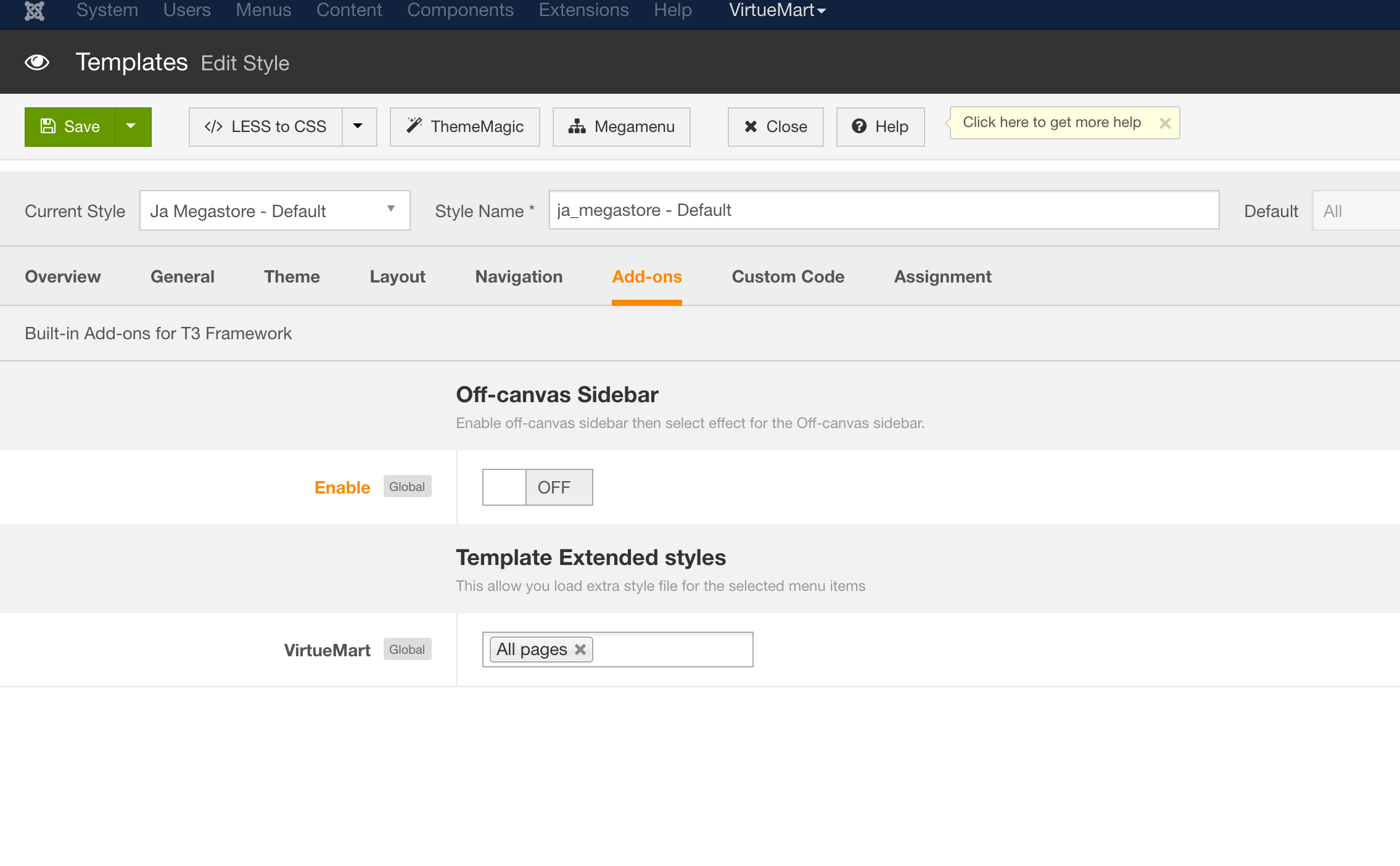
1 user says Thank You to Ninja Lead for this useful post
djsmooth5
- Join date:
- March 2015
- Posts:
- 60
- Downloads:
- 149
- Uploads:
- 7
- Thanks:
- 13
- Thanked:
- 2 times in 2 posts
October 19, 2016 at 5:59 am #977980Thank you so much!! something so simple, gosh!! thanks so so much!!!
AuthorPostsViewing 4 posts - 1 through 4 (of 4 total)This topic contains 4 replies, has 2 voices, and was last updated by
djsmooth5 8 years, 1 month ago.
The topic ‘Mobile menu won't disappear on Desktop’ is closed to new replies.
Mobile menu won't disappear on Desktop
Viewing 4 posts - 1 through 4 (of 4 total)