-
AuthorPosts
-
tamirzzz2 Friend
tamirzzz2
- Join date:
- January 2013
- Posts:
- 53
- Downloads:
- 0
- Uploads:
- 13
- Thanks:
- 21
- Thanked:
- 2 times in 1 posts
May 15, 2014 at 10:33 am #197806Hi there,
After adding my logo, I have noticed that the logo is not align with the main menu text. I mean, it is aligned but the problem is that the logo itself contains text so it appears as not being aligned. How can I change the vertical position of the main menu text?
I am attaching a screenshot. Can you please advise?
Thanks
 TomC
Moderator
TomC
- Join date:
- October 2014
- Posts:
- 14077
- Downloads:
- 58
- Uploads:
- 137
- Thanks:
- 948
- Thanked:
- 3155 times in 2495 posts
tamirzzz2 Friend
tamirzzz2
- Join date:
- January 2013
- Posts:
- 53
- Downloads:
- 0
- Uploads:
- 13
- Thanks:
- 21
- Thanked:
- 2 times in 1 posts
May 22, 2014 at 11:47 am #536214Tom,
The problem is that whoever desiges the JA templated did not take under consideration that logos may be big with presence. Therefore, the templates` logo shrinking mechanism would not work for all logos.
To make a long story short, I need you to tell me how to make the attached logo fit into:
http://tamirdwh.funet.co.il/subdomains/dwh/main/
In addition, please have a look at my prod site in:
http://tamirdwh.funet.co.il/web2 with Shape5 template.
Many thanks,
Tamir
 TomC
Moderator
TomC
- Join date:
- October 2014
- Posts:
- 14077
- Downloads:
- 58
- Uploads:
- 137
- Thanks:
- 948
- Thanked:
- 3155 times in 2495 posts
May 22, 2014 at 3:15 pm #536243What are the dimensions of your logo image that you wish to use (height/width)?
tamirzzz2 Friend
tamirzzz2
- Join date:
- January 2013
- Posts:
- 53
- Downloads:
- 0
- Uploads:
- 13
- Thanks:
- 21
- Thanked:
- 2 times in 1 posts
May 22, 2014 at 5:07 pm #53626370 width
172 Height
Thanks
 TomC
Moderator
TomC
- Join date:
- October 2014
- Posts:
- 14077
- Downloads:
- 58
- Uploads:
- 137
- Thanks:
- 948
- Thanked:
- 3155 times in 2495 posts
tamirzzz2 Friend
tamirzzz2
- Join date:
- January 2013
- Posts:
- 53
- Downloads:
- 0
- Uploads:
- 13
- Thanks:
- 21
- Thanked:
- 2 times in 1 posts
May 22, 2014 at 5:16 pm #536266Hi,
Actually it should be on the far right (I changed my mind after sending you the screnshot).
Come to think of it, I am open to suggestions. If you find a good location that fits RTL layout, and makes the site look professional, go for it!
Please have a look at my site at:
http://tamirdwh.funet.co.il/subdomains/dwh/main/
Many thanks!
 TomC
Moderator
TomC
- Join date:
- October 2014
- Posts:
- 14077
- Downloads:
- 58
- Uploads:
- 137
- Thanks:
- 948
- Thanked:
- 3155 times in 2495 posts
May 22, 2014 at 5:22 pm #536267Personally, I prefer the logo on the right hand side … usually where most people’s eyes do first.
Check out these recently added resources as a starting point for customizing/resizing your logo . . .
If you don’t see anything you can utilize (or works) within the listing of tips/tutorials, let me know.
tamirzzz2 Friend
tamirzzz2
- Join date:
- January 2013
- Posts:
- 53
- Downloads:
- 0
- Uploads:
- 13
- Thanks:
- 21
- Thanked:
- 2 times in 1 posts
May 22, 2014 at 5:39 pm #536271the guide you sent me has nothing to do with issue I am facing
I need a place the put the logo in it`s normal size (without shrinking)
Thanks
 TomC
Moderator
TomC
- Join date:
- October 2014
- Posts:
- 14077
- Downloads:
- 58
- Uploads:
- 137
- Thanks:
- 948
- Thanked:
- 3155 times in 2495 posts
May 22, 2014 at 5:46 pm #536274Customize logo: size, alignment – T3[/h]
The docs is for templates developed with T3 Framework. In the docs, we implement in JA Bookshop
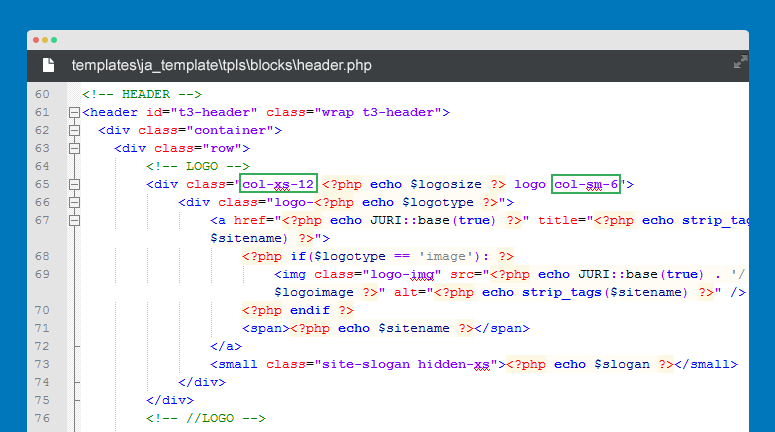
#1: Change logo block size[/h] By default, Logo of templates developed with T3 Framework is declared in the templates/ja_template/tpls/blocks/header.php file. Open the file and you will see how Logo is declared.

- <!– LOGO –>
- <div class=”col-xs-12 <?php echo $logosize ?> logo col-sm-6″>
- <div class=”logo-<?php echo $logotype ?>”>
- <a href=”/<?php echo JURI::base(true) ?>” title=”<?php echo strip_tags($sitename) ?>”>
- <?php if($logotype == ‘image’): ?>
- <img class=”logo-img” src=”/<?php echo JURI::base(true) . ‘/’ . $logoimage ?>” alt=”<?php echo strip_tags($sitename) ?>” />
- <?php endif ?>
- <span><?php echo $sitename ?></span>
- </a>
- <small class=”site-slogan hidden-xs”><?php echo $slogan ?></small>
- </div>
- </div>
- <!– //LOGO –>
You can change the logo block size on responsive layouts by changing the values of col-ms-, col-xs- and col-md-
- col-xs- size on extra small screens like mobile
- col-ms- size on small screens like tablet
- col-md- size on medium screen like desktop
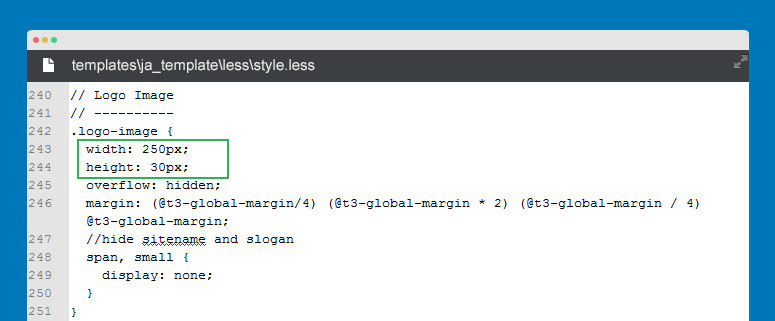
#2: Change logo size[/h] Open file in templates/ja_template/less/style.less, find the style for logo image – .logo-image

- // Logo Image
- // ———-
- .logo-image {
- width: 250px;
- height: 30px;
- overflow: hidden;
- margin: (@t3-global-margin/4) (@t3-global-margin * 2) (@t3-global-margin / 4) @t3-global-margin;
- //hide sitename and slogan
- span, small {
- display: none;
- }
- @media (max-width: @screen-sm) {
- margin: (@t3-global-margin / 2) (@t3-global-margin * 2) (@t3-global-margin / 2) (@t3-global-margin * 3);
- }
- }
Now change the values of width and height.
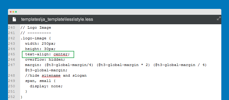
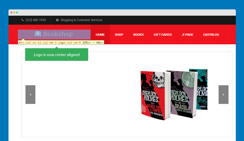
#3: Change logo alignment[/h] In the style.less file, add text-align style for the .logo-image.

- // Logo Image
- // ———-
- .logo-image {
- width: 250px;
- height: 30px;
- text-align: center;
- overflow: hidden;
- margin: (@t3-global-margin/4) (@t3-global-margin * 2) (@t3-global-margin / 4) @t3-global-margin;
- //hide sitename and slogan
- span, small {
- display: none;
- }
- }
See the front-page

Check out video tutorial here: https://www.youtube.com/watch?v=8Qh7ZClcLU4tamirzzz2 Friend
tamirzzz2
- Join date:
- January 2013
- Posts:
- 53
- Downloads:
- 0
- Uploads:
- 13
- Thanks:
- 21
- Thanked:
- 2 times in 1 posts
May 22, 2014 at 6:24 pm #536286Tom,
I don`t think you get my drift.
Changing the menu size is an option, but it would look ugly.
I thought perhaps deleting the menu logo and placing the logo between the menu and the breaking news (for example, have a look at http://www.dwh.co.il ) :. For this I need your assistance.
Can you please help?
Thanks
tamirzzz2 Friend
tamirzzz2
- Join date:
- January 2013
- Posts:
- 53
- Downloads:
- 0
- Uploads:
- 13
- Thanks:
- 21
- Thanked:
- 2 times in 1 posts
May 22, 2014 at 8:41 pm #536304hi,
OK, so the issue was summed up to one small thing. how to erase the line marked with green sqaure?
I am attaching a screenshot.
Tnx
Saguaros Moderator
Saguaros
- Join date:
- September 2014
- Posts:
- 31405
- Downloads:
- 237
- Uploads:
- 471
- Thanks:
- 845
- Thanked:
- 5346 times in 4964 posts
May 23, 2014 at 5:07 am #536347It’s right border of menu item in the main menu, if you use firebug, you can see it easily: http://prntscr.com/3lqisu
AuthorPostsViewing 13 posts - 1 through 13 (of 13 total)This topic contains 13 replies, has 3 voices, and was last updated by
Saguaros 10 years, 6 months ago.
We moved to new unified forum. Please post all new support queries in our New Forum
Jump to forum


