-
AuthorPosts
-
pavit Moderator
pavit
- Join date:
- September 2007
- Posts:
- 15749
- Downloads:
- 199
- Uploads:
- 2274
- Thanks:
- 417
- Thanked:
- 4028 times in 3778 posts
March 5, 2016 at 4:45 pm #895289Hi
In this file /templates/ja_magz/css/themes/pink/template-responsive.css line 1915 you have
@media (max-width: 767px) {
  .t3-mainnav .navbar-inner .item-first {
    margin-right: 0 !important;
  }
  .t3-mainnav .navbar {
    width: auto !important;
    margin-left: 0 !important;
  }
  .top-header,
  .spl-home-1,
  .spl-home-2,
  .spl-home-3 {
    display: none;
  }
Remove the display: none;
March 5, 2016 at 5:09 pm #895294Thank you very much ! It work.
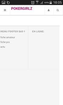
Why there is a line on the right and you can scroll from left to right then that nothing.
Why the very bottom, there is an empty area?
thx
March 5, 2016 at 5:14 pm #895295Line on the left…
-
March 5, 2016 at 5:16 pm #895299
pavit Moderator
pavit
- Join date:
- September 2007
- Posts:
- 15749
- Downloads:
- 199
- Uploads:
- 2274
- Thanks:
- 417
- Thanked:
- 4028 times in 3778 posts
March 5, 2016 at 5:29 pm #895304Hi
Try to take a look at THIS TOPIC
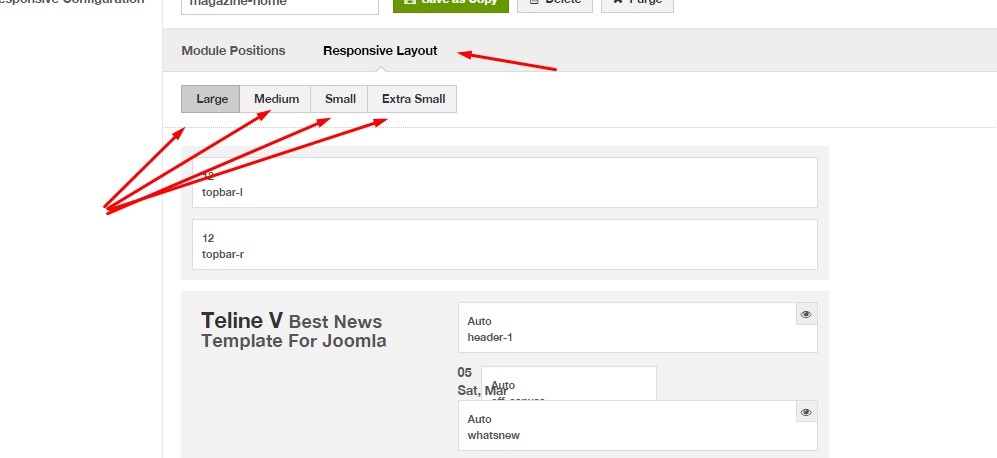
Regarding empty area you should verify from your template manager – layout tab – responsive if such modules are hided into various screen views
March 5, 2016 at 6:08 pm #895312Try to take a look at THIS TOPIC
Oops, your account does not have permission to access this topic. Sign Up Now!
March 5, 2016 at 6:15 pm #895313I hide the module (footer-logo, footer-social and footer) but its still appears on the bottom of my site web.
pavit Moderator
pavit
- Join date:
- September 2007
- Posts:
- 15749
- Downloads:
- 199
- Uploads:
- 2274
- Thanks:
- 417
- Thanked:
- 4028 times in 3778 posts
March 5, 2016 at 6:16 pm #895314you need to set the footer module position to col-xs-12 for extra small layout so they can fit properly in this view and not make the gap .
Also verify that you are using latest version of template and T3 Framework using Ja Extension manager component
March 5, 2016 at 6:36 pm #895317you need to set the footer module position to col-xs-12 for extra small layout so they can fit properly in this view and not make the gap .
I don’t understand. For me its ok in "Template manager – layout tab – responsive"
Also verify that you are using latest version of template and T3 Framework using Ja Extension manager component
its ok.
pavit Moderator
pavit
- Join date:
- September 2007
- Posts:
- 15749
- Downloads:
- 199
- Uploads:
- 2274
- Thanks:
- 417
- Thanked:
- 4028 times in 3778 posts
March 5, 2016 at 6:40 pm #895318I hide the module (footer-logo, footer-social and footer) but its still appears on the bottom of my site web.
Answer to this post as private reply and share a temp super user account to your backend so we can take a closer look at your configuration and answer with a solution.
March 5, 2016 at 6:44 pm #895319This reply has been marked as private.pavit Moderator
pavit
- Join date:
- September 2007
- Posts:
- 15749
- Downloads:
- 199
- Uploads:
- 2274
- Thanks:
- 417
- Thanked:
- 4028 times in 3778 posts
March 5, 2016 at 7:02 pm #895320This reply has been marked as private.March 8, 2016 at 4:31 pm #896716Hi, after the modification about home-10 and the picture, my template is not responsive on phone.
I have only the main nav menu and logo, login, search.
🙁 🙁
pavit Moderator
pavit
- Join date:
- September 2007
- Posts:
- 15749
- Downloads:
- 199
- Uploads:
- 2274
- Thanks:
- 417
- Thanked:
- 4028 times in 3778 posts
March 8, 2016 at 4:44 pm #896722Hi
Since you compiled less to css files now all your files were moved under /local/css folder
so what i suggested in the second post above is still vaild
You will need to remove from this file now /local/css/themes/pink/template-responsive.css
around line 1915@media (max-width: 767px) { .t3-mainnav .navbar-inner .item-first { margin-right: 0 !important; } .t3-mainnav .navbar { width: auto !important; margin-left: 0 !important; } .top-header, .spl-home-1, .spl-home-2, .spl-home-3 { display: none; }Remove the display:none;
March 8, 2016 at 4:55 pm #896725Where is repertory local ?
thanks
AuthorPostsThis topic contains 16 replies, has 2 voices, and was last updated by
sauvage 8 years, 8 months ago.
The topic ‘No responsive’ is closed to new replies.
Jump to forum


