Tagged: padding images
-
AuthorPosts
-
 max_santiago
Friend
max_santiago
- Join date:
- January 2013
- Posts:
- 216
- Downloads:
- 49
- Uploads:
- 58
- Thanks:
- 120
- Thanked:
- 8 times in 3 posts
December 10, 2015 at 10:43 am #794139Hallo,
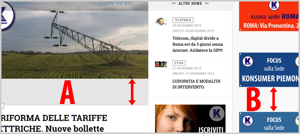
where is possible set better padding about:A. Homepage article image in homepage;
B. Images contents into sidebar position.I attach image.
Url is: http://www.konsumer.itThanks!
M.
Adam M Moderator
Adam M
- Join date:
- May 2014
- Posts:
- 5159
- Downloads:
- 33
- Uploads:
- 66
- Thanks:
- 95
- Thanked:
- 1271 times in 1235 posts
December 11, 2015 at 3:55 pm #804940Hi @max_santiago,
-
I checked your site and see that you managed to solve the problem in sidebar.
- About the featured article in main body. Normally, the thumbnail has 3 variations : big, medium and small, the size here is big.
In JA Teline V, we implemented a function to specify image thumbnail in admin >>> System >>> Global Configuration >>> choose Articles on left sidebar >>> Shared >>> currently, your big image dimension is 785×385 which mean the ratio for width:height should be 2:1.
In case the container is look like a square box in your frontend, the image is scaled and show a grey box inside it. You can try open file templates/ja_teline_v/css/custom.css (if you don’t have this file, just create a new one) then add this code :
.magazine-featured .item-image img,
.magazine-featured .pull-left.item-image img,
.magazine-featured .pull-right.item-image img,
.magazine-featured .img_caption {
    width: auto !important;
    max-width: none;
}
max_santiago
Friend
max_santiago
- Join date:
- January 2013
- Posts:
- 216
- Downloads:
- 49
- Uploads:
- 58
- Thanks:
- 120
- Thanked:
- 8 times in 3 posts
December 11, 2015 at 5:58 pm #805510Hey Adam M, thanks for your reply and solution.
About issue #1 in sidebar now I have only a module with some images :-D, but I haven’t solved this problem but with this simple and working ‘trick’…
For #2, I have copied your solution in custom.css… and it solve my image problem in homepage but… sincerly I don’t like it! 🙂 I prefer 2×1 ratio: with your suggest it is 785×512 and too much ‘fat’ 🙂
also now, preview image is a little different by same image in the article (text proportion etc…)Is not possible to eliminate original padding and view correct ratio with your custom.css code?
Thanks!
M.
Adam M Moderator
Adam M
- Join date:
- May 2014
- Posts:
- 5159
- Downloads:
- 33
- Uploads:
- 66
- Thanks:
- 95
- Thanked:
- 1271 times in 1235 posts
December 14, 2015 at 11:03 am #812457Hi @max_santiago,
-
Try to reproduce the problem with images in sidebar so I can check and suggest you how to fix it.
- Actually the solution above is best way to make the featured image look acceptable. About the image ratio, the current dimension of your featured "viewport" is 590×385 (width x height) which is around 1.5:1 so you must have featured image with the same ratio, for example :
- Assuming you have an image and the width is 700px, using above ratio, you must crop the image height to 466px.
- Assuming you have an image and the height is 500px, using above ratio, your image should have width around 750px;
AuthorPostsViewing 4 posts - 1 through 4 (of 4 total)This topic contains 3 replies, has 2 voices, and was last updated by
Adam M 9 years ago.
We moved to new unified forum. Please post all new support queries in our New Forum


