-
AuthorPosts
-
gberm Friend
gberm
- Join date:
- July 2010
- Posts:
- 55
- Downloads:
- 0
- Uploads:
- 0
- Thanks:
- 4
- Thanked:
- 3 times in 1 posts
August 27, 2010 at 11:08 am #353863What colors will be available? I’ll need orange 🙂
smitheringale Friend
smitheringale
- Join date:
- December 2009
- Posts:
- 236
- Downloads:
- 0
- Uploads:
- 0
- Thanks:
- 63
- Thanked:
- 44 times in 18 posts
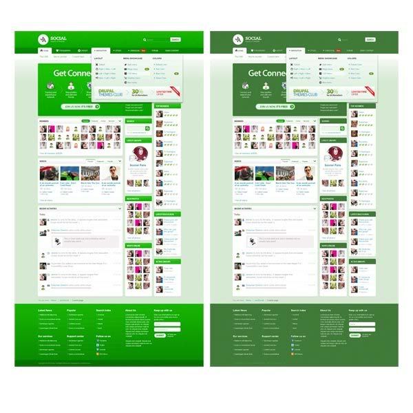
August 27, 2010 at 11:20 am #353864This looks absolutely spot on – but there was just one thing I noticed. The blue and black colours look very appealing and the red is nice too. But the green looks very garish – almost to the point of hurting ones eyes to look at it for any length of time.
Is there any way the garish light green could be substituted for a more sophisticated darker green?
Attached a simple image for consideration: –

<em>@Hung Dinh 191843 wrote:</em><blockquote>Demo are coming in a several days (3-4) then normaly you can have the download after 2 days. Because this is the first time we support Agora, we are working with jVitals developers to help with the fine tuning of HMTL/CSS markup as well.</blockquote>
August 27, 2010 at 11:31 am #353866These social buttons…yes, you can work a little with them as they are very big according to me…but, will they be available also for K2 articles. I manage my articles only with K2, so these buttons would not be useful if they don’t work with K2 component.
Another thing maybe that it woul be plausible…to change the sharing tool of Jomsocial with this counting buttons.
smitheringale Friend
smitheringale
- Join date:
- December 2009
- Posts:
- 236
- Downloads:
- 0
- Uploads:
- 0
- Thanks:
- 63
- Thanked:
- 44 times in 18 posts
August 27, 2010 at 11:49 am #353867Oh, and it’s such a little thing – but you have Copyright Ja Sulfur at the bottom of the template. You can guarantee this would confuse someone if it slipped through into the download in the next few days.
brianss Friend
brianss
- Join date:
- July 2008
- Posts:
- 25
- Downloads:
- 0
- Uploads:
- 2
- Thanks:
- 2
- Thanked:
- 1 times in 1 posts
August 27, 2010 at 12:28 pm #353871Great design! Any chance that K2 will be integrated into this template? This seems like a very versatile template, but it would be nice to have a K2 option or something similar for sites that may not use the social components. I would love to see more templates featuring a portfolio section (sortable by category).
Also, I agree with others regarding the colors. Outside of blue, they just don’t seem sophisticated or rich enough. The black seems like a washed out gray. I’m not a fan of bold colors like red and green, but richer shades of black, blue, etc. would look great, like the JA Norite colors. Thanks!
1 user says Thank You to brianss for this useful post
damian Friend
damian
- Join date:
- May 2008
- Posts:
- 154
- Downloads:
- 0
- Uploads:
- 8
- Thanks:
- 70
- Thanked:
- 20 times in 1 posts
August 27, 2010 at 1:28 pm #353873Really Love Magazine Layout. Awesome
smitheringale Friend
smitheringale
- Join date:
- December 2009
- Posts:
- 236
- Downloads:
- 0
- Uploads:
- 0
- Thanks:
- 63
- Thanked:
- 44 times in 18 posts
August 27, 2010 at 1:35 pm #353874Although I don’t really want K2 integrated into anything, I agree with your comments about the colours.
It seems arrogant for me to leave an opinion like this – who am I to say whether K2 should be used or not? Yet, I just want to throw my opinion into the mixing bowl.
<em>@brianss 191859 wrote:</em><blockquote>Great design! Any chance that K2 will be integrated into this template? This seems like a very versatile template, but it would be nice to have a K2 option for sites that may not use the social components. Also, I agree with others regarding the colors. Outside of blue, they just don’t seem sophisticated or rich enough. The black seems like a washed out gray. I’m not a fan of bold colors like red and green, but richer shades of black, blue, etc. would look great. Thanks!</blockquote>
brianss Friend
brianss
- Join date:
- July 2008
- Posts:
- 25
- Downloads:
- 0
- Uploads:
- 2
- Thanks:
- 2
- Thanked:
- 1 times in 1 posts
August 27, 2010 at 3:17 pm #353881<em>@smitheringale 191862 wrote:</em><blockquote>Although I don’t really want K2 integrated into anything, I agree with your comments about the colours.
It seems arrogant for me to leave an opinion like this – who am I to say whether K2 should be used or not? Yet, I just want to throw my opinion into the mixing bowl.</blockquote>
Don’t get me wrong. I’m not a big K2 fan. I actually think Zoo from YooTheme is more elegant. I just think that modules like K2 and Zoo really help in building out some areas like Portfolios and Blogs. And it seems like a better way to orgnaize your content.
smitheringale Friend
smitheringale
- Join date:
- December 2009
- Posts:
- 236
- Downloads:
- 0
- Uploads:
- 0
- Thanks:
- 63
- Thanked:
- 44 times in 18 posts
August 27, 2010 at 5:53 pm #353888Don’t get me wrong, I think K2 is a much nicer way to present information – but it seems to be overly complicated and prone to not working as one would hope it would.
<em>@brianss 191872 wrote:</em><blockquote>Don’t get me wrong. I’m not a big K2 fan. I actually think Zoo from YooTheme is more elegant. I just think that modules like K2 and Zoo really help in building out some areas like Portfolios and Blogs. And it seems like a better way to orgnaize your content.</blockquote>
gberm Friend
gberm
- Join date:
- July 2010
- Posts:
- 55
- Downloads:
- 0
- Uploads:
- 0
- Thanks:
- 4
- Thanked:
- 3 times in 1 posts
August 27, 2010 at 11:40 pm #353906I think also Zoo is the better CCK.
 zao dao
Friend
zao dao
- Join date:
- September 2014
- Posts:
- 155
- Downloads:
- 160
- Uploads:
- 2
- Thanks:
- 12
- Thanked:
- 11 times in 1 posts
August 28, 2010 at 12:48 am #353911zoo is not better,zoo in only looks nice in frontend,but is not so good in backend and has some buds and problem when manage it.
www.8media.com
www.zaodao.comnetmediadesign Friend
netmediadesign
- Join date:
- August 2010
- Posts:
- 5
- Downloads:
- 0
- Uploads:
- 0
- Thanked:
- 3 times in 4 posts
August 28, 2010 at 7:22 pm #353997This looks very nice, great job joomlart!
Trimud Friend
Trimud
- Join date:
- May 2006
- Posts:
- 245
- Downloads:
- 36
- Uploads:
- 11
- Thanks:
- 8
- Thanked:
- 55 times in 45 posts
August 28, 2010 at 9:53 pm #354008Great look, completly agree with commnts about the green color.
If JA didn’t integrate K2 there will be no problem someone from the community to do it. Someone like me 😛
August 28, 2010 at 10:17 pm #354009how can i download it plz
-
AuthorPosts
This topic contains 103 replies, has 51 voices, and was last updated by Phill 12 years, 10 months ago.
We moved to new unified forum. Please post all new support queries in our New Forum

