-
AuthorPosts
-
Hung Dinh Friend
Hung Dinh
- Join date:
- September 2014
- Posts:
- 4408
- Downloads:
- 11
- Uploads:
- 189
- Thanks:
- 309
- Thanked:
- 3310 times in 3 posts
June 20, 2010 at 4:56 am #151926JoomlArt Joomla template for June is coming, it’s JA Anion! Anything about theaters, DVD, HD trailers, movie times etc., are right in JA Anion. Let’s go big to make an internet movie database like imdb, or movies.com as a source for movies news and reviews…
A strong point of JA Anion lines in the set of extensions, basic but adaptable to kick off such a movie site. Typical functional presentations in JA Anion: group contents into tabs (eg. Popular, Latest); show product items in grid or list type; create slides of image items both in scroll format and auto slideshow.
Certainly lots of things are still ahead to get a full-featured movie site, but JA Anion will be a cut-through. Browse JA Anion’s 6 color sets – default, blue, red, green, brown, orange for real inspiration.
We heard some request for a more clean & business target template and I believe you will be happy with this concept.
Default Color:
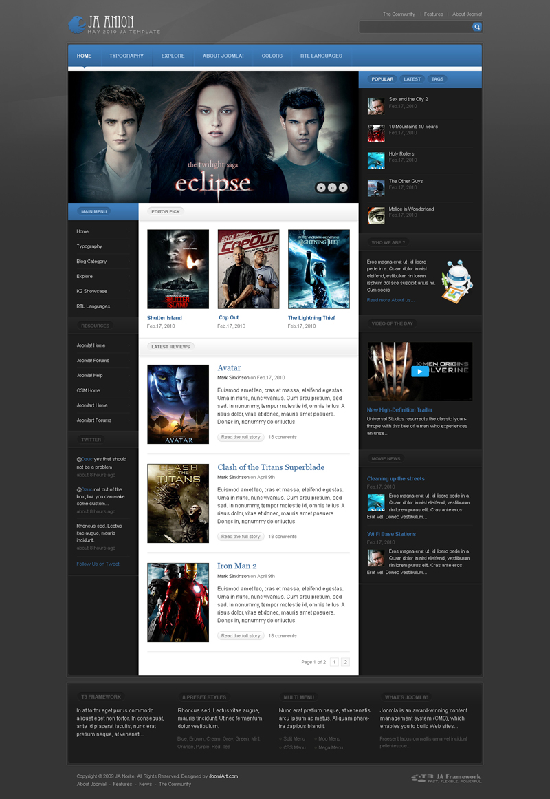
View the higher resolution HERE
Dark Blue:
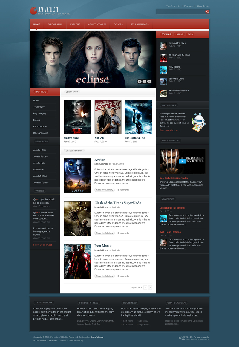
View the higher resolution HERE
Dark Brown:
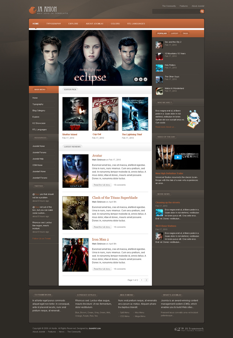
View the higher resolution HERE
Dark Green:
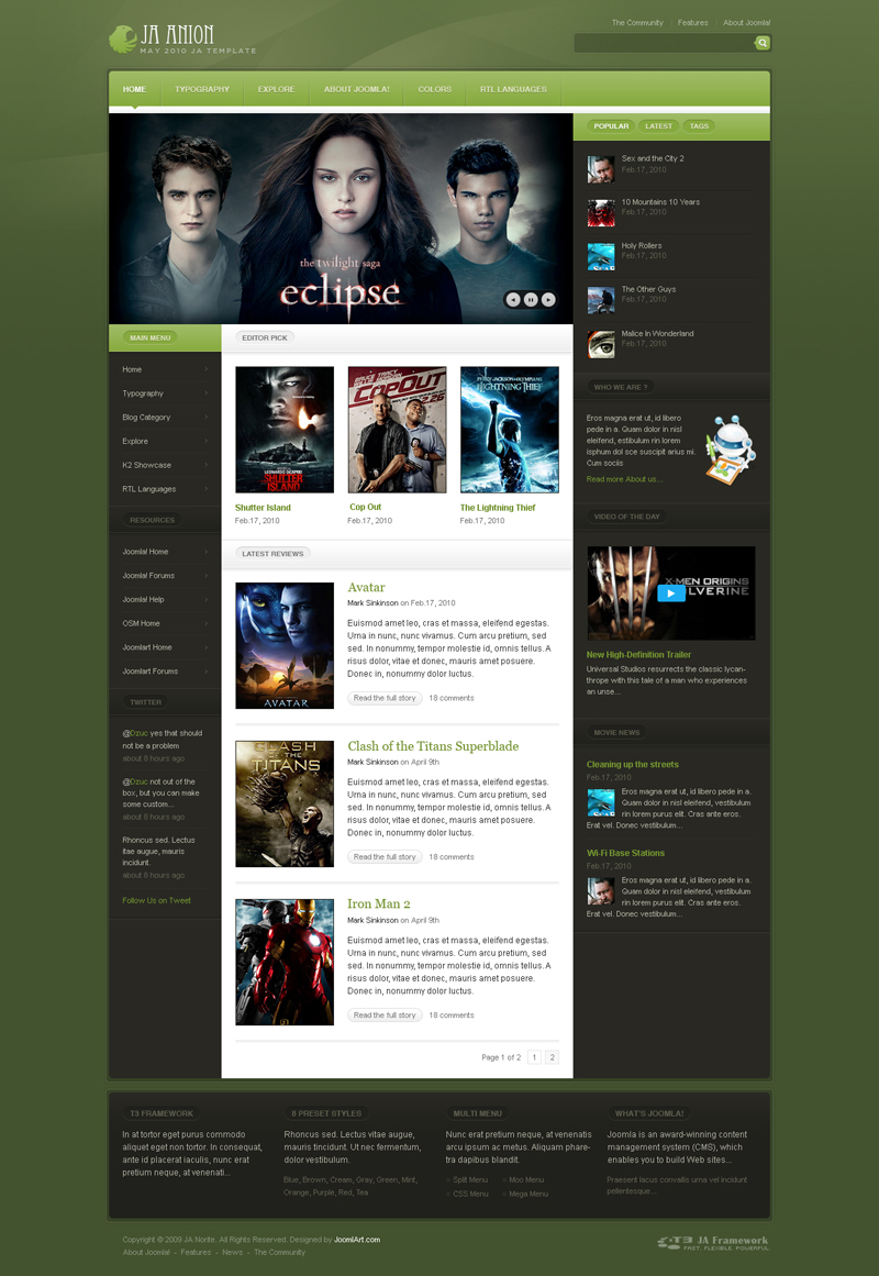
View the higher resolution HERE
Dark Orange:
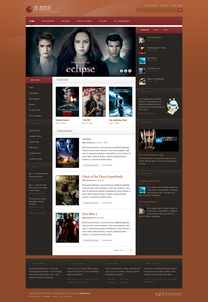
View the higher resolution HERE
Dark Red:
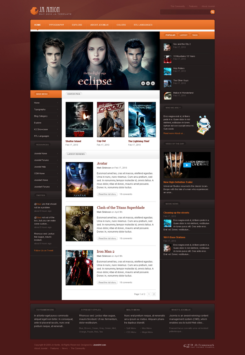
View the higher resolution HERE
Light Color:
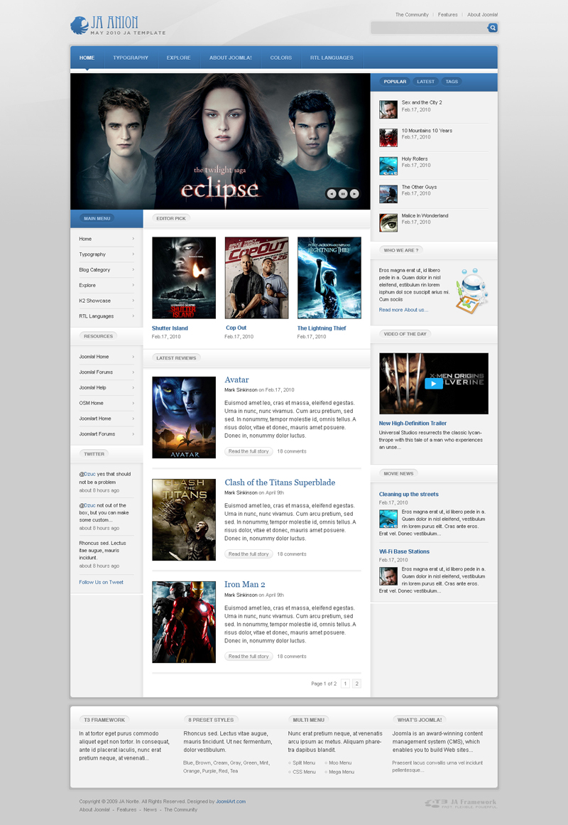
View the higher resolution HERE
Light Blue:
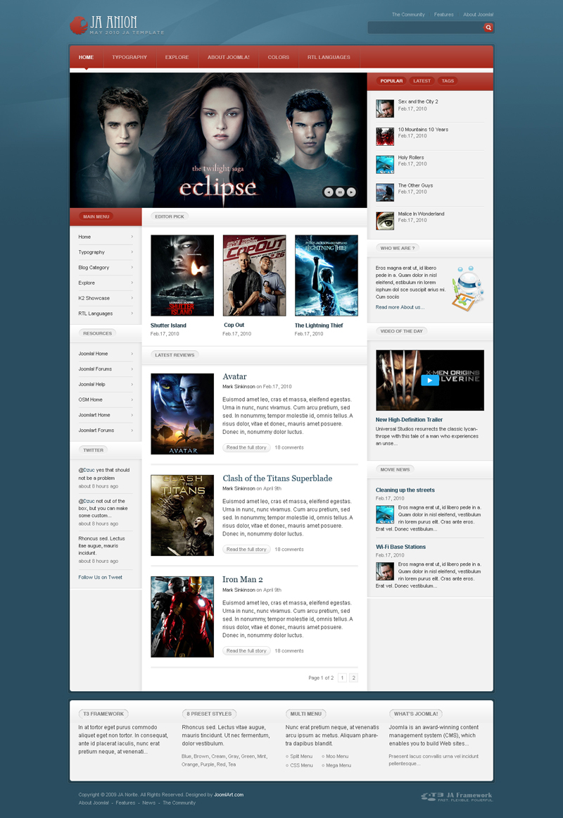
View the higher resolution HERE
Light Brown:
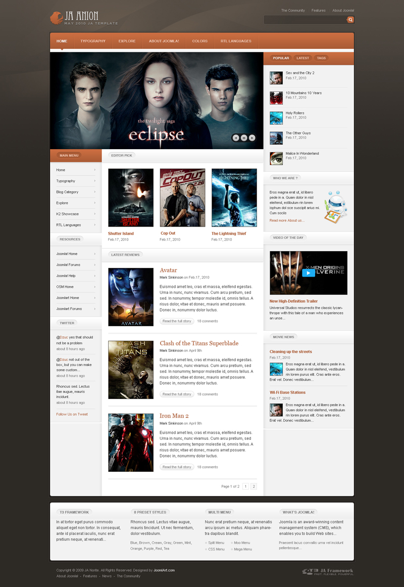
View the higher resolution HERE
Light Green:
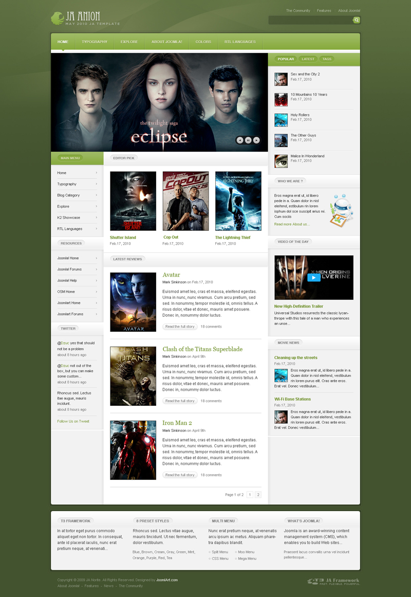
View the higher resolution HERE
Light Orange:
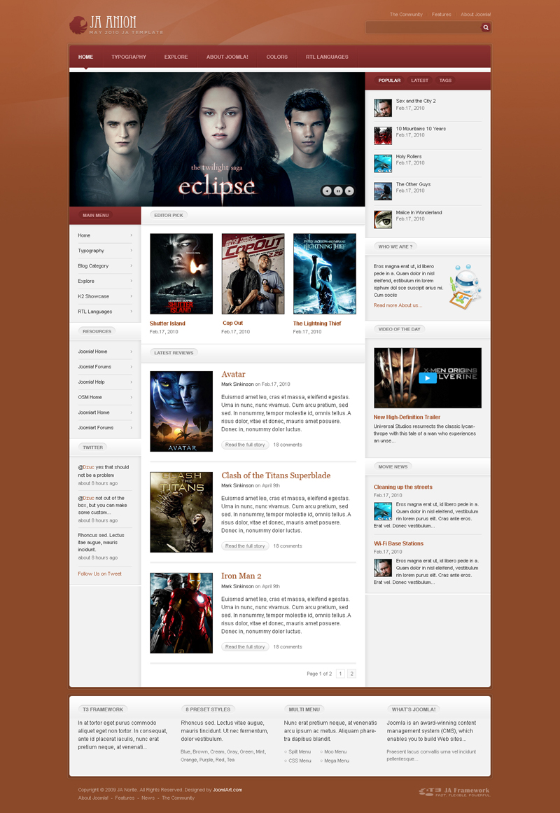
View the higher resolution HERE
Light Red:
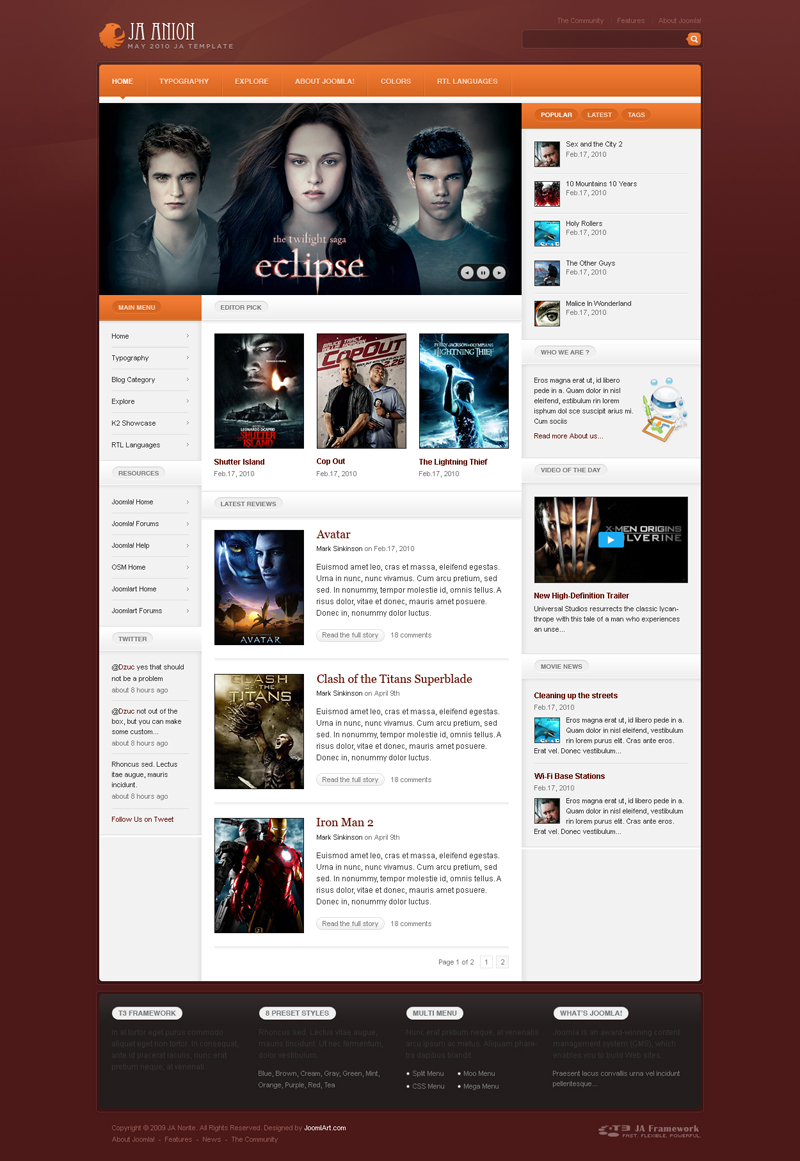
View the higher resolution HERE
10 users say Thank You to Hung Dinh for this useful post
tonyg Friend
tonyg
- Join date:
- June 2008
- Posts:
- 197
- Downloads:
- 0
- Uploads:
- 8
- Thanks:
- 18
- Thanked:
- 46 times in 27 posts
June 20, 2010 at 9:47 pm #347517All so predictable now, nothing new same old regurgitated designs.
lpeet01 Friend
lpeet01
- Join date:
- February 2010
- Posts:
- 11
- Downloads:
- 11
- Uploads:
- 0
- Thanks:
- 8
- Thanked:
- 2 times in 1 posts
June 20, 2010 at 10:24 pm #347519Looks great good work!
bernhar Friend
bernhar
- Join date:
- July 2006
- Posts:
- 214
- Downloads:
- 0
- Uploads:
- 1
- Thanks:
- 3
- Thanked:
- 3 times in 1 posts
June 20, 2010 at 11:27 pm #347520This looks really interesting. It´s always hard to judge a design by just looking at a preview image. This seems to have a very versatile layout though and in my view a nice solution to the problem, how to combine rounded and angular elements in a harmonic way.
antoniu1 Friend
antoniu1
- Join date:
- July 2006
- Posts:
- 349
- Downloads:
- 0
- Uploads:
- 5
- Thanks:
- 29
- Thanked:
- 40 times in 1 posts
June 21, 2010 at 12:56 am #347522Looks nice 🙂
And my wellmeant compliments for the new site, looks awesome!!
I have to agree that template designs are very much alike. But this is the same for most clubs. For example, most clubs will tend to always put a slideshow header at the top and remain from then on predictable to the bottom, where there is the same old dark colored bar for some lists. Somewhere some tabbed column and some articles in a list like overview. In that respect this design is the same like most other designs. I am referring here to designs like this new one. It’s not the content, but the way it is presented.
There are some designs from clubs like for example templateplazza (magz plazza) or joomlabamboo (Grid2) that are introducing a very different design. These designs are often not just the different placement of content, but are backed up by specific code, jquery for example, to create nice effects.
I would think that JA should be able to have more different designs in that sense, even though I will not say that they are bad or always “the same”. The designs are okay, but not outstanding. The upcoming june design (in a week tops) for Gavick Pro (Postnote) is an example of a template where the design is well done, subtle and different from most of the designs that are available.
What I see happening with other clubs is that different designers are being hired to offer different designs that not only really make a difference, but also take time to see what creative effects/uses can be implemented into the template, like the above mentioned.
The same problem goes for RT, where the designs may seen different, but that is only because of the immense design overkill, which make modifications a lot harder instead of easier. They have put too much time into their framework, making it easy to use, yet make it impossible to adjust template and column widths. Basic things that aren’t possible anymore, unless you can really find your way, which has become very difficult for most.
What I would suggest is that JA starts to hire designers that are not connected to the eastern view, but are used to western design style, which is different. From the designs I can see that this type of creativity is missing. No offense meant here.
Finally, I know for a fact that the many members Joomlaxtc have, come from the effort they put into the extensions that they code for. K2, Kunena, Eventlist, Jcomments, Seyret, etc. This, together with the designs that are really different/distinct, make them interesting to many. It’s not that their templates are that bug free or compatible at all; they have many bugs and stuff. But these are taken for granted for those reasons.
There’s another thing I don’t understand from JA. While JA does do a great job integrating their comments component, for example, when I look at an article page, it scrolls down after it loads the comment part, forcing me to have to scroll up to the top each page. At least on a Mac. It’s these small things that actually make a component difficult to use. I would not force my viewers to scroll up each article page because the comment component scrolls it down when loading. I don’t understand these things are fixed even before the component is launched, because this is a huge problem for any site builder. However, after several templates, it’s still doing that. I dare say that this means that responsible site builders will skip that component and move to Jcomments instead. Or won’t want a template as it has this strange behavior. In an indirect way this will affect JA in the long run, which is a shame.
The first serious template clubs that were there when Joomla came up after Mambo were JA and RT. Both grew incredibly and probably still do, but as many other clubs are there today, working very hard to get a piece of the action, both cannot rely on their reputation only. They have to maintain that and improve it. Not by expanding to other platforms only, but by making sure that the creativity remains in both designs and effects. These are the things that most developers and site owners miss. Anyone can put a module somewhere. But there are but a few that can come up with a different look, where there’s not that same old boring slideshow at the top. It has to go. It is boring and predictable and best becomes a thing of the past. 🙂
Some things to consider, hope this helps JA in some way 🙂
Tom
ghostik Friend
ghostik
- Join date:
- April 2010
- Posts:
- 71
- Downloads:
- 2
- Uploads:
- 1
- Thanks:
- 2
- Thanked:
- 11 times in 4 posts
June 21, 2010 at 8:12 am #347565very nice looking template
ph0t0n Friend
ph0t0n
- Join date:
- May 2009
- Posts:
- 5
- Downloads:
- 0
- Uploads:
- 0
- Thanks:
- 2
- Thanked:
- 2 times in 2 posts
June 21, 2010 at 2:07 pm #347615No offence meant Antioniu1? I know that Joomlart has a certain style, but then that’s the same for every decent designer isn’t it? The clean lines, efficient use of space, subtle but varied colour schemes and typography and layout make most of the templates Hung creates extremely versatile for different projects.
It’s equally important to remember the technology and coding that goes on in the background of these templates, what with the T3 framework, variable template options etc. Have you ever checked out his CSS? I think you’ll be surprised how much is going on in the background here.
Keep it up Hung, I like being able to rely upon you for these superb quality templates, and if I need to customise anything, the support’s been great.
Like the new site, by the way,
Chris2 users say Thank You to ph0t0n for this useful post
antoniu1 Friend
antoniu1
- Join date:
- July 2006
- Posts:
- 349
- Downloads:
- 0
- Uploads:
- 5
- Thanks:
- 29
- Thanked:
- 40 times in 1 posts
June 21, 2010 at 2:19 pm #347618Hi Ph0t0n,
Thanks for your response. No, no offense meant at all indeed. 🙂
Perhaps you might read it in another tone, so that you don’t automatically ASSUME that I am “being negative”. I suggest things, compare and give my view. That’s okay, isn’t it?
Perhaps I should point out that I am a long standing member of JA, almost from the start and that I do love JA. This doesn’t mean that some things could be looked at or improved. Does it?
I am totally aware of T3 and the coding. T3 is a great accomplishment indeed, agree totally.
Thanks,
Tom3 users say Thank You to antoniu1 for this useful post
damian Friend
damian
- Join date:
- May 2008
- Posts:
- 154
- Downloads:
- 0
- Uploads:
- 8
- Thanks:
- 70
- Thanked:
- 20 times in 1 posts
June 21, 2010 at 3:13 pm #347621Just want to know about T3 V.2 .
thatcomputerdude Friend
thatcomputerdude
- Join date:
- December 2008
- Posts:
- 280
- Downloads:
- 0
- Uploads:
- 9
- Thanks:
- 67
- Thanked:
- 32 times in 1 posts
June 21, 2010 at 4:37 pm #347624Very nice clean design – makes for a great starting point when customizing for a client.
I understand some people are members because they need out of the box designs to use for their website or a clients site – there is nothing wrong with that. Not all of us rely on the out of the box designs though, we need a solid foundation to customize the template so we can offer our clients custom designs.
Thank you JA Team for another solid template, much appreciated! It’s also nice to have a forum that allows all of us different developers to talk, debate, agree and disagree to help collaborate for our industry!
1 user says Thank You to thatcomputerdude for this useful post
antoniu1 Friend
antoniu1
- Join date:
- July 2006
- Posts:
- 349
- Downloads:
- 0
- Uploads:
- 5
- Thanks:
- 29
- Thanked:
- 40 times in 1 posts
June 21, 2010 at 5:14 pm #347630<blockquote>I understand some people are members because they need out of the box designs to use for their website or a clients site – there is nothing wrong with that. Not all of us rely on the out of the box designs though, we need a solid foundation to customize the template so we can offer our clients custom designs.</blockquote>
Exactly, that was my point. Great you understand. And I was thinking of them – as these are the larger amount of the members – as with any club 🙂 I always like to help improve JA. They are great guys.
I never talked about perfect templates or “out of the box” designs. I redesign most of these templates anyway. This was never what I wrote, nor my point. I am talking about different approaches. A frontpage can really be very different, you know. 🙂 Yet most of the clubs still come with the same old slideshow at the top. Like it’s a rule. It’s not. And that’s where the real creativity in designing comes in.
I like where this template goes. But I think the K3 framework can do lots more than that. 🙂
Thanks!
Tomthatcomputerdude Friend
thatcomputerdude
- Join date:
- December 2008
- Posts:
- 280
- Downloads:
- 0
- Uploads:
- 9
- Thanks:
- 67
- Thanked:
- 32 times in 1 posts
June 21, 2010 at 5:23 pm #347631<em>@antoniu1 183554 wrote:</em><blockquote>Exactly, that was my point. Great you understand. And I was thinking of them – as these are the larger amount of the members – as with any club 🙂 I always like to help improve JA. They are great guys.
I never talked about perfect templates or “out of the box” designs. I redesign most of these templates anyway. This was never what I wrote, nor my point. I am talking about different approaches. A frontpage can really be very different, you know. 🙂 Yet most of the clubs still come with the same old slideshow at the top. Like it’s a rule. It’s not. And that’s where the real creativity in designing comes in.
I like where this template goes. But I think the K3 framework can do lots more than that. 🙂
Thanks!
Tom</blockquote>
I understand – I was just throwing out my 2 cents on how I feel and think – not trying to direct them at you or your remarks. I do agree with your remarks about thinking outside the box though!ph0t0n Friend
ph0t0n
- Join date:
- May 2009
- Posts:
- 5
- Downloads:
- 0
- Uploads:
- 0
- Thanks:
- 2
- Thanked:
- 2 times in 2 posts
June 21, 2010 at 9:17 pm #347646Hi antoniu1,
No, I know you were being helpful, and it is important to share opinions on here, I’m not against discussion, of course. However, I was worried that your comments were a little ill-timed considering the whole site has gone through a recent major update and Hung clearly continues to invest in improving the designs, technology and useability.RE: more Western designs, I agree that variety is the order of the day, although I suspect Hung is capable of this rather than needing to import other designers. As a developer, I do customise the designs a lot, and don’t always use the slideshow areas as suspected. Personally, I also like overlapping png’s and divs, and interesting PSDs for graphical interest. On the other end of the scale, simple, large-type clean and minimal sites a la WordPress style are also good. So….I also look forward to more from JA, could do without the slideshow (though not always!), would like to see some more dynamic width options, but overall am really happy Hung is in no way “relying on his reputation”.
…only MHO….I think design is one of those areas that attracts strong opinions, and I’m glad you drew me up on my response..
Cheers
ChrisJune 21, 2010 at 11:43 pm #347651Nice look, but i hoped for a more revolutionary template for this theme.
kipperfletcher23 Friend
kipperfletcher23
- Join date:
- February 2009
- Posts:
- 54
- Downloads:
- 0
- Uploads:
- 6
- Thanks:
- 5
- Thanked:
- 11 times in 1 posts
June 22, 2010 at 3:51 pm #347736I have noticed template monster are now offering a lot of funky designs for various topics. Although your designs are clear and very good I would like to see a lot more design included. A business style, a childrens style, a motor style, a trave style etc
-
AuthorPosts
This topic contains 26 replies, has 22 voices, and was last updated by VisiGod 14 years, 5 months ago.
We moved to new unified forum. Please post all new support queries in our New Forum

